Challenge
This well-respected corporate turnaround consultancy needed a brand update that would appeal to a conservative traditional client base—and an assertive new market.
Solution
Starting with a bold revamp of the firm’s typographic logo and a companion monogram, we then applied our Responsive Branding process to develop a flexible system of print collateral.
Result
The brand’s visual strength conveys expertise, excellence and solidity, yet the system’s flexibility allows associates to tailor their communication to specific audiences.
Many different things can initiate a rebranding effort. Getzler Henrich Associates was growing, and the marketing team found the company’s longstanding logo difficult to reproduce on the new business cards they were requisitioning for new employees. Too, the old mark created an unequal and untrue visual hierarchy between the two partners’ names.
The firm’s primary business is with bankers, attorneys and the owners of distressed companies — Getzler Henrich helps reorganize these businesses when they fail to meet debt obligations.
The new system allows Getzler Henrich to speak with a cohesive brand voice.
After establishing a baseline of research, our team recommended updating the Getzler Henrich brand and all its applications across media, including the website, advertising, trade show communication and special event announcements.
Our client partners asked us to use the rebrand as an opportunity not just to secure its reputation with existing customers and prospects — but also to help develop business in new sectors, specifically the private equity market. The firm’s base audience tends to be mature and more traditional; the latter, younger and more assertive.
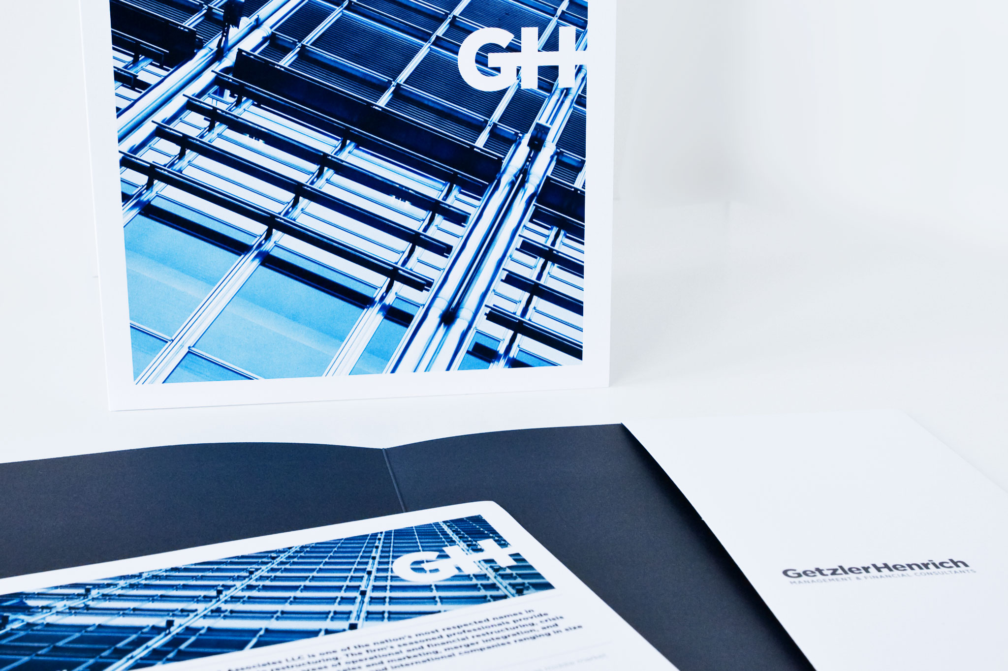
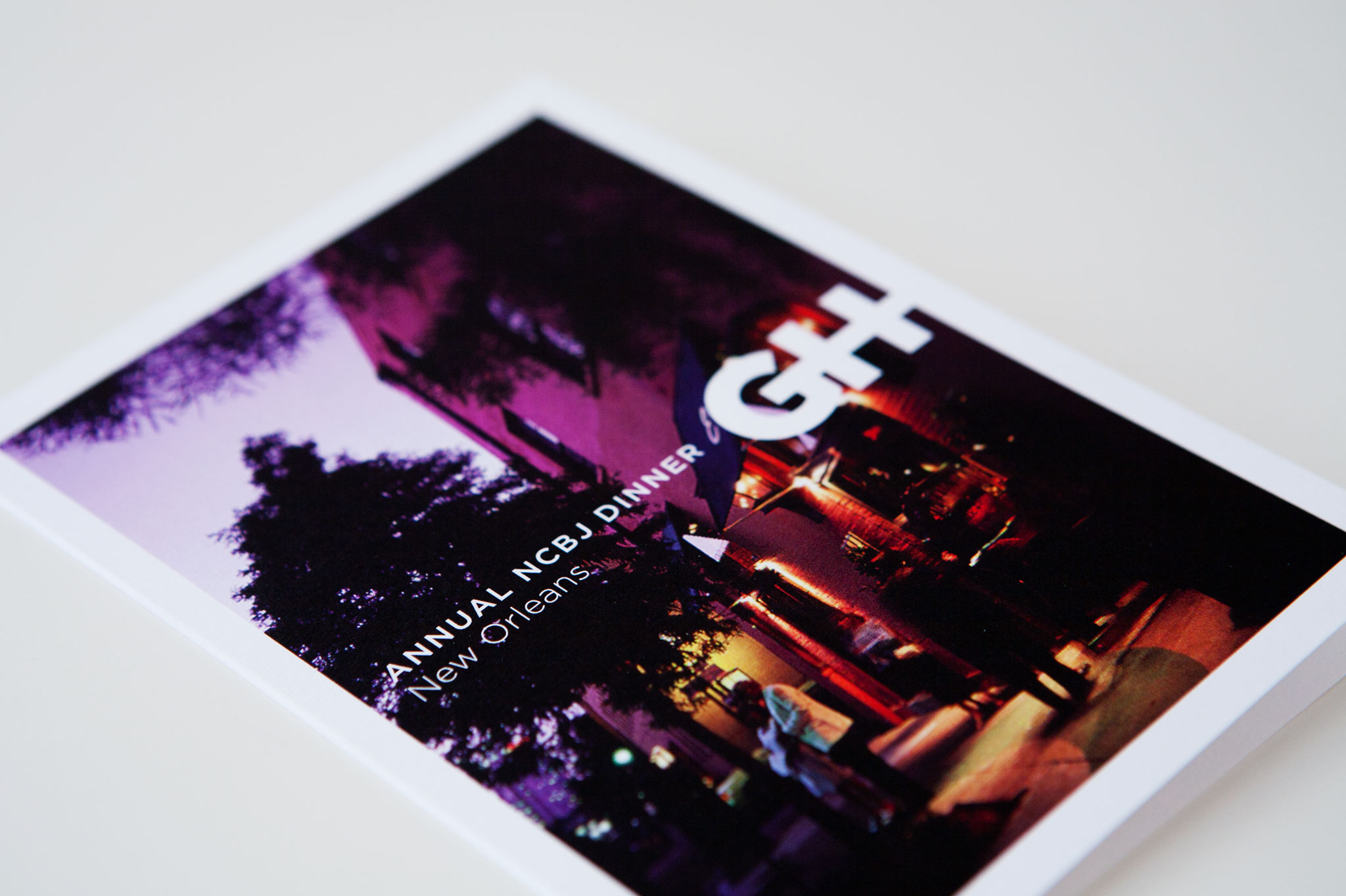
How to develop a brand to meet the expectations of two diverse customer groups? Our solution: Create a Responsive Brand. Our new system allows Getzler Henrich to speak with a cohesive brand voice, even as it’s communicating to different audiences with different needs.

We began by reinterpreting the existing logo to represent a bold interlocking of the partners’ respective talents. The firm’s corporate color was blue, a color indicating trustworthiness in banking and finance. We updated it to a brighter, more contemporary shade. And we recommended a friendlier typeface to support the logo and other communications.
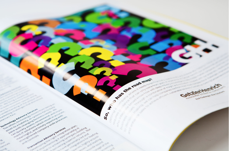
The advertising creative direction used symbols and punctuation in dynamic illustrations that represent the abstract thinking and analysis at the heart of the firm’s practice. These illustrations were animated for use on the web. The website integrates with a customer-relationship-management system (Salesforce and Marketo) to track all outreach.
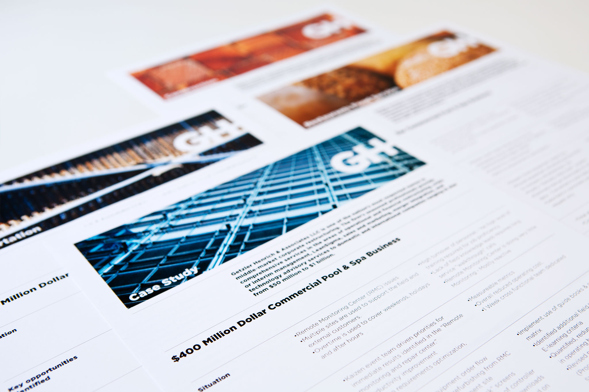
Finally, we organized the firm’s print collateral by industry and curated a library of images that marketing employees could use to build client materials. This flexibility is a hallmark of our Responsive Branding approach: Employees can choose from a system of publication designs to customize communication to their audiences and print materials on demand as needed.

Employees can choose from a system of publication designs to customize communication to their audiences and print materials on demand as needed.
40%
Increase in site traffic
20%
Increase in response rate from trade show advertising
Fresh
The word used by field sales to describe the rebrand
