BlackRock
Updating an Institutional Brand
- Financial Services
- Design
- Investor Communication
Challenge
Thanks to an acquisition, this global leader in asset management needed a brand update that would appeal not just to institutional clients, but to individual investors.
Solution
In collaboration with an advertising partner, we created a full visual identity that overlaid the firm’s intellectual and strategic excellence with images that captured the human faces of its client base.
Result
One of the most innovative visual identities for a financial services company—which helped the firm engage with its audience and maintain their trust during a time of transition.
With $4 trillion in assets under management, BlackRock is the world’s largest asset manager. In late 2009, the firm acquired Barclays Global Investors and its iShares brand of exchange-traded funds. This acquisition marked a transformation of BlackRock’s business from the institutional category, serving pension funds, public institutions, foundations and companies, to a broad-based financial company providing investment solutions to millions of people in all walks of life.
BlackRock’s business transformed to a broad-based company providing investment solutions to millions of people.
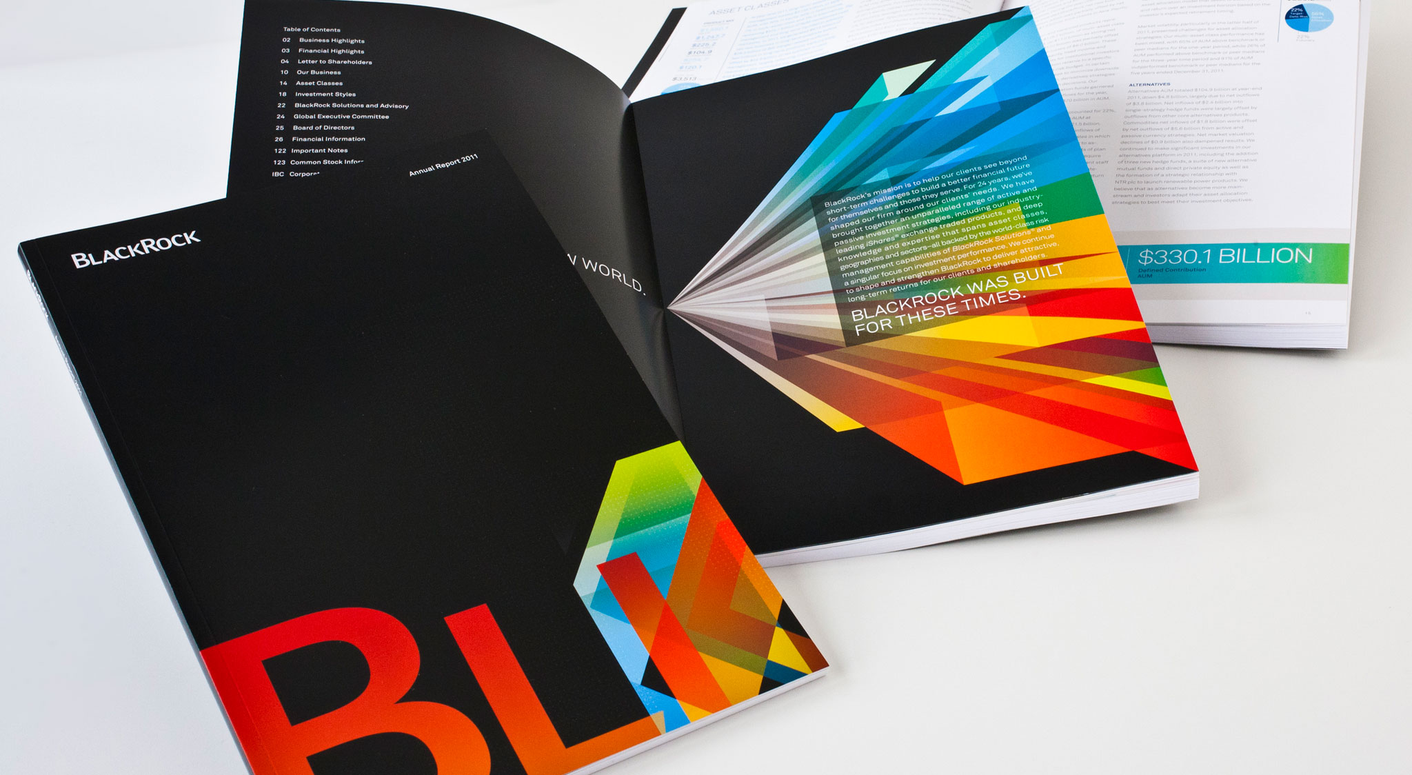
After the 2008 financial crisis, BlackRock acknowledged the economic uncertainty with the tagline, “BlackRock was built for these times.” To graphically redefine the company in the eyes of employees and the public, BlackRock engaged Ogilvy and Decker. Working closely with BlackRock’s many internal teams as well as the agency, we collaborated on the development of a new visual language.
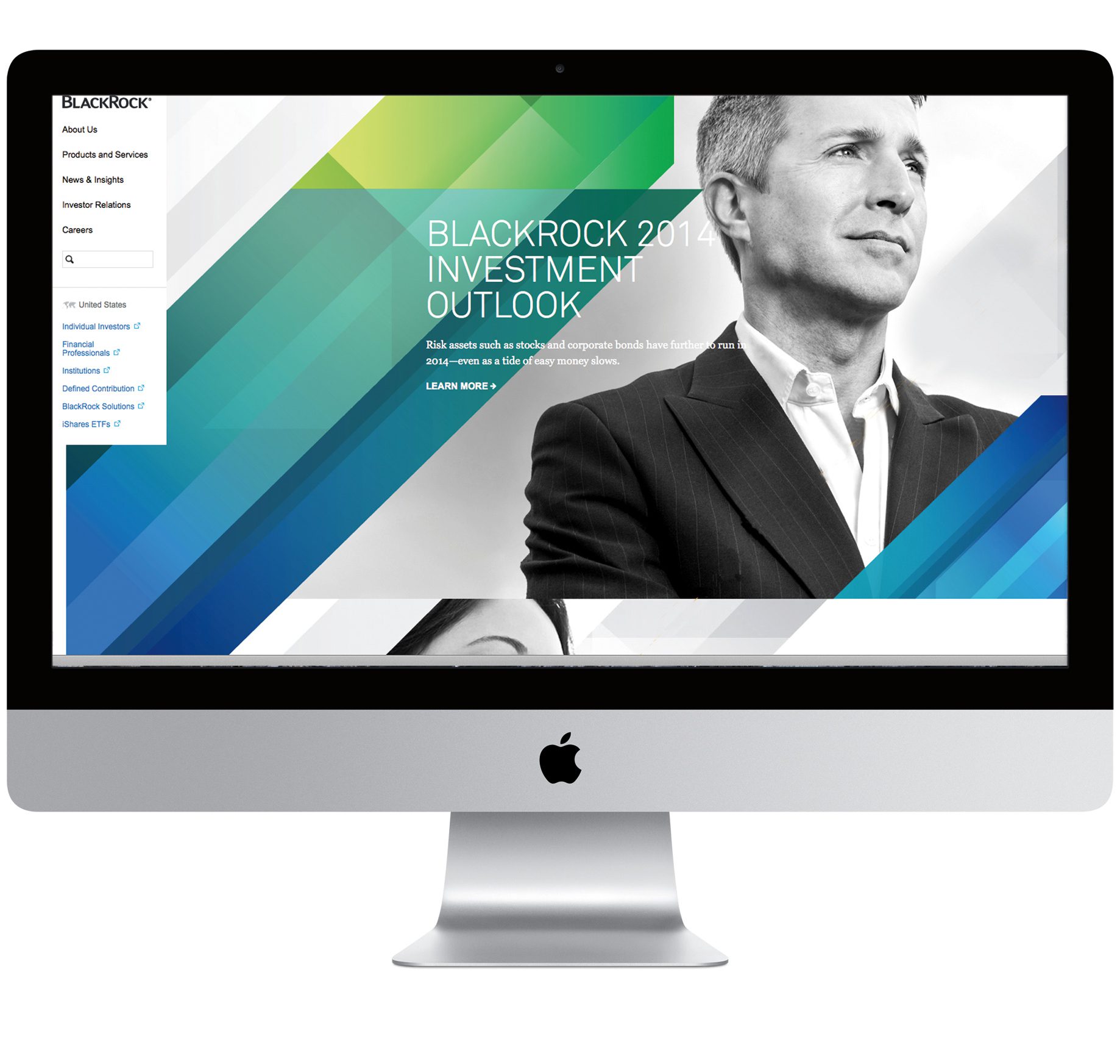
To create an image of innovation, we discarded the visual elements that traditionally define the financial services category. After weeks of research, our team gave the first presentation. We referenced the speeches of BlackRock chairman Laurence Fink, who speaks repeatedly of the firm’s clients with reverence. We recommended photography to represent the clients BlackRock serves: firemen, teachers, police officers—hardworking real people.
One of the most innovative visual identities for a financial services company helped the firm engage with its audience and maintain their trust during a time of transition.
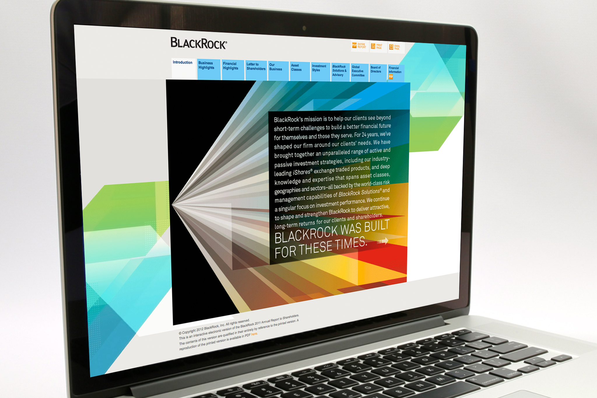
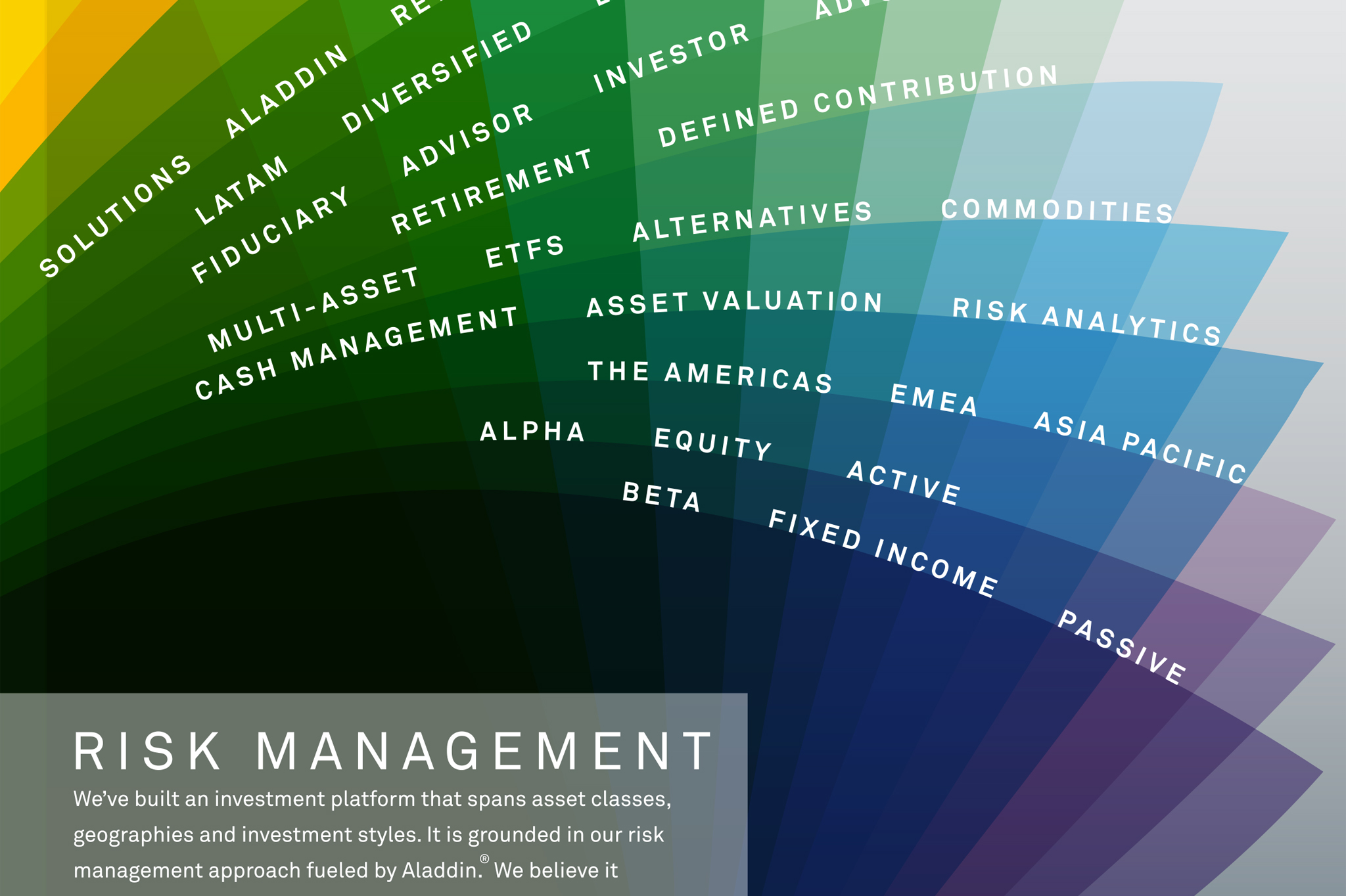
Our collaborator, Ogilvy, developed a gradient color graphic to represent the intellectual prowess, mathematical precision and analytical exactitude BlackRock is known for. The graphic was layered over images of people to yield a visual message that combines the power of analysis with compassion. Our team then incorporated these themes into the 2011 annual report and companion microsite.
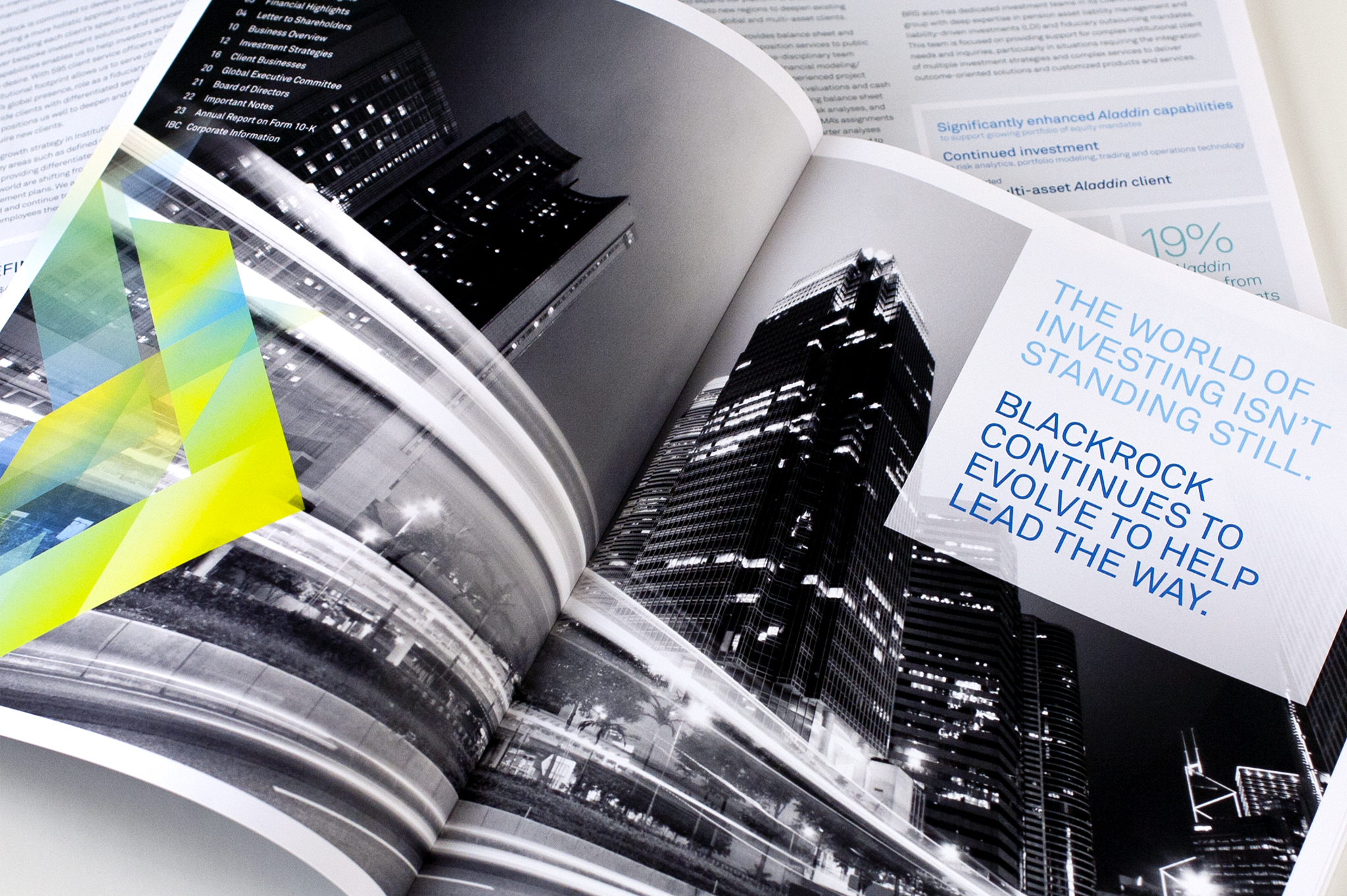
The graphic vocabulary continued to evolve in year two, with the decision to use black-and-white photography and more finely tuned color palettes. BlackRock’s internal team incorporated these graphics into short films, broadcast commercials, thousands of brochures and presentations across the globe. For two years Decker, Ogilvy and BlackRock’s internal team collaborated during a time of massive transition to launch, evolve and ultimately create one of the most innovative visual identities for a financial company.
For two years, Decker, Ogilvy and BlackRock’s internal team collaborated to launch, evolve and ultimately create one of the most innovative visual identities for a financial company.
#1
Best Annual Report North America
10%
Increase in digital engagement
Full
integration with national advertising campaign