Challenge
BronxWorks serves one of the poorest congressional districts in the U.S. Its website, a critical tool to communicate with the community, didn’t function in the mobile environment.
Solution
Designed and developed a new website focused on providing frictionless access to services while supporting fundraising and recruitment efforts.
Result
A website that reflects the culture of the Bronx and meets the needs of the community, (fully responsive) and the organization.
What We Learned by Researching Our Client
The South Bronx is shorthand for the pressures facing urban America. BronxWorks was founded in 1972 based on early 20th century reformist ideals to address poverty and improve immigrant assimilation.
BronxWorks is the largest nonprofit serving the Bronx offering an enormous range of services and programs. It has an impressive impact and reaches over 50,000 people annually. In 2019, homelessness declined 30% in the Bronx as 14,890 people were protected from eviction, and its homeless programs provided shelter to hundreds of individuals. Children and youth programs range from preschool to after school to summer day camps. Adolescent pregnancy prevention programs focus on breaking generational poverty. Senior centers provide meals and companionship. And this is just a small fraction of their work.
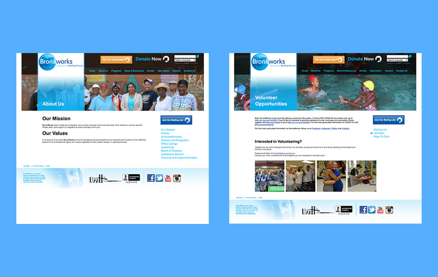
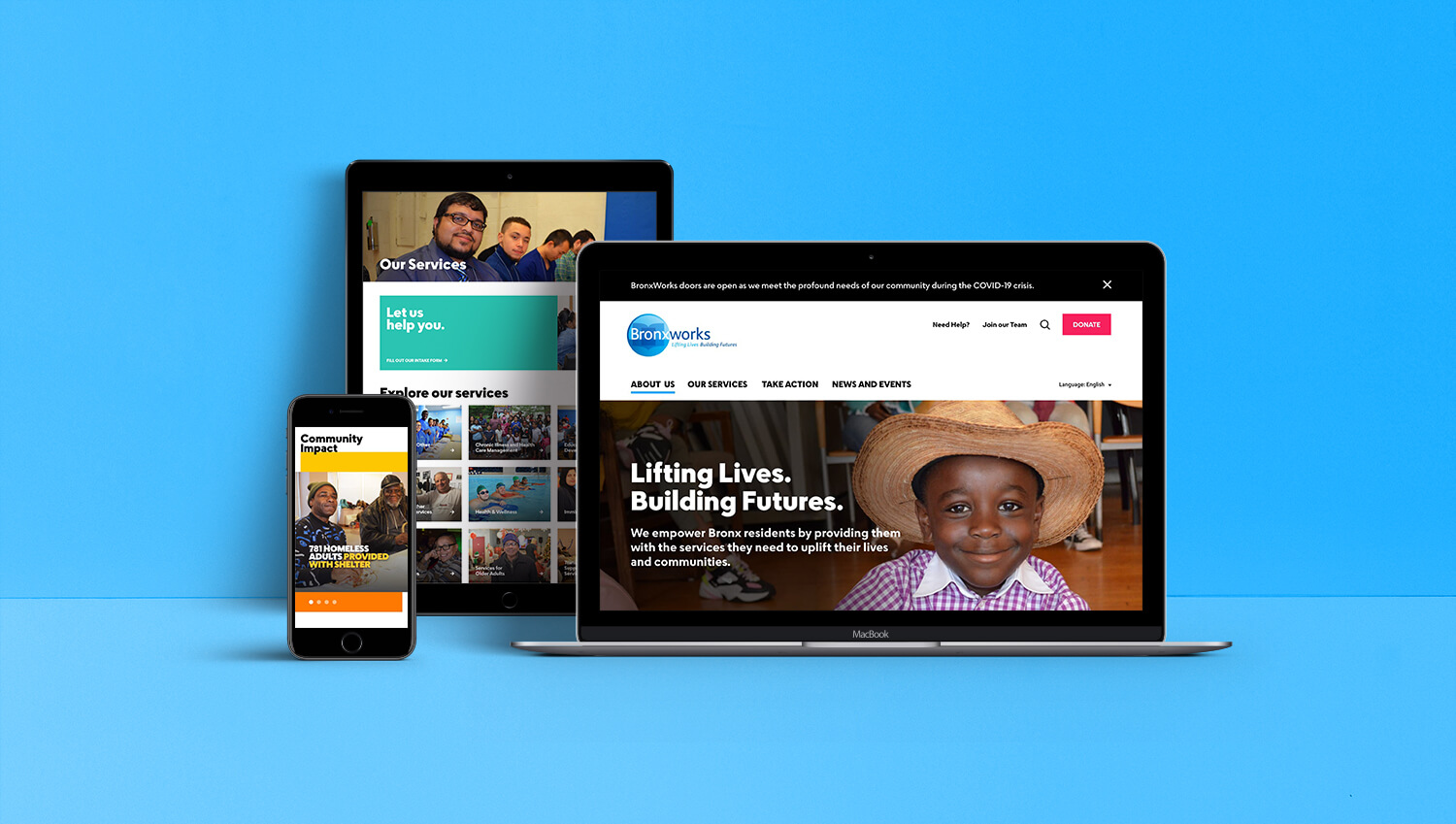
In the midst of all of this organizational success, there was a major problem—the website. It was slow to load—which aggravated everyone. It broke often and did not function well in the mobile environment. This was a critical flaw since most of the neighborhood owned a smartphone but not a computer. The old site also graphically failed to reflect the community; it had a corporate feel and didn’t resonate with the cultural vibrancy of the Bronx.
Workshopping to Gather Consensus
We led a series of five workshops with the organization’s communication team to clarify brand positioning and align messaging to our objectives. BronxWorks was a “force multiplier”—its heroic community impact only increased through partnerships with foundations, corporations and government agencies.
If you believe in the great urban experiment that New York is, and you want the region to be strong, the Bronx has to succeed.”
Persona Development
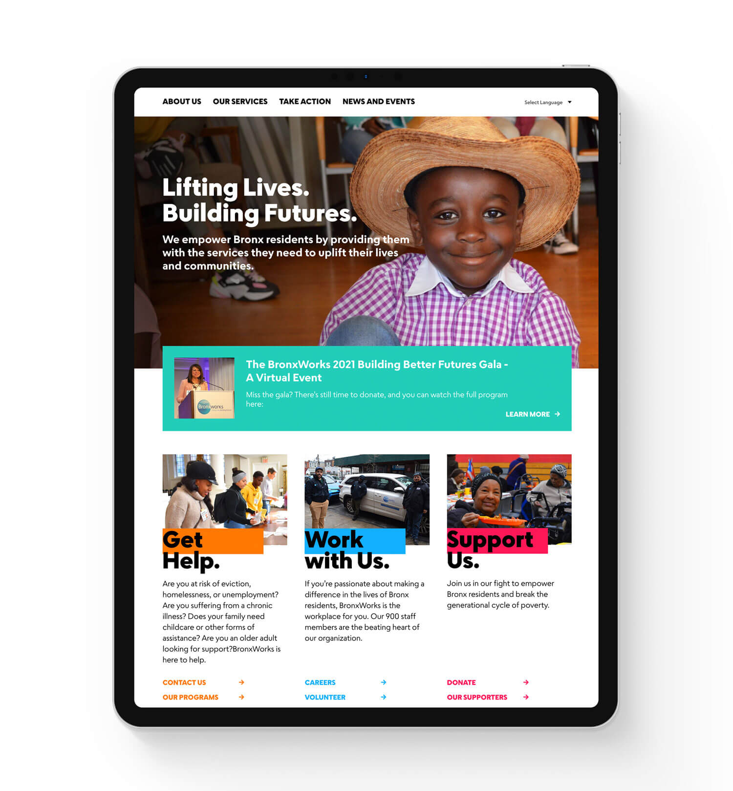
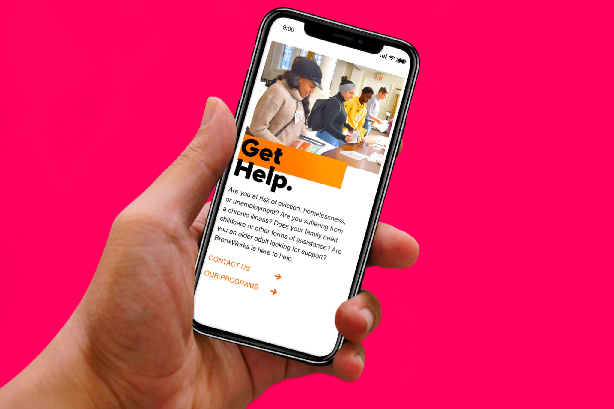
There were three main audiences: the community, funders and potential employees. We targeted messaging on the home page to each group. First, we wanted members of the community to be able to locate what they needed through a “How can we help?” portal. Second, demonstrating the profound impact of the programs was important to increase funding and donation. This information was categorized under “I want to help.” Third, the site had to inspire prospective employees and volunteers. Recruiting fell under “I want to join.”
Content Inventory
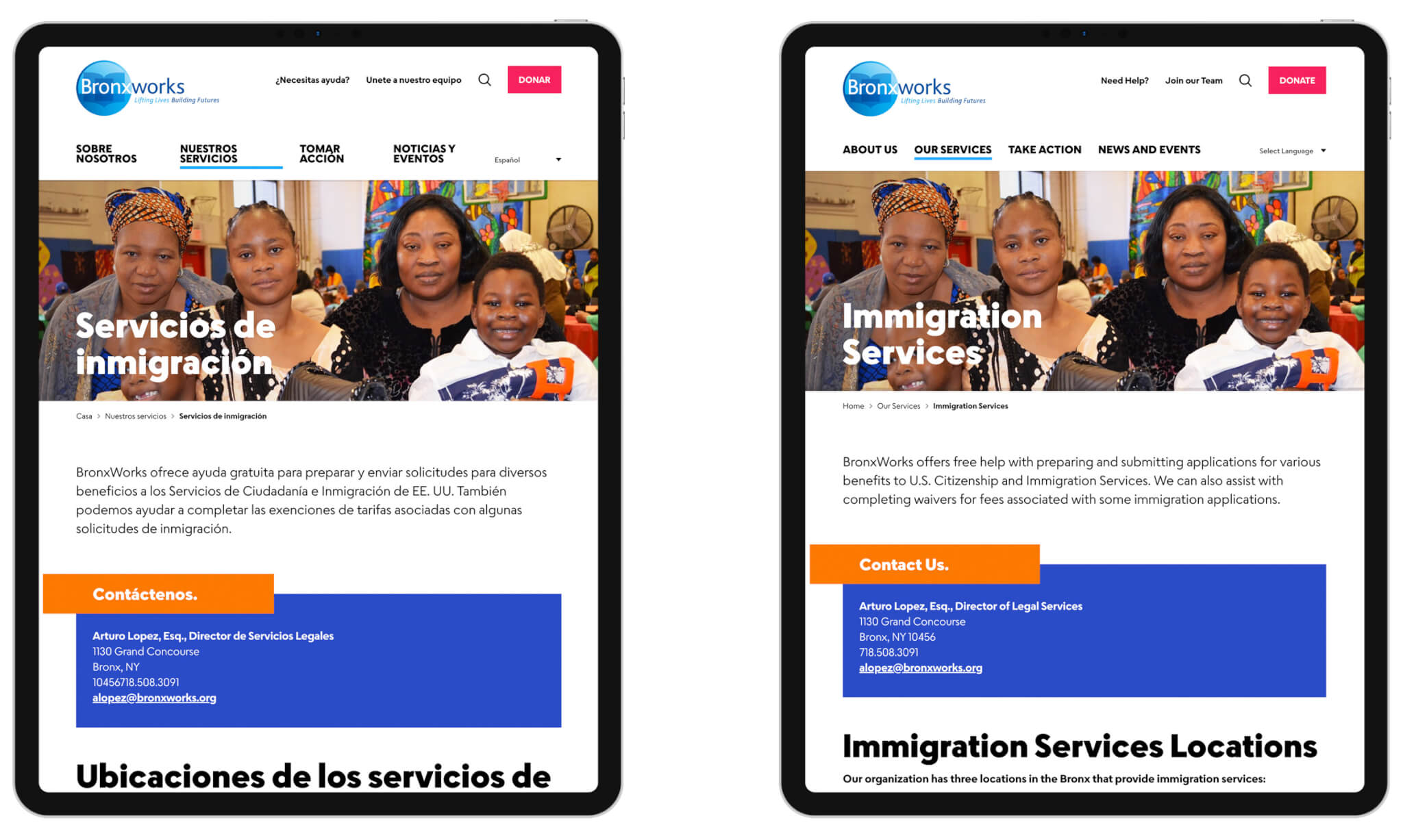
We worked closely with BronxWorks’ internal communication team and writer Olivia Rubino Finn to reorganize the site’s massive content. Our first goal was to designate logical categories according to subject. Once appropriate categories were identified, we simplified all of the writing to make it accessible for those who speak English as a second language.
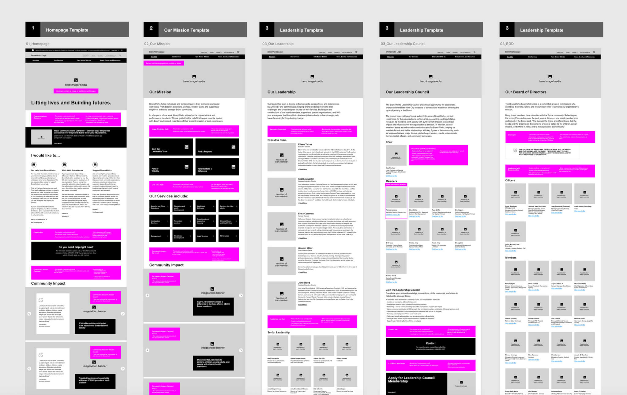
Information Architecture
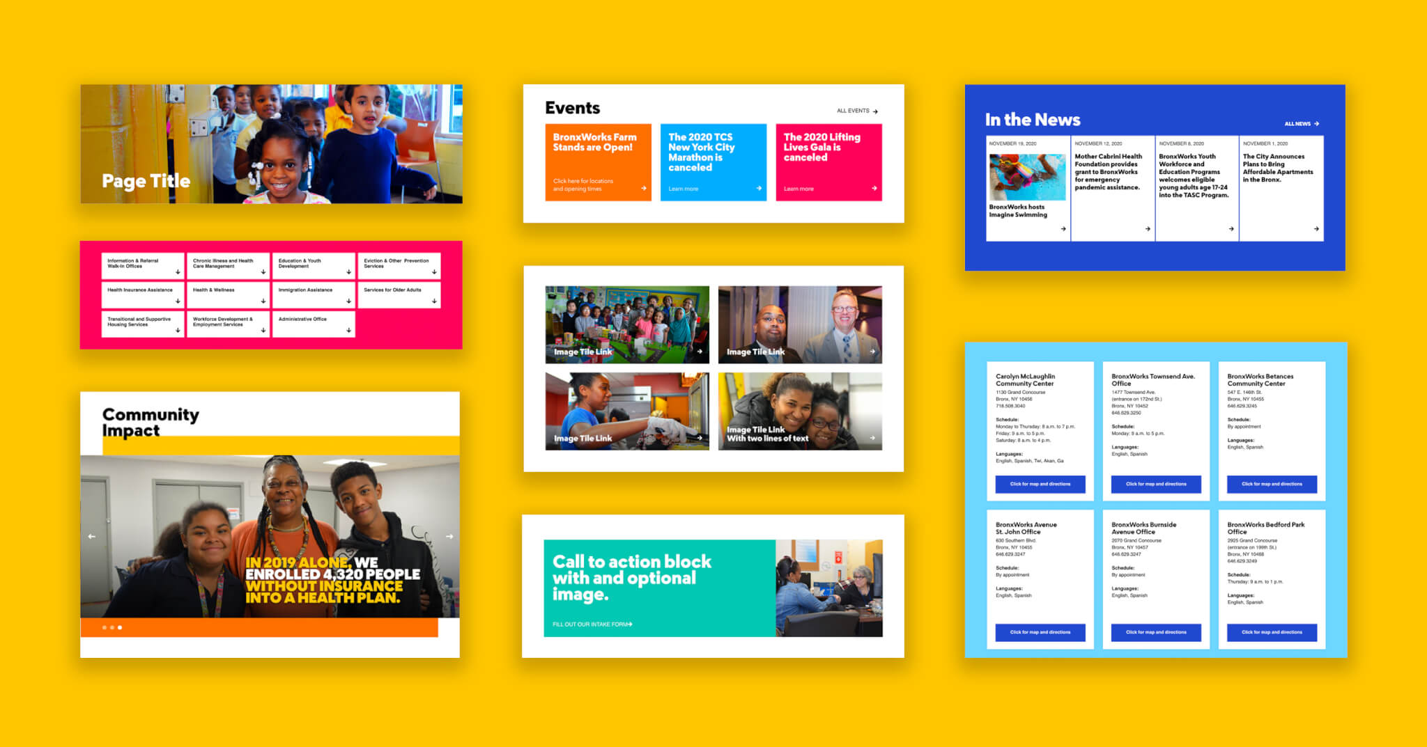
Our goal was to simplify every possible interaction and when possible, use photos or other visuals to represent services or subjects. Once content was organized, we used the wireframing process to create a system of modules for specific content types. Example modules include client stories, impact infographics, location of services and staff stories. These modules were designed to be easily inserted or removed from pages by the staff in the future.
We designed and developed a new website focused on providing frictionless access to services while supporting fundraising and recruitment efforts.
Typography
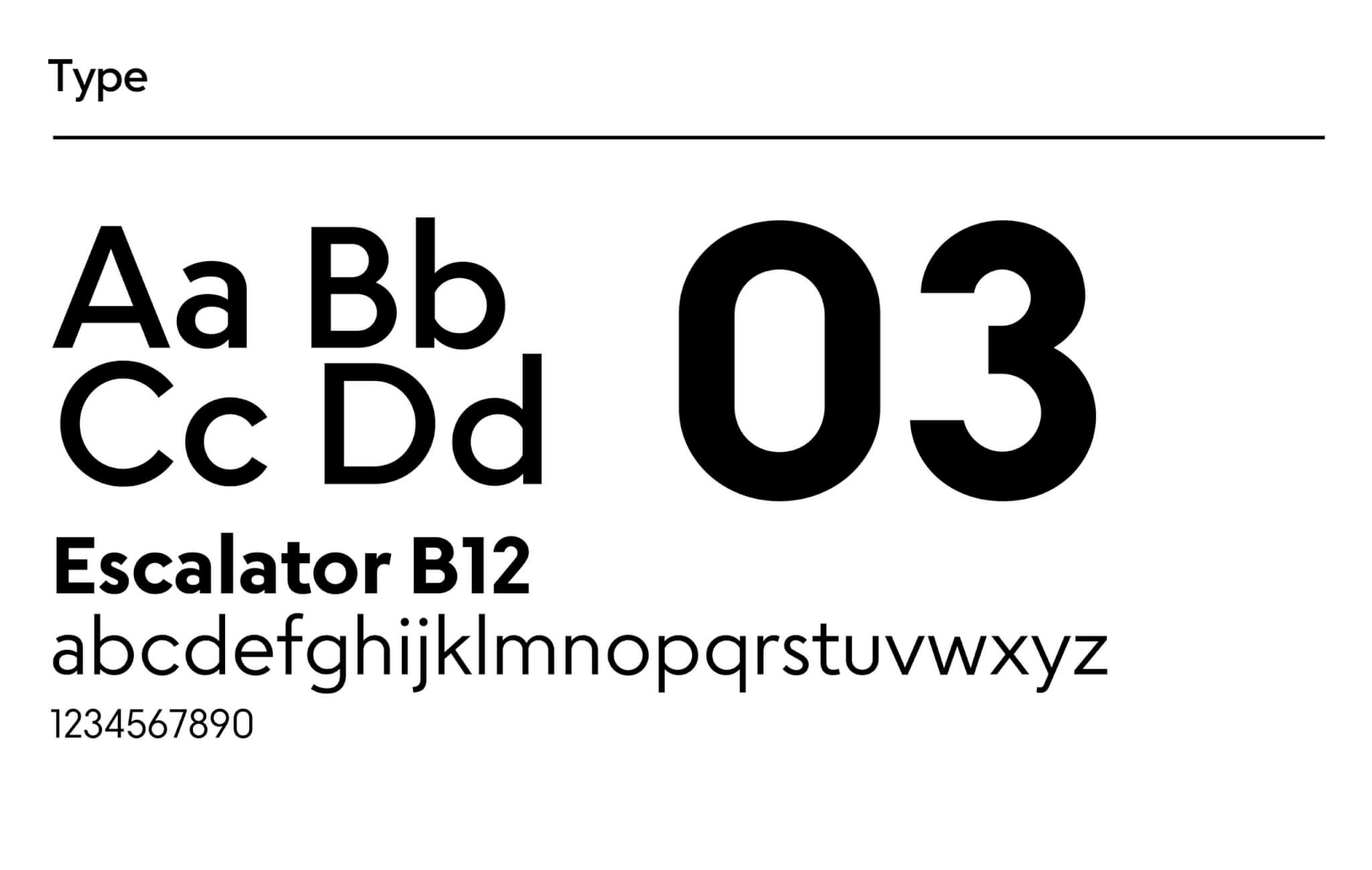
A big part of the site’s success is the use of the font Escalator, designed by Jesse Ragan of XYZ Type. We worked closely with Jesse to implement it as a variable web font. The result is faster loading pages with a more sophisticated design and reader experience. The text is clear and enjoyably legible in all screen sizes and especially, mobile.
Technology
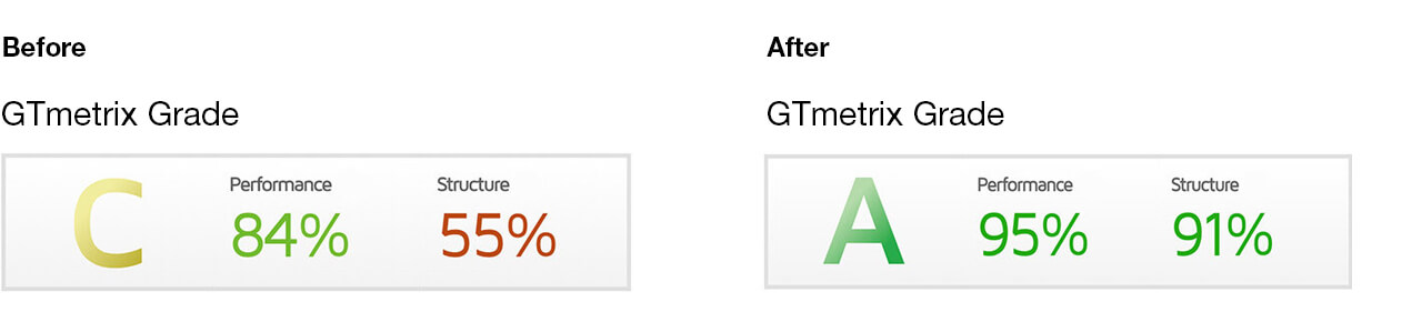
Thanks to our development partner, MANYFOLD, the site now loads quickly. The old site took almost 4 seconds to load with a GTMetrix Grade of C; the new site loads in just over one second, with a grade of A. The content management system was moved from a legacy version of Drupal 6 (last supported in 2016) to an up-to-date version of WordPress which simplified the internal work stream and made the site more resilient. Also, most of the organization’s clients access the site on mobile devices, and the new site is now fully responsive.
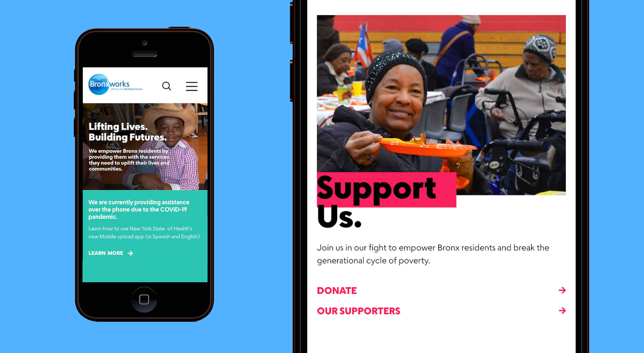
And lastly, the website now mirrors the community—all of the images selected were taken by the staff and clients. We complemented the shots with a palette of bright colors reflective of Latin culture to create a site that dances to the same rhythm.
The new BronxWorks website looks amazing! Had to shout out this fabulous upgrade. This vastly increases accessibility for community members and even us as staff to connect with BronxWorks programs!”
Credits:
Creative Director: Lynda Decker
Senior Designer: Susanne Adrian
Interactive Designer: Ryan Breeser
Junior Designer: Jason Mangelson
Project Manager: Shannon Hughes
Type Designer: Jesse Ragan
Developer: MANYFOLD
Photos: BronxWorks
Additional Copy: BronxWorks
Awards Won:
Webby’s Anthem Award – Gold Award
GDUSA American Graphic Design
GDUSA American Web Design