Harris, Wiltshire & Grannis
Communicating Expertise and Culture
- Legal
- Digital Design
- Strategy
- User Experience
Challenge
Out of date technology drove Harris, Wiltshire & Grannis to seek a new website. The real challenge was the articulation of a differentiated brand in a highly competitive market.
Solution
Our seven-step Brand Revelation process created consensus around a strategy that emphasized the firm’s unique knowledge and expertise.
Result
A visual brand expression unlike any other law firm.
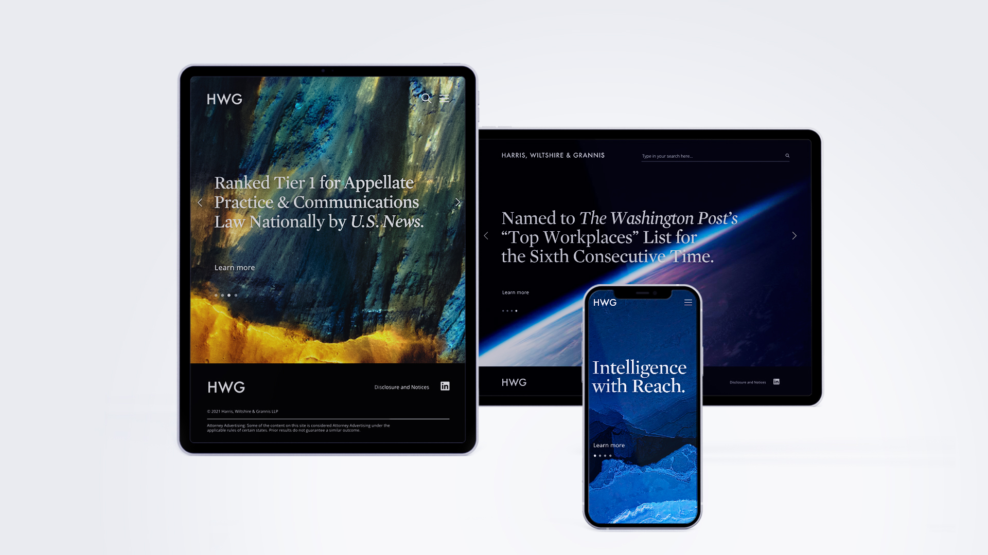
With its largest office in Washington DC, Harris, Wiltshire & Grannis is best known for its extraordinary expertise in telecommunications and technology. Its litigation and ethics practices are also robust, yet the website did not accurately reflect the firm’s latest accomplishments. The partners were also dissatisfied with the site’s outdated functionality and mobile experience.
While the technology was a catalyst to redesign the site, the real challenge was uniting the divergent opinions on how to communicate their virtuosity without diminishing the contribution of any practice.
Law firms are under increasing competitive pressure, and the Washington DC market is one of the fiercest in the country. Our goal was to enhance HWG’s leadership position by clearly defining and communicating its exceptional differences.
We employed our seven-step Brand Revelation process which leads organizations through a series of workshops and uncovers key areas of opportunity and facilitates consensus among leadership teams.
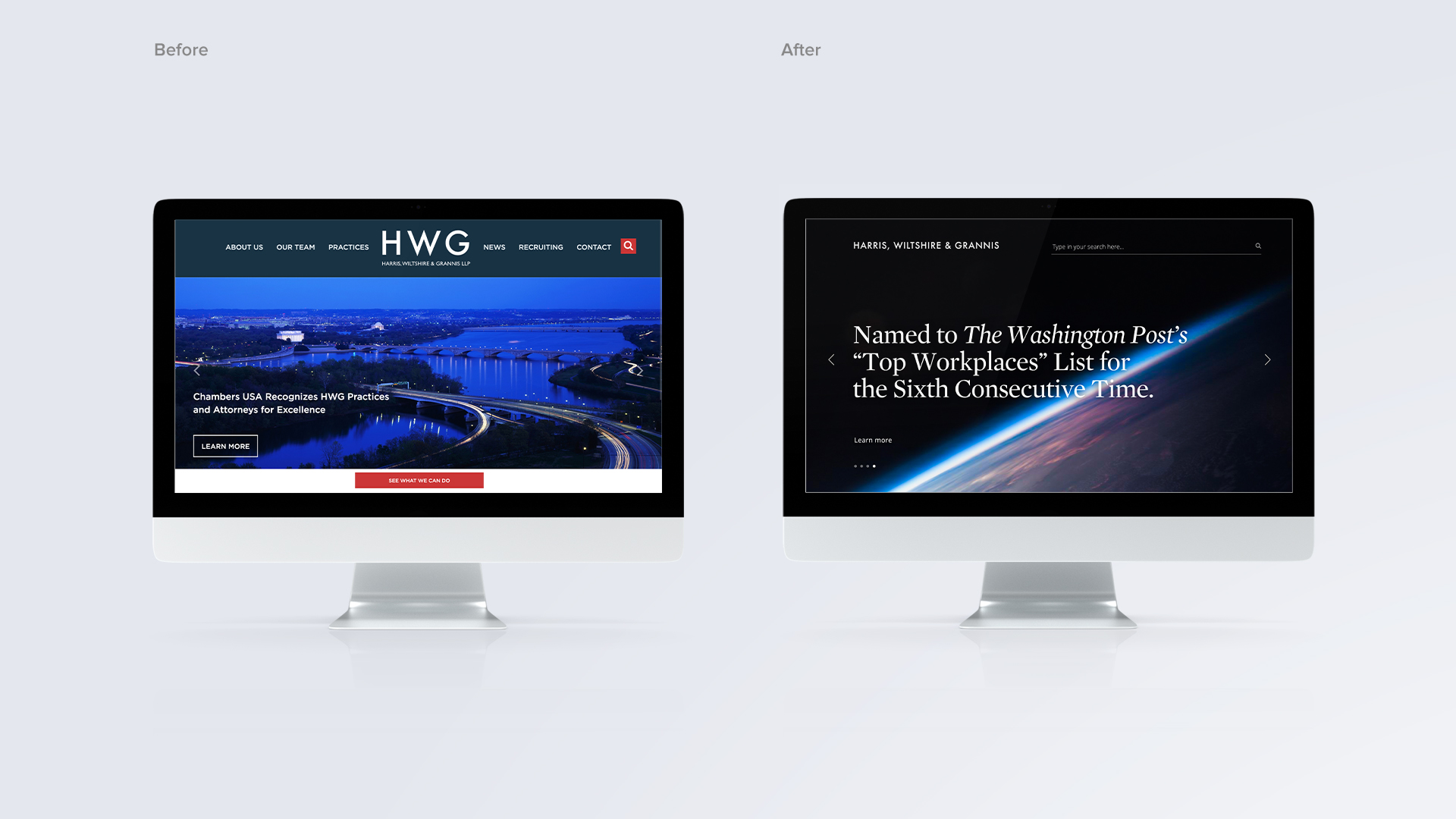
Our seven-step Brand Revelation process created consensus around a strategy that emphasized the firm’s unique knowledge and expertise.
Decker worked closely with HWG’s partners and Brand Revelation led us to a solution that emphasized the firm’s key differentiation.
HWG’s lawyers are unparalleled in their comprehensive knowledge of communication, space, technology, and media industries along with the related geopolitical issues. They are well versed in the lingua franca of government and federal agencies. Their litigation practice is world-class and they are known as “lawyer’s lawyers” for ethics. In short, HWG’s intellectual mastery extends around the globe, to the far reaches of outer space, and deep below the sea.
This sense of depth and breadth led us to create the tagline, “Intelligence with Reach.”
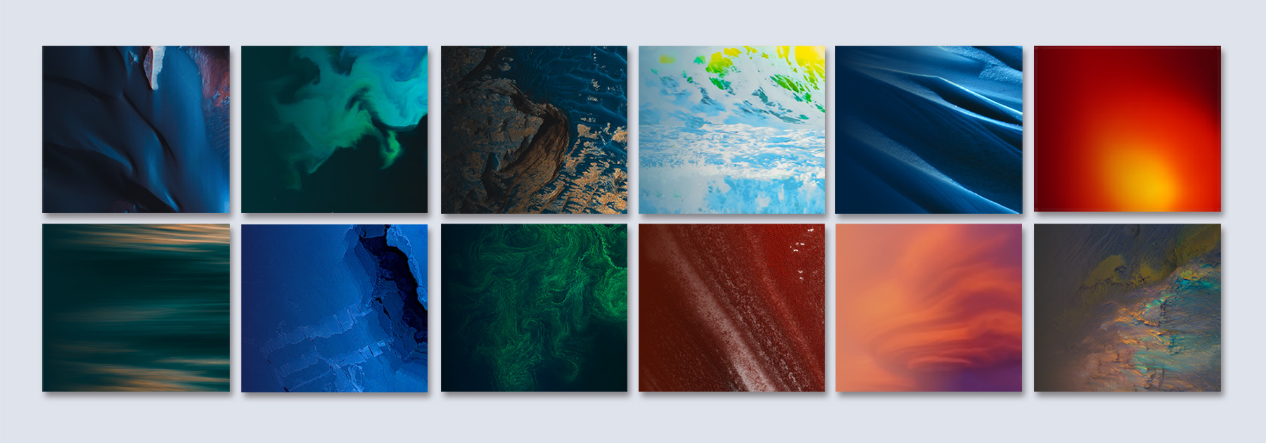
Visually differentiating a legal brand can be daunting—so many firms look alike, using the same type of images (i.e. scales, gavels, cityscapes and skylines). Instead of looking at the challenge of brand differentiation through the narrow and literal lens of specific practice areas, the Decker team considered the whole firm, and the context of challenges met and solved.
We saw a metaphor between the firm’s skills and the most demanding and progressive area of human exploration and achievement—space. Our team did extensive research and uncovered abstract images produced by NASA, NOAA and other governmental agencies. These images conjure the height of human intellectual accomplishment—and reflects the partners’ commitment to problem solving.
As a bonus, we loved the unspoken relationship to government.
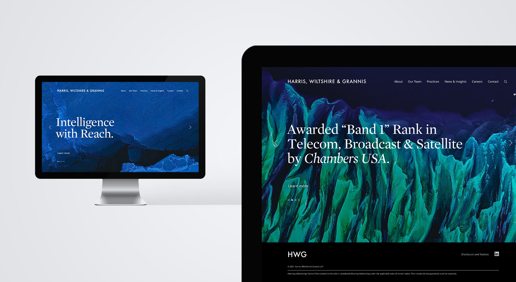
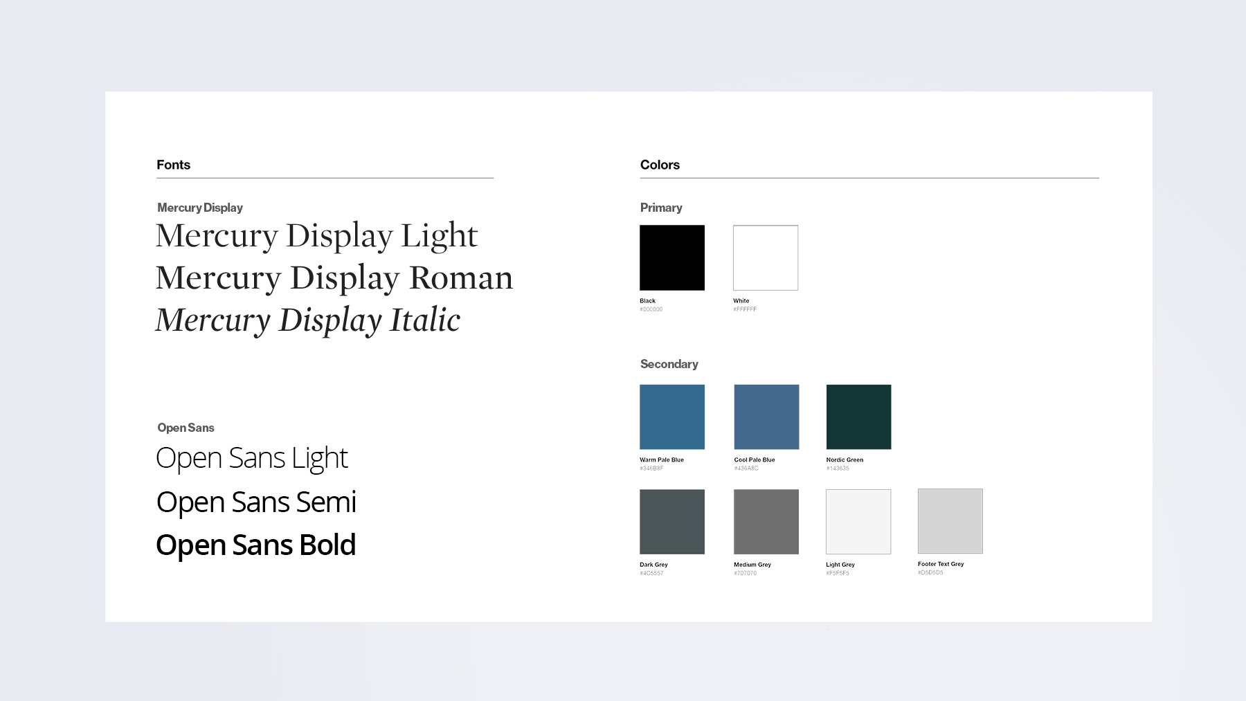
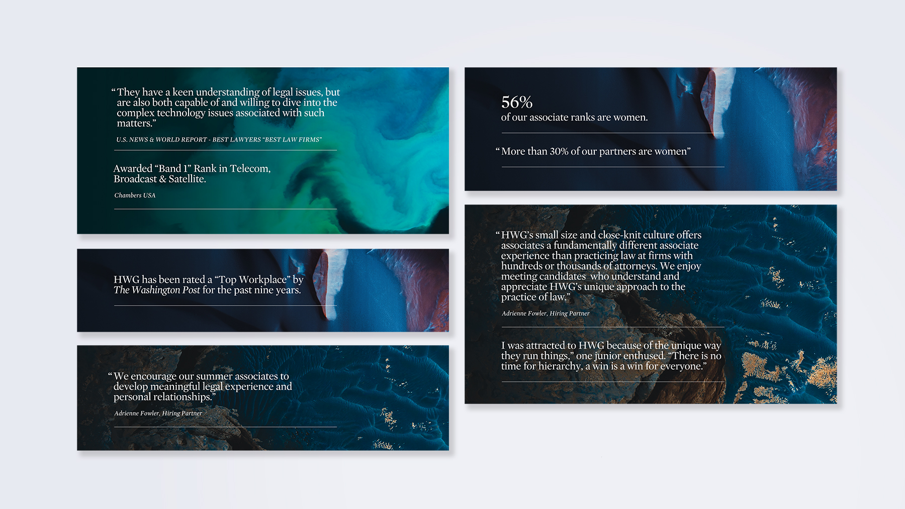
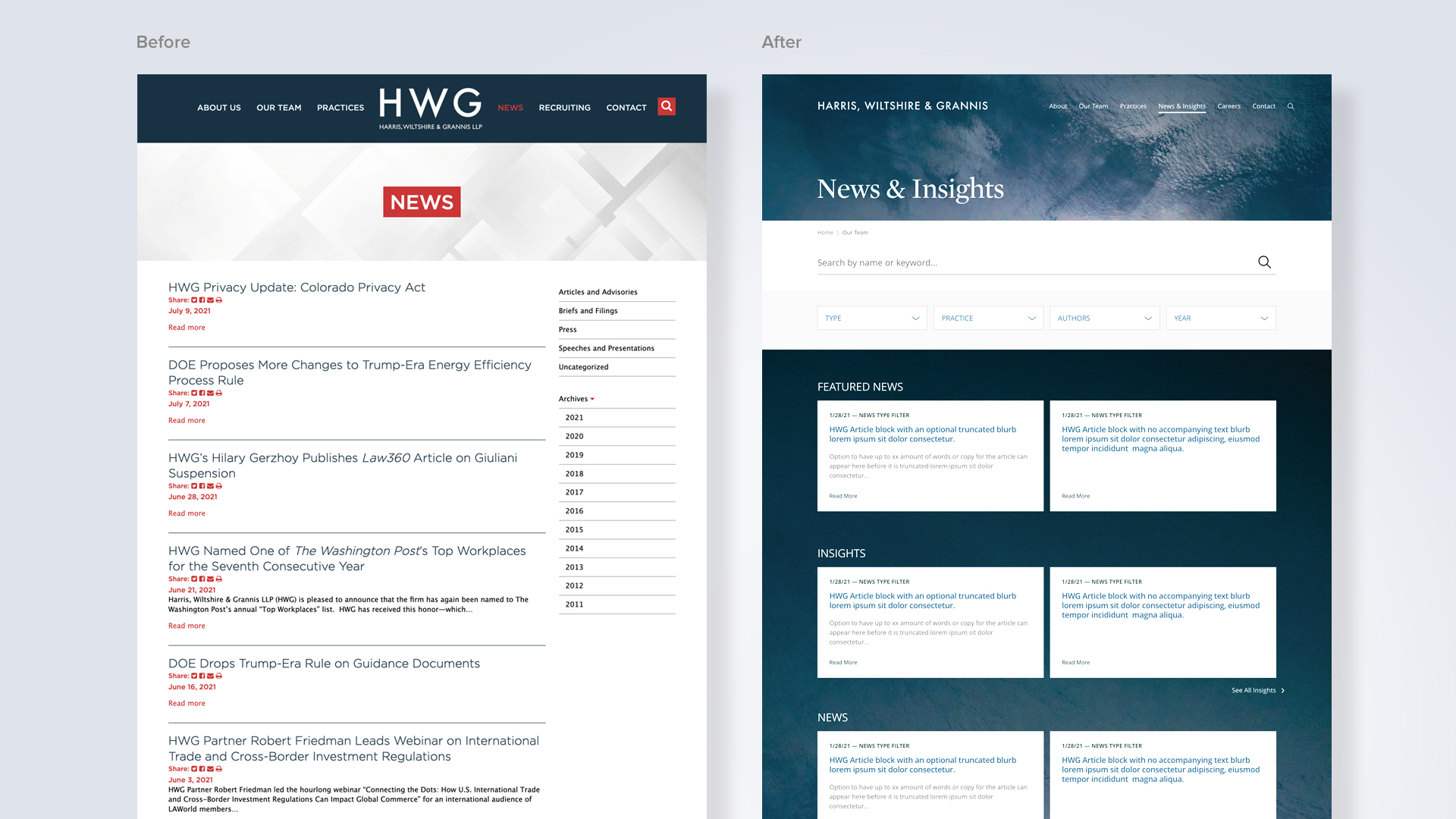
Once we agreed on this representation of the brand, we designed the site with an eye for simplicity and clarity in design. The old site had numerous inconsistent taxonomies, and our time spent iterating wireframes and content was reflected in crisp functionality and anticipating future communication needs.
The Decker team considered the whole firm, and the context of challenges met and solved.
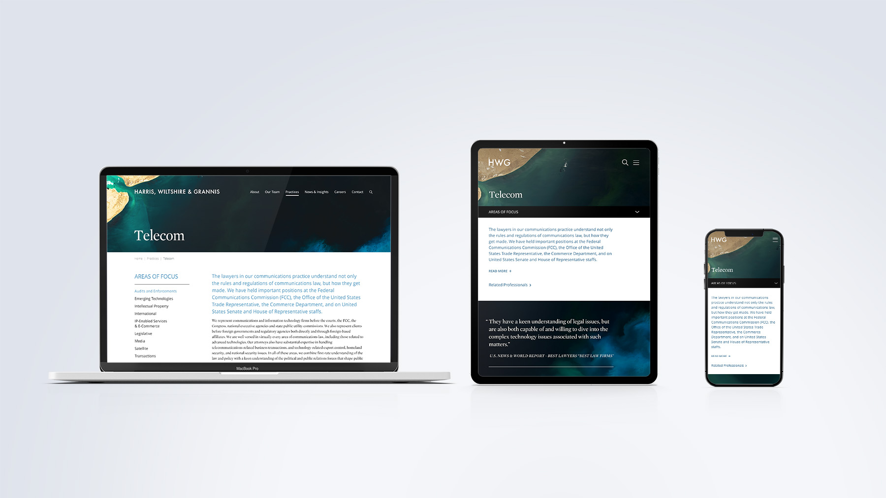
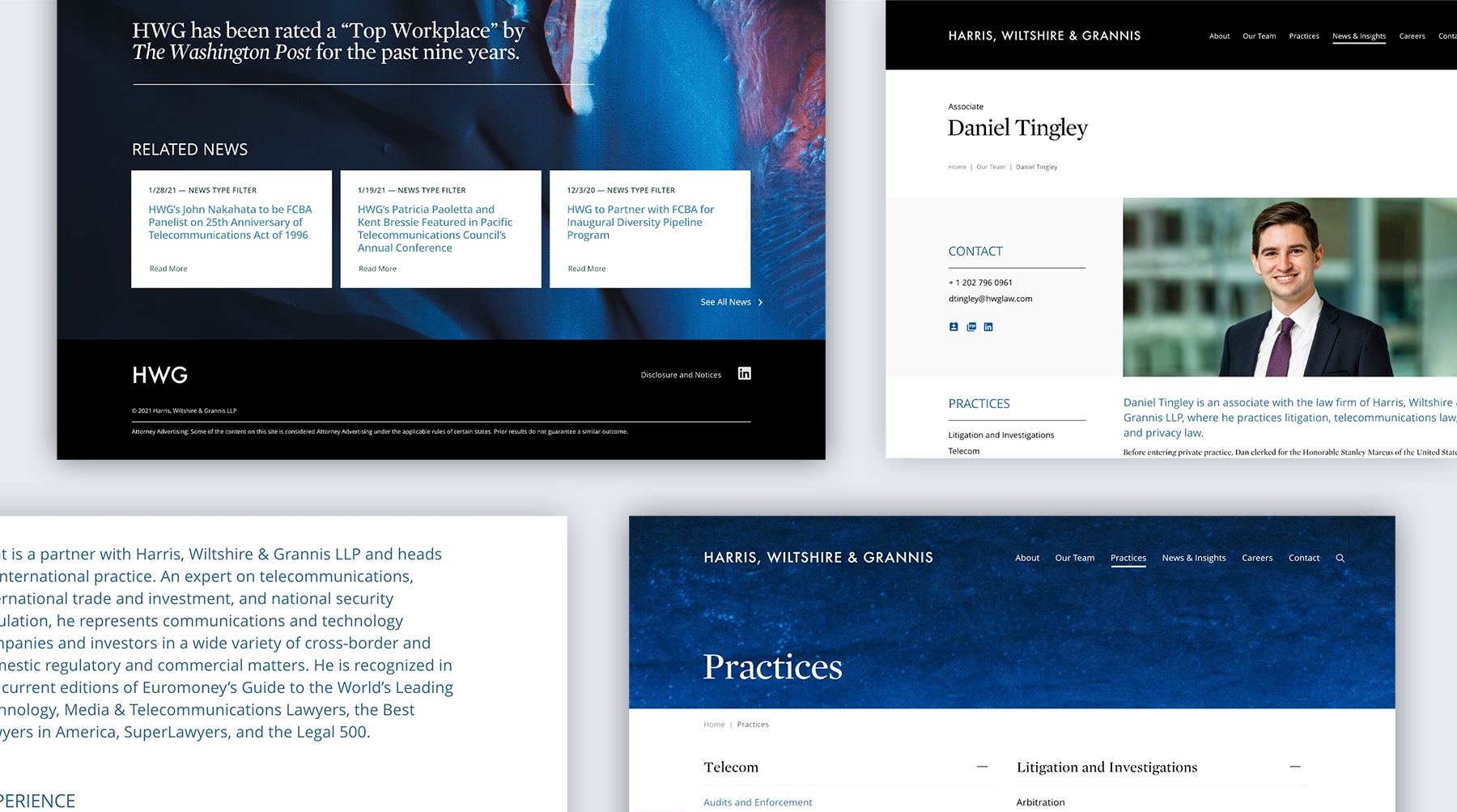
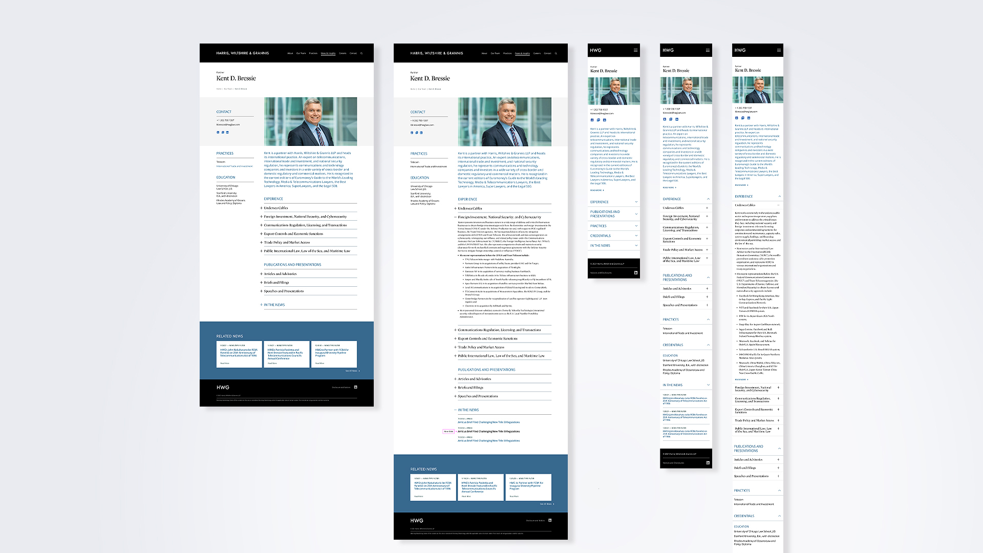
Aware that today’s readers are short on time, our user interface on both desktop and mobile incorporates the use of “drawers” truncating text to invite scanning with the option of in-depth engagement. While desktop users click, mobile users “touch and swipe” and we specifically designed the navigation to enhance the experience on a phone. Additionally, we enhanced the search function to give users pinpoint results.
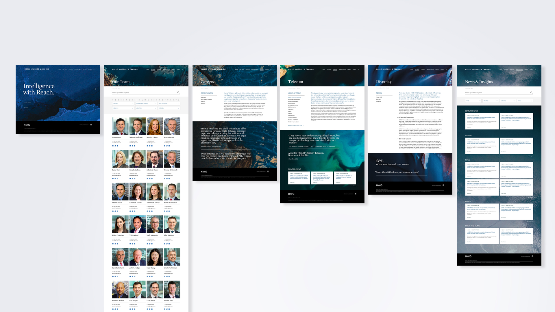
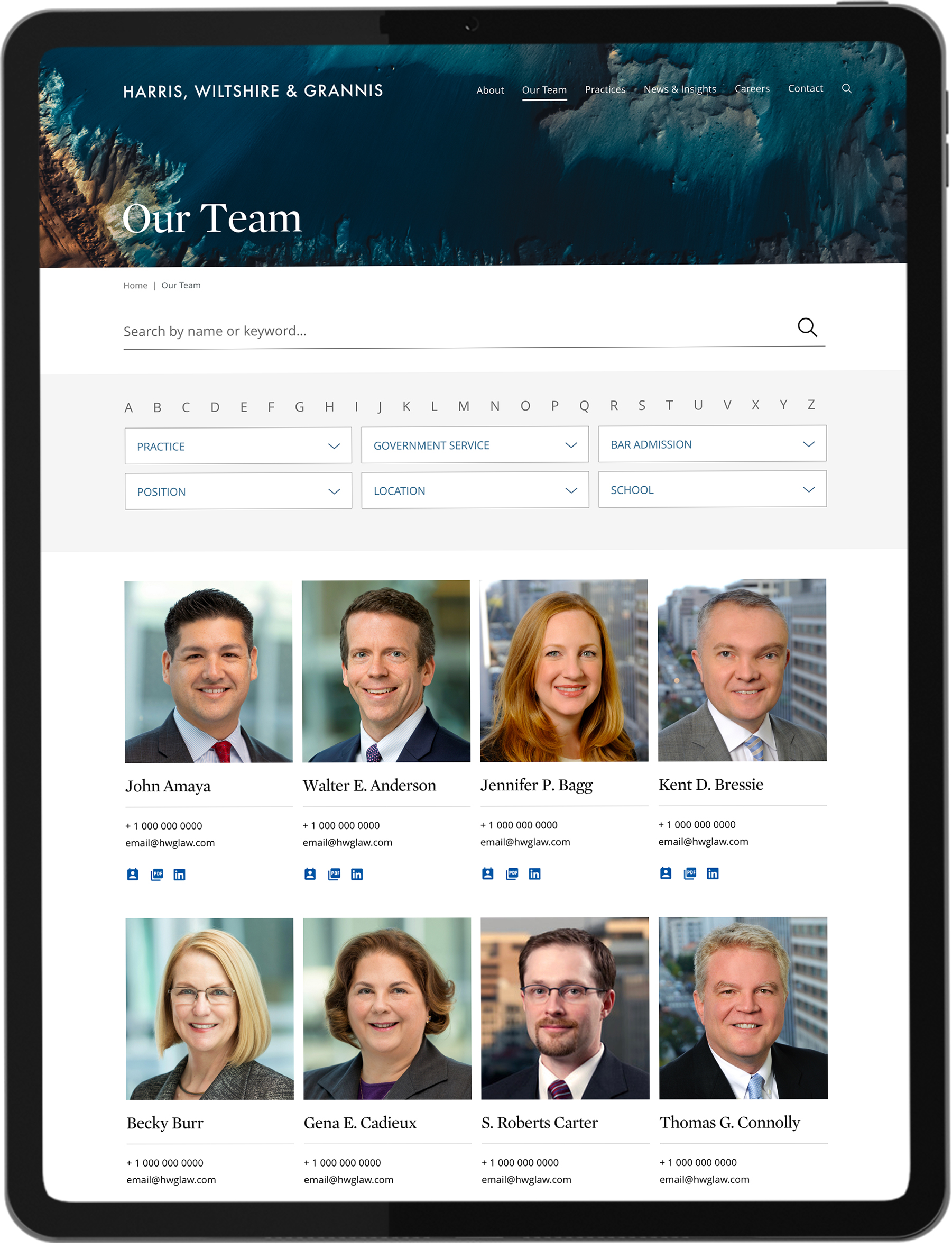
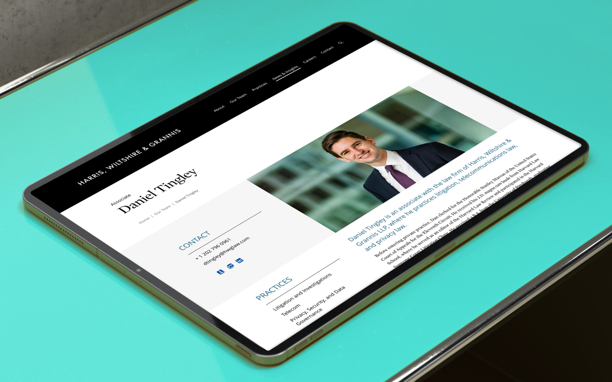
Lawyer biographies are the most visited area on a firm’s website. CMOs often struggle with partner’s requests to customize formats and the presentation of information. While we were able to design a master format that served most needs, we were challenged to add customization features specifically for certain leaders.
The backend of a CMS is not glamorous, yet essential to a marketing team’s satisfaction. Our developer, MANYFOLD trained the HWG marketing team and was able to make adjustments during the beta phase.
HWG is now positioned accurately and authentically with a website that can grow and accommodate their needs as they move into the future.
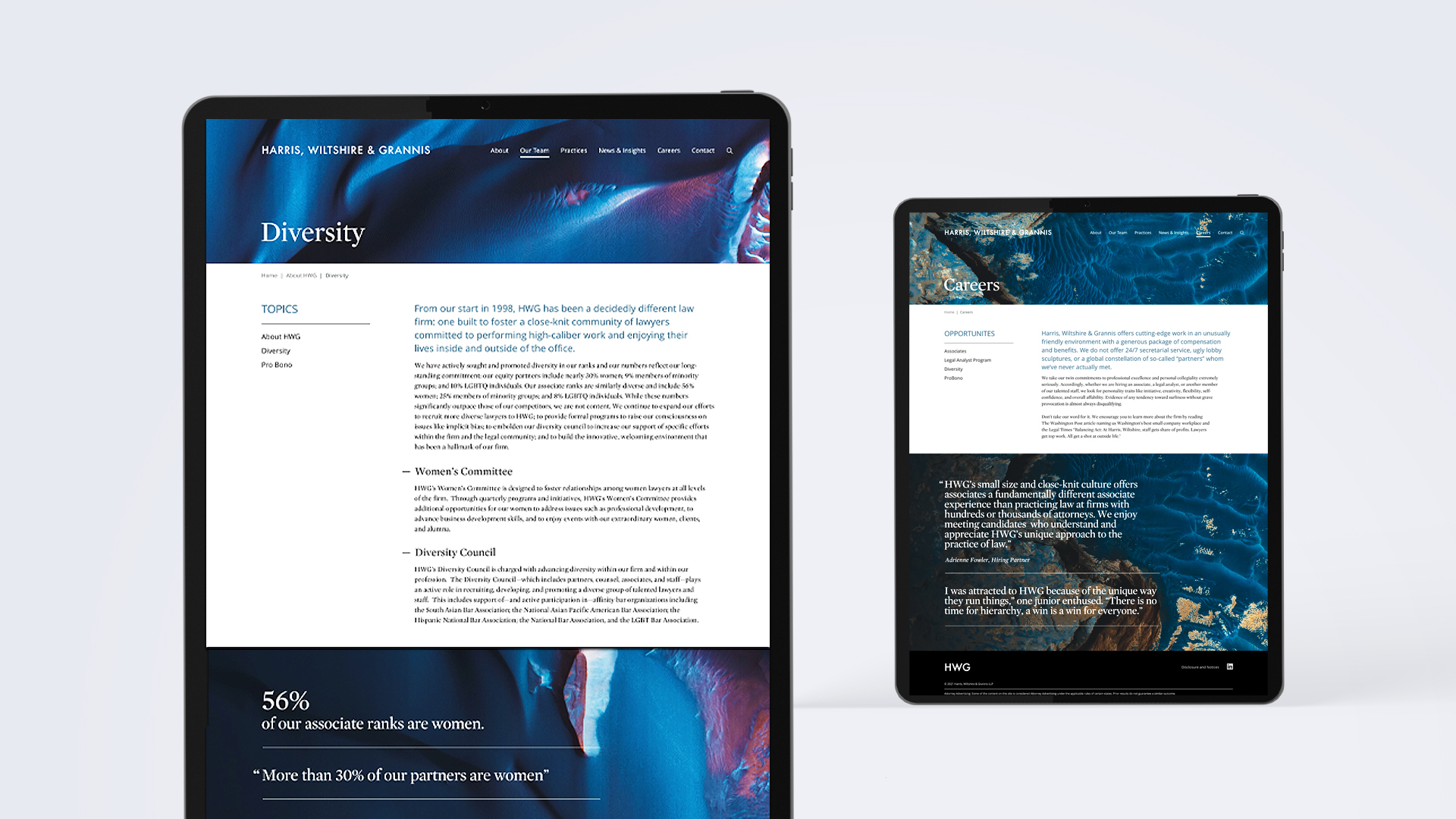
While desktop users click, mobile users “touch and swipe”—we specifically designed the navigation to enhance the mobile experience.
Credits:
Creative Director: Lynda Decker
Interactive Designers: Camille Murphy and Ryan Breeser
Senior Designer: Susanne Adrian
Project Manager: Shannon Hughes
Developer: MANYFOLD
Photos: NASA/NOAA
