Hunt Mortgage Group
Digital Design Brand Building
- Financial Services
- Design
- Digital Design
- User Experience
Challenge
An acquisition meant that a financial firm’s previous website needed an update — in both content and in technology.
Solution
We created a fresh and engaging online experience that speaks to HMG’s brand values, clarifies the company’s business lines and reaches customers on any platform and any device.
Result
Since the site launch, visits have increased 76%. Thanks to strategic search-engine optimization and analytics practices, Hunt is seeing strong search results, with organic Google search representing 38% of site traffic.

Hunt Mortgage Group (HMG) has built its brand by collaborating with each client to meet their unique needs. The organization’s key differentiator is the intelligence and talent of its employees.
We began our collaboration with HMG’s leadership team with an in-depth discovery process and came away with a key insight. Communications in the commercial real estate sector are saturated with low-quality imagery of buildings and generic copy. Emphasizing HMG’s core strengths was the solution to differentiating this brand against its competition. We let the brand’s core values guide the conversation to engage the customer.
We let the brand’s core values guide the conversation to engage the customer.

HMG is a non-bank commercial lender. Recent expansion and acquisition made it one of the country’s significant sources of commercial real estate mortgages, with $10.4 billion of loans in its portfolio. In redesigning HMG’s website, our goal was to reflect this premium positioning and introduce a new management team.
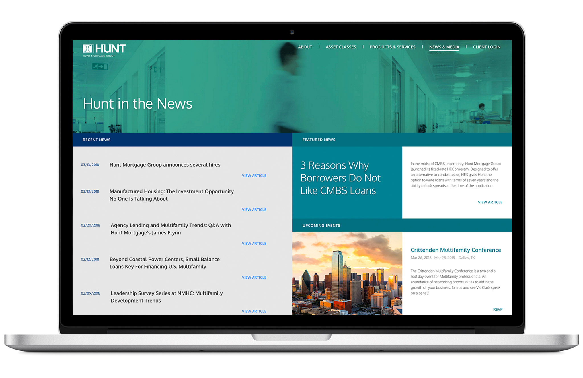
First, the home page opens with an image of one of the organization’s leaders with his words emphasizing its values and philosophy. As the user scrolls down, the more promotional aspects of the site, like speaking engagements and press coverage, are revealed.

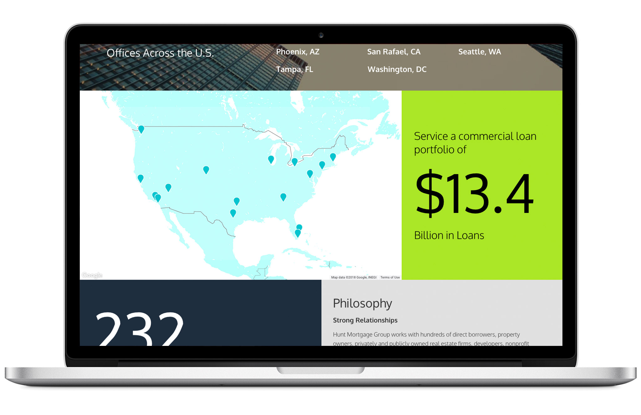
In the “About” section, a tiered segment spotlights HMG’s executive team. On the first level, the user can access contact information and download vCards — this content also automatically populates other areas of the website. On the second level, the visitor can go deeper into biographies and background.
A dynamic map in this section is particularly interesting: Since the majority of press releases are about deals, the system takes the location of the deal and places it in a map. It takes the amount of the deal and highlights it in a box for the reader.

Working with our development partner, MANYFOLD, we devised a user experience that is sensitive to both the site visitor and to the very busy internal team that manages the site day-to-day. MANYFOLD developed a content management system based on the easy-to-use WordPress platform, with fully customized features that make management of the site efficient.
We devised a user experience that is sensitive to both the site visitor and the very busy internal team that manages the site day-to-day.

Visit Hunt Mortgage Group
76%
Increase in site visits
8000
page view
+%
Increased brand recognition as a leader in multi-family housing financing
