Madison Performance Group
Rebranding Employee Engagement
- Professional Services
- Brand Experience
- Brand Systems
- Design
- Digital Design
- Strategy
- User Experience
Challenge
Update the visual brand to better communicate the firm’s strengths: thought leadership, exemplary customer service, and a business and technology infrastructure with global reach.
Solution
The visual brand now reflects a balance of the firm’s stability and experience, with its ability to deliver effective engagement and sales incentive solutions.
Result
A 10% increase in new business in the first year after the launch.

Madison Performance Group is a marketing firm that helps companies drive business results by integrating reward and recognition into their employee compensation programs so they may grow, reward and retain talent.
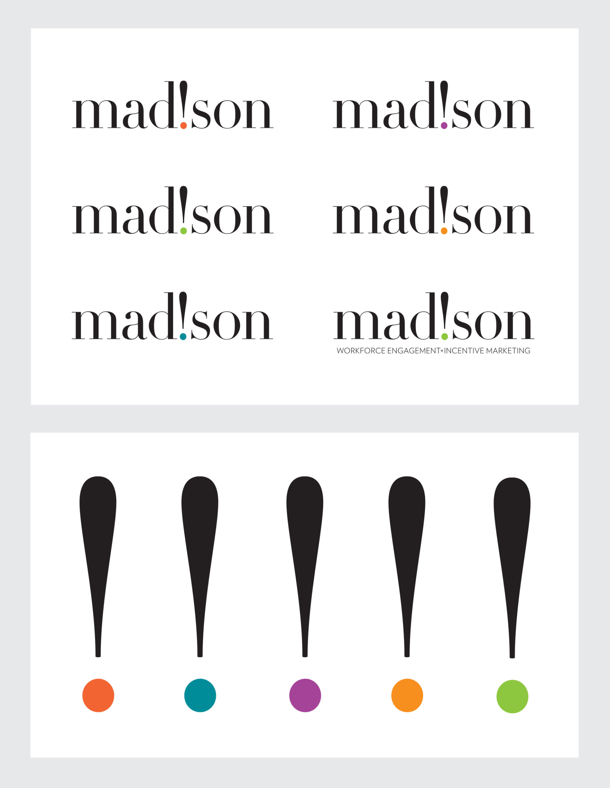
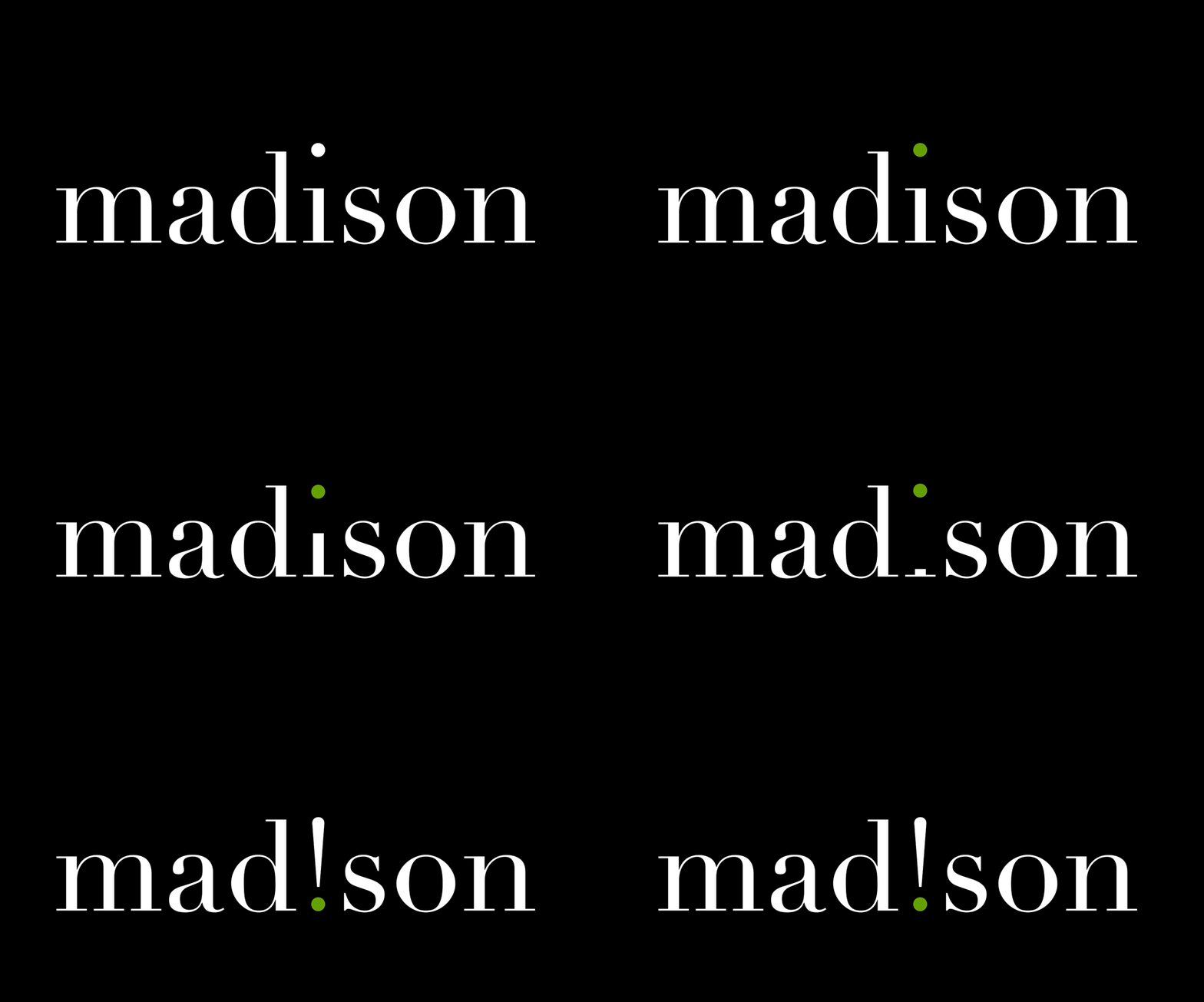
Our brand development created a liquid logo that, like people, has many different personalities. The exclamation point is a metaphor for the enthusiasm created by recognition programs and the loyalty employees feel when they are valued. The exclamation point is the foundation of the program.
Our research revealed that many clients recognized Madison’s commitment to delivering customer satisfaction, but did not see the firm as strategic, or as industry thought leader.
Madison’s stationery system balances the visual impact of the logo with an orderly presentation of contact information. The color palette can be leveraged to denote different corporate departments, and includes an unexpected splash of color on the reverse of the business card.
The website is a key vehicle in articulating the voice and nuance of the rebranded firm. It extends Madison’s new design lexicon into a dynamic, online realm. The website opens with an interactive carousel of five videos that speak to the pressing needs of the clients Madison serves, and how the firm approaches its work.


The web icons are color coordinated and used to indicate different sections within the main website navigation. Level 1 icons are used on the site’s home page and represent the company’s core competencies. Level 2 icons are used to call attention to thought leadership deliverables. The use of the exclamation point in the web icons extends the logo’s energy deeper into the brand architecture and binds the various levels of the site together with a consistent element.
Thought leadership content is downloadable through a monthly publication called Performance Perspectives, and a new, twice-weekly blog post delivers timely insights while enhancing search engine statistics. In each issue, the masthead, grid and typographic styles are to remain consistent. Alternating dot colors are featured in the masthead per volume, rotating through the 5-color palette. Bold highlights within the text, if any, correspond with that issue’s dot color for variety.

The visual brand now reflects a balance of the firm’s stability and experience, with its ability to deliver effective engagement and sales incentive solutions.
The versatility of the exclamation point and dot is evident in this starburst treatment—a powerful, energetic image that can be used as a supporting graphic element, or as a repeat pattern on promotional merchandise.

The exclamation point can be interpreted in a number of ways to enhance the brand’s message and make it memorable and distinct in trade advertising.

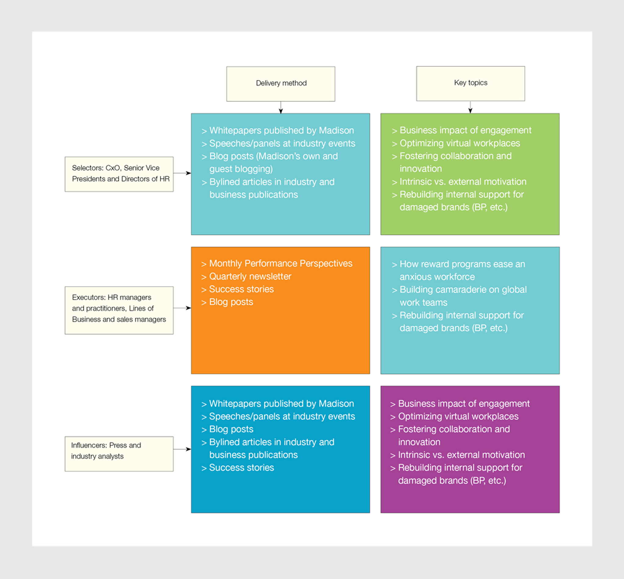
In tandem with designing the new Madison visual brand architecture, Decker used its messaging expertise to help the firm further refine the communications hierarchy. In doing so, Decker Design worked with Madison on capturing the firm’s message in new vehicles to reach newer audiences—Selectors and Influencers—while maintaining an open, ongoing dialog with its core audience, Executors.

The interplay of modern and classic elements — punctuated with a visually riveting exclamation point — at once conveys the firm’s sophisticated knowledge, deep expertise and clever wit.

Brand
Leadership Updated
36%
Increase in site visits
12%
Increase in lead generation
