Challenge
The identity for this highly specialized research and analytics company was more than a decade old, so it didn’t represent the cutting-edge technology and deep insights it provides.
Solution
We created a truly Responsive Brand, with a bold new mark and a comprehensive, flexible system of colors, type and formats that met the company’s highly technical needs.
Result
A definitive, “ownable” brand that positions the company’s expertise. Our collaborative approach made it easier for the client to sell the new brand throughout the organization. And our system ensures that all communications—whether quick-turn press releases or creative tradeshow displays—are right on brand.

Mathematica provides policymakers with high-quality research and evaluates the effectiveness of programs for informed decision-making. The organization’s focus is education, health and underserved populations. Its audience includes academics, government officials and nonprofit leaders.
Mathematica’s communication system had not been updated for over a decade, and it needed a more relevant and contemporary image. Seeking to preserve its logo, the organization retained us to energize the brand’s overall architecture.
Mathematica provides policymakers with high-quality research and evaluates the effectiveness of programs for informed decision-making.
We began by interviewing executives to understand their long-term goals. Then we met with the in-house design team to learn about their day-to-day challenges. One of the greatest issues in a brand update is gaining support for change throughout the organization. Often, internal teams worry about increased workloads and resist the new direction.
Our highly personal approach involves partnering with our clients to jointly lead workshops that include relevant team members in of defining goals, problems and potential solutions, thereby investing them in the program’s success. We help our clients gain internal consensus and cooperation for these initiatives.

After working with the teams, our strategy group audited and analyzed existing communication efforts. We discovered inconsistencies between the organization’s aspirations and the material it was publicly presenting.

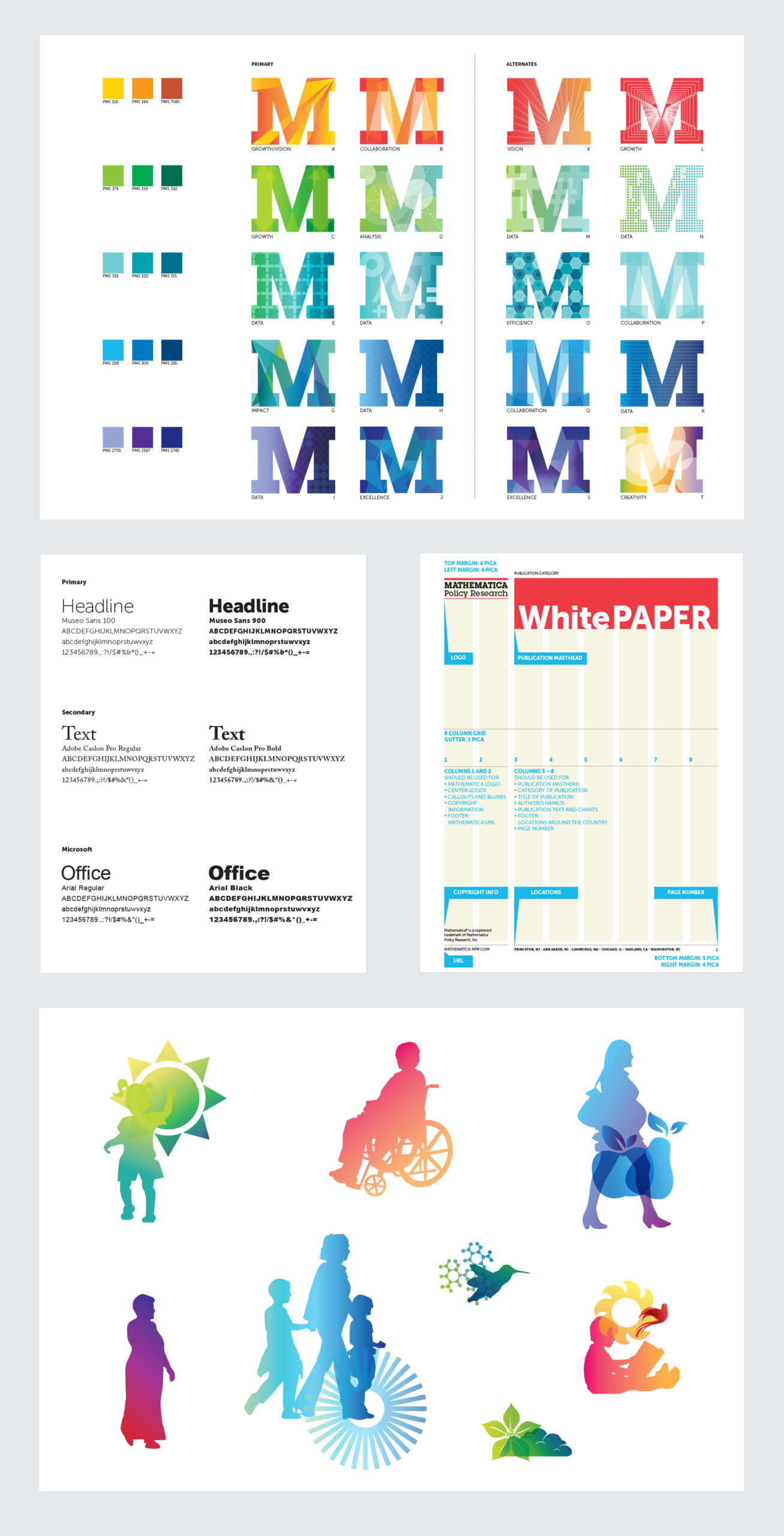
We applied our Responsive Branding approach to develop a bold, contemporary design within a framework that could be implemented by any employee, regardless of design experience. We chose striking, modern typography combined with bright, clean colors. Additionally, we created a stylized illustration library and a dynamic secondary logo graphic to expand the system’s visual vocabulary and ensure quality imagery.
A definitive, “ownable” brand that positions the company’s expertise. The new system ensures that all communications are right on brand.
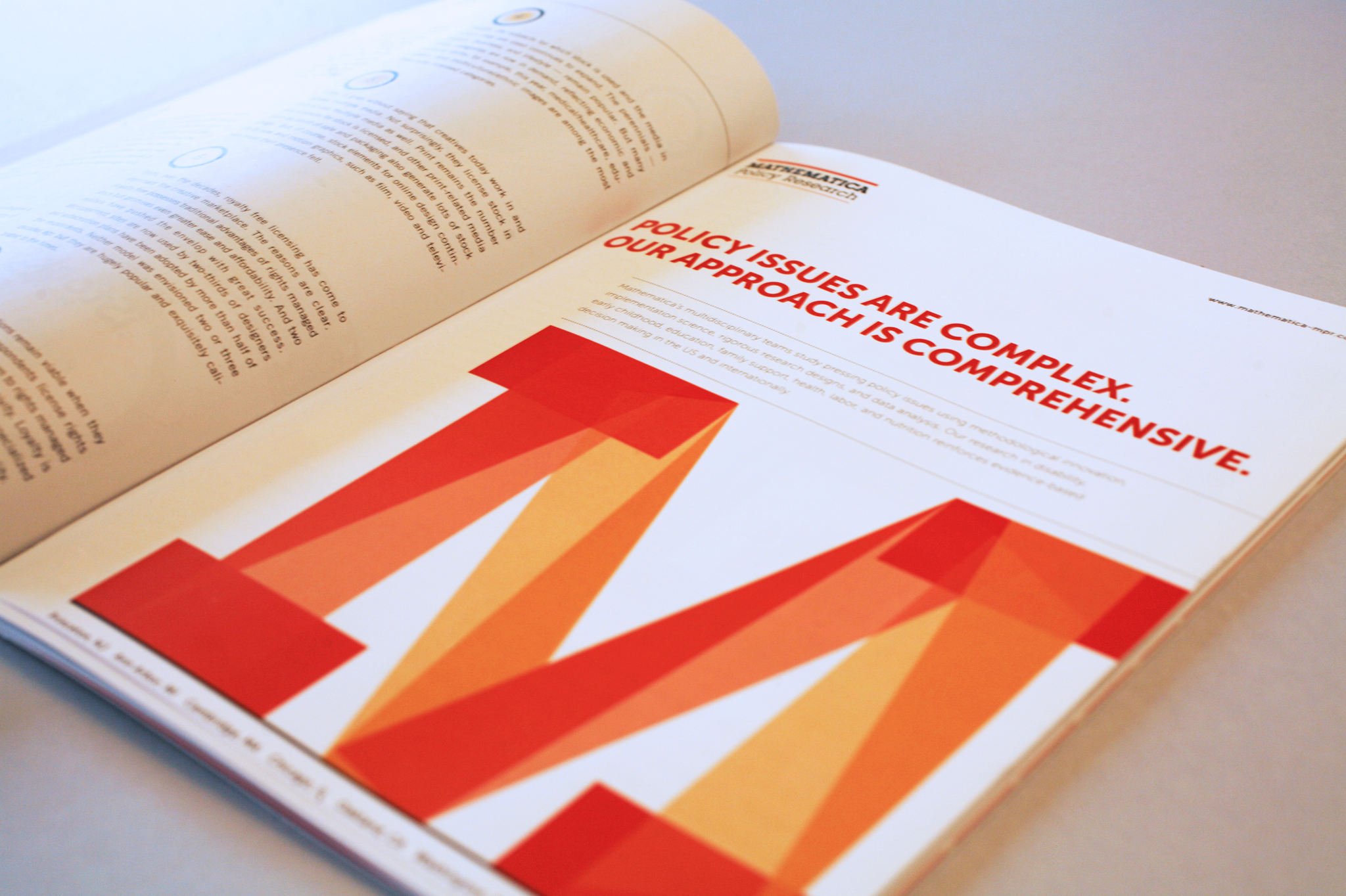
The most vibrant addition to the Mathematica brand was a series of ‘M’ graphics designed to represent various aspects of the organization’s mission and values. Mathematica works within a consistent framework and set of principles, yet it analyzes ever-changing problems. The bold ‘M’ works as a frame to contain colored graphics that represent different business lines.
Our workshops, templates and style guide empowered the Mathematica internal team with the knowledge and tools to implement the new brand. The system is highly structured but flexible enough to enable appropriate creative expression.

Where materials have to be produced quickly (breaking news releases, business proposals) or are subject to strict formatting requirements (like research developed for government clients), the system’s rigid structure makes it easy for employees to insert text and produce documents.
For more marketing-oriented materials (trade show displays, advertising, brochures) with longer lead times, the brand system offers broad parameters that create consistency but allow the designers to develop original solutions.
We firmly believe that Responsive Brand systems need to be flexible to allow marketing materials to be audience-centric, on strategy and, most important, creative.

Our workshops, templates and style guide empowered the Mathematica internal team with the knowledge and tools to implement the new brand.

Full integration with architectural strategy
Streamlined communications
An updated brand strategy without a logo change
