Financial Services
The Annual Report as a Marketing Tool
- Financial Services
- Design
- Digital Design
- Investor Communication
- User Experience
Challenge
Today, more than one-in-three American workers are Millennials, and this figure will continue to grow as Millennials find jobs. How best can we reach this ever-growing group and convince them of the importance of retirement planning?
Solution
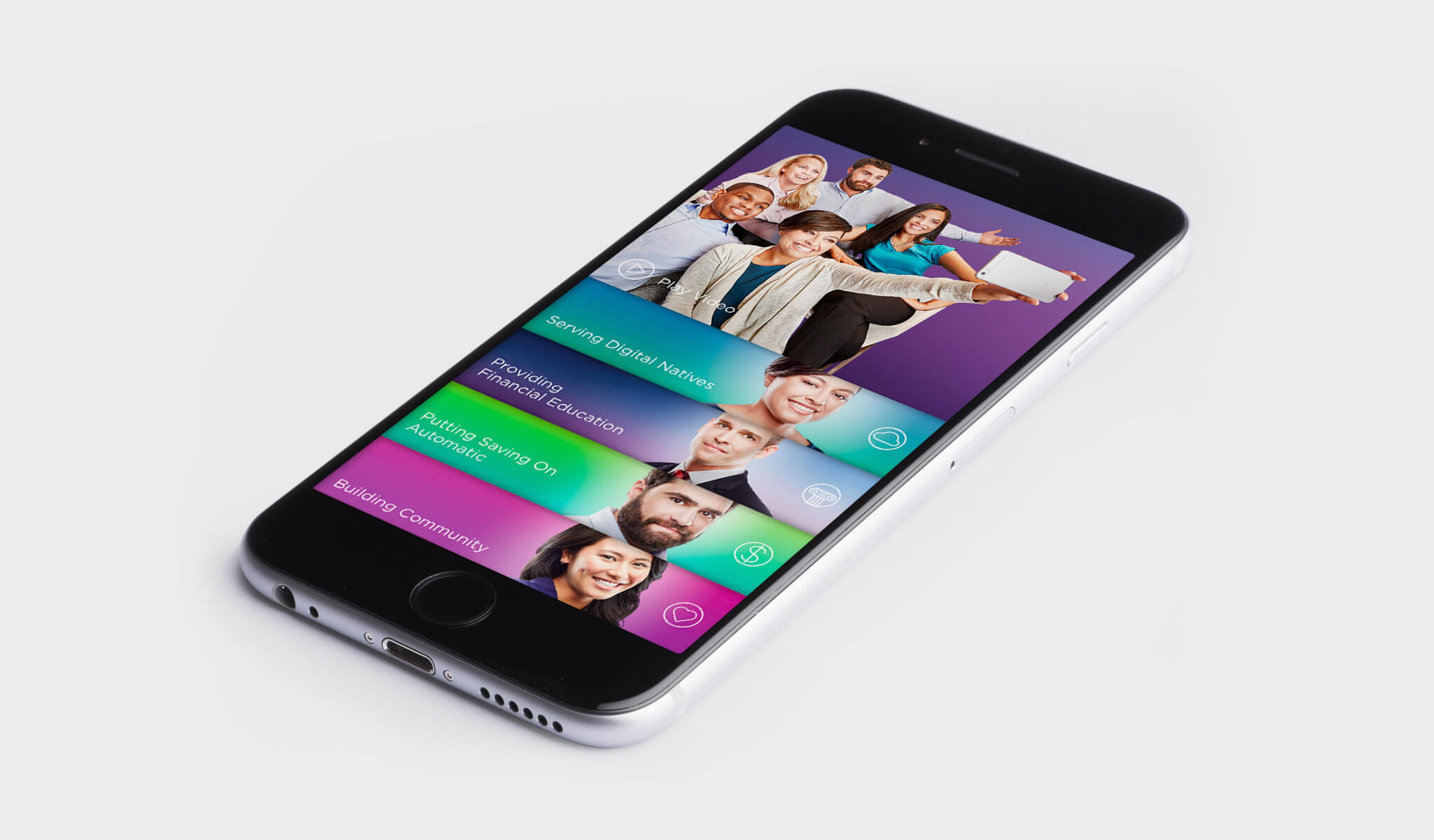
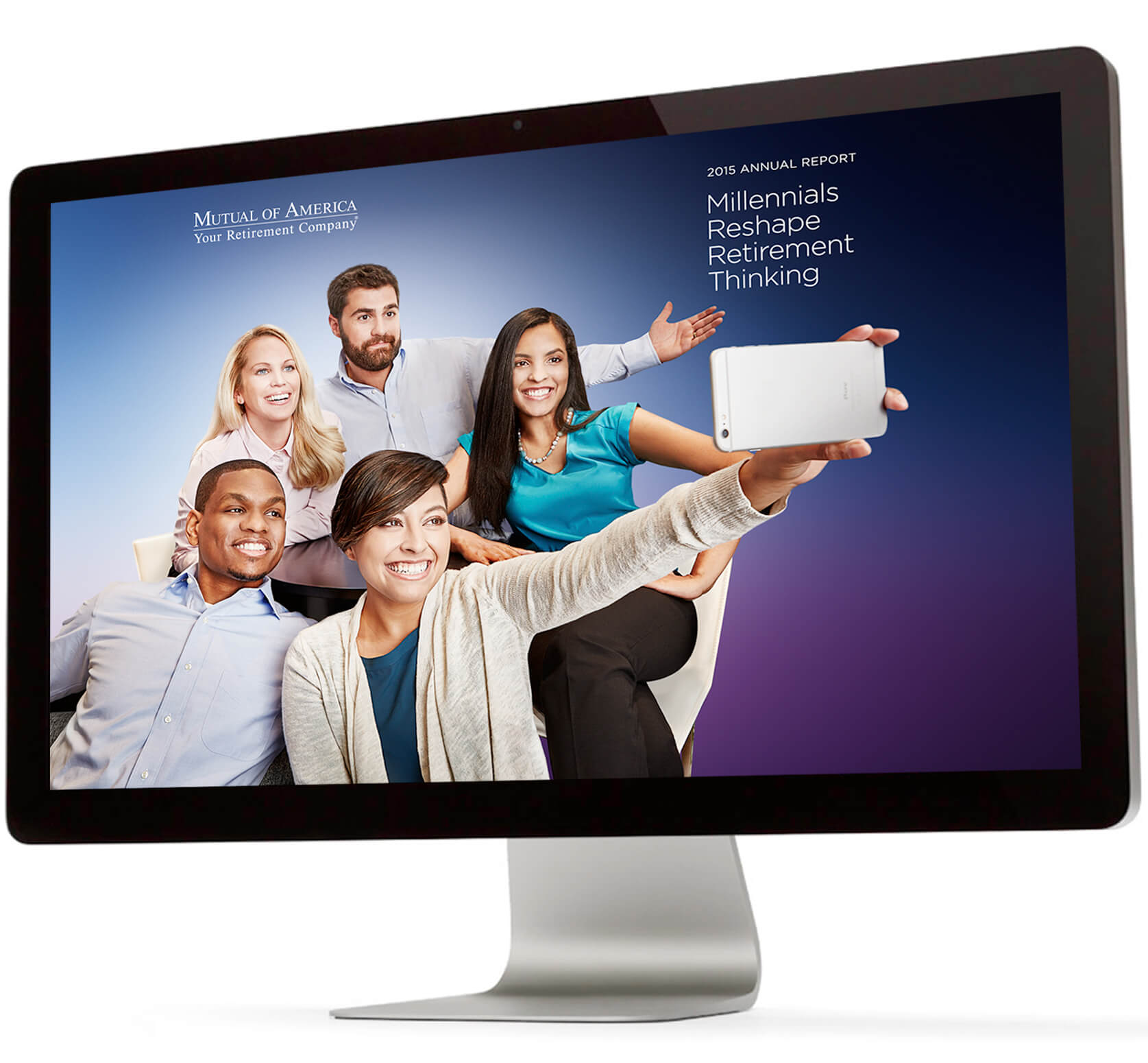
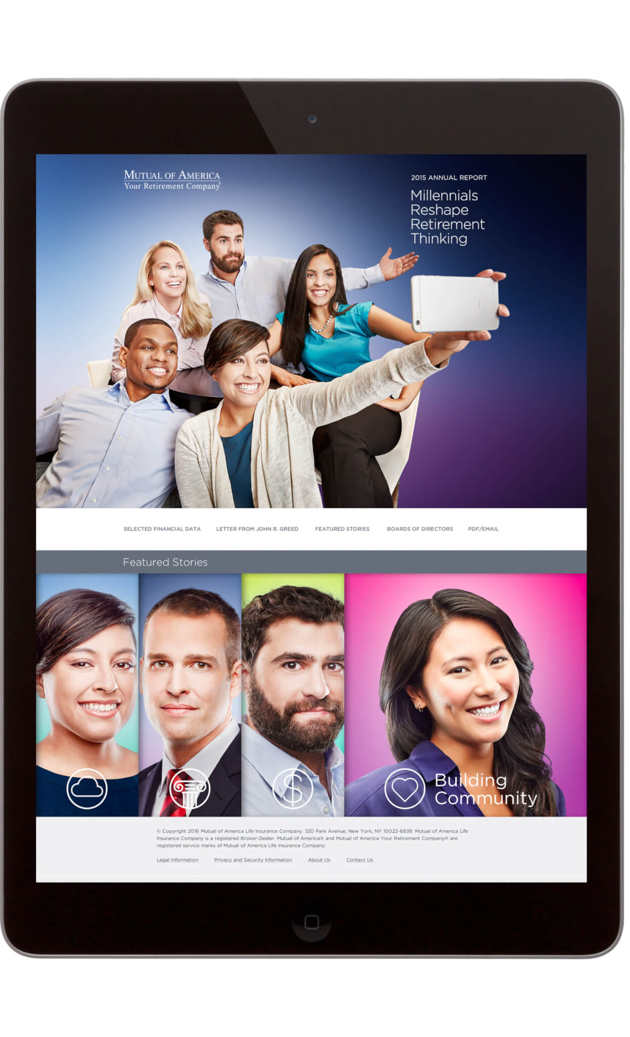
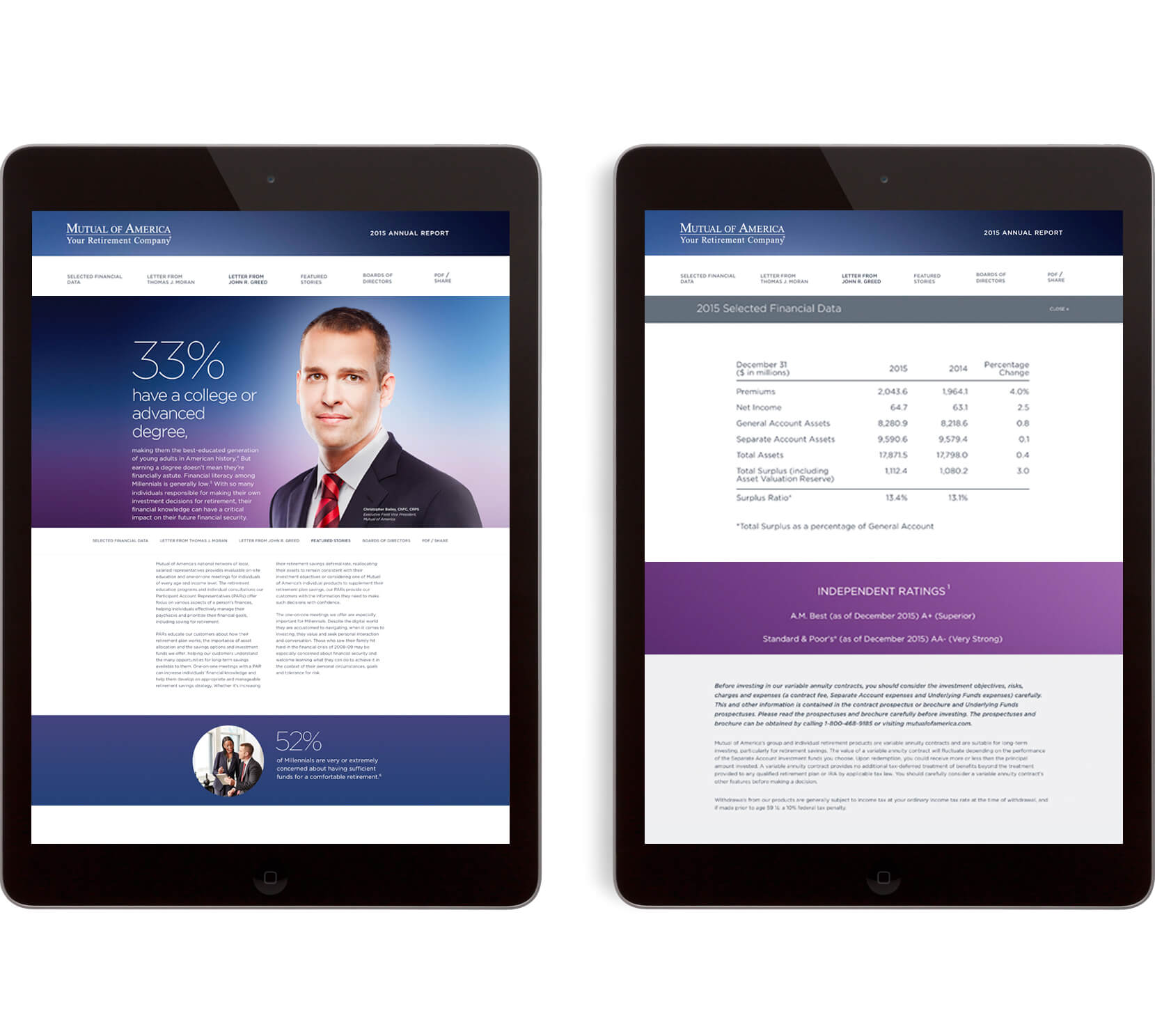
We developed a visually engaging approach that centered on a digital experience—the web site is fully responsive with an enhanced mobile site. Bright colors and careful attention to casting, styling and typography were integral to attracting this intensely visual generation.
Result
Visits to the website increased by 50% at launch. Field offices were impressed by the youthful look and feel of the materials and considered them valuable assets to connect with this audience.
As a leader in providing retirement services for the non-profit sector, our client was aware of the changing demographics in the workforce. Outnumbering their parents’ generation (the Baby Boomers) and Generation X, Millennials are now the largest segment of American labor. Yet this generation has many challenges.
Strapped with large student debt and concerns about the future, they are putting off decisions that previous generations made at their same age. Retirement security is dependent upon starting one’s savings early, yet their generation’s economic pressures are such, they make it a low priority.
How can we communicate with an audience that shuns traditional media and does not prioritize saving? Additionally, how can we create an effective communication strategy for a company within a very conservative industry that does not embrace social media?
Our solution was twofold. First we had to provide information and a rationale to the company owners who made up the current client base. Traditionally, the organization used the annual report as its primary marketing vehicle. We suggested a format that highlighted important data to modernize this paper-based communication—we made it highly skimmable—and ultimately coordinate it to the digital experience that would speak to the key audience—the millennials themselves.
First we had to provide information and a rationale to the current client base.
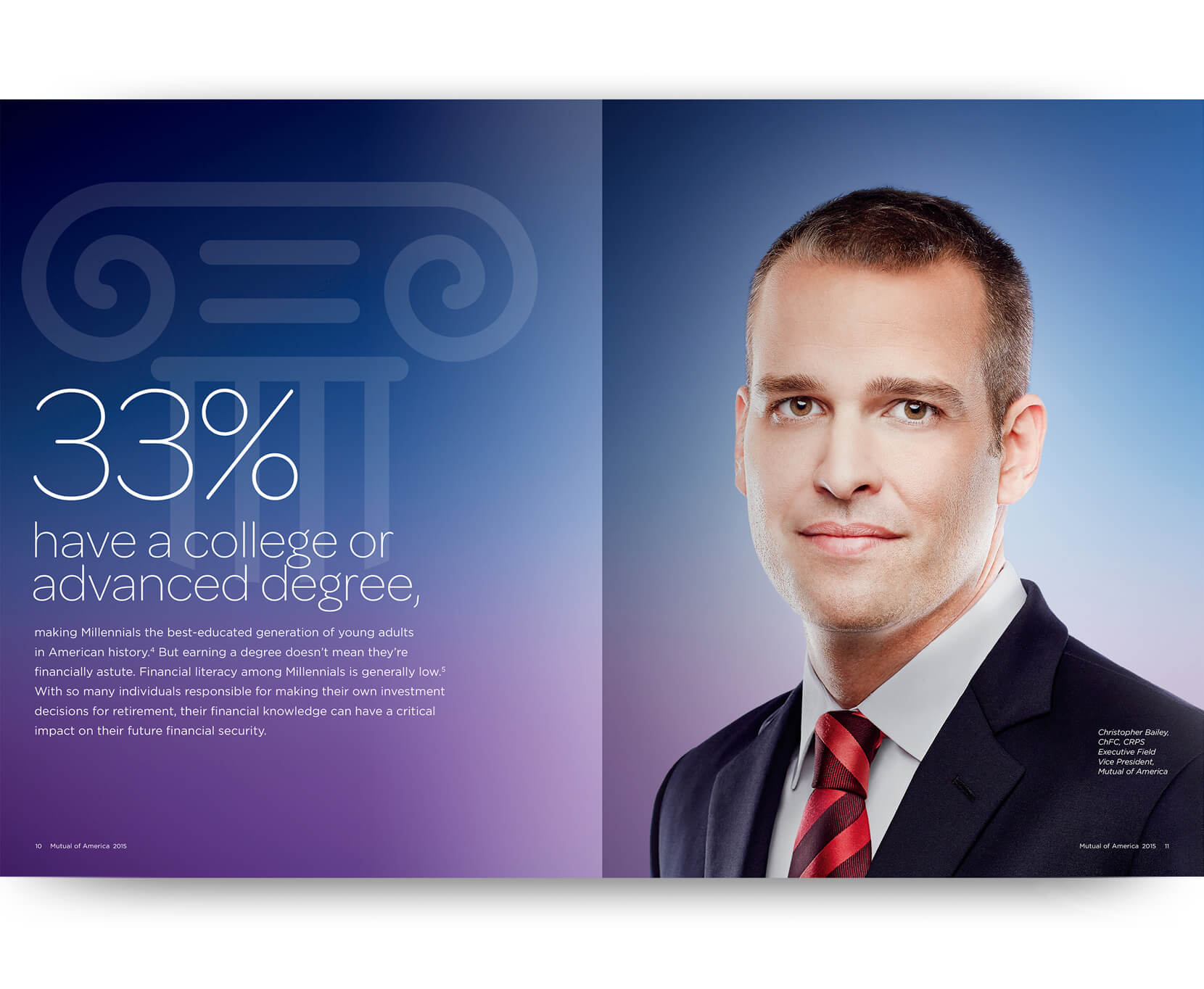
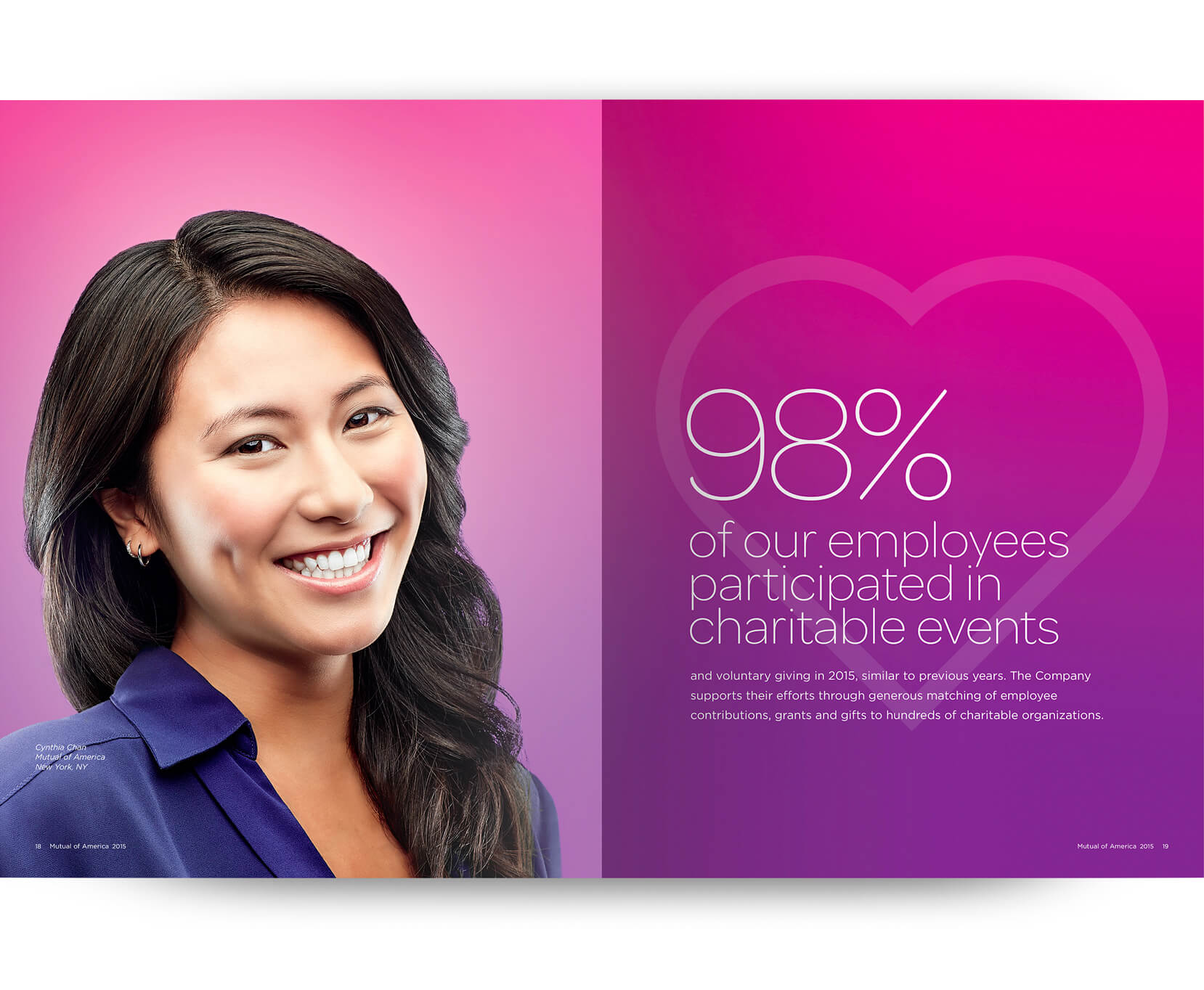
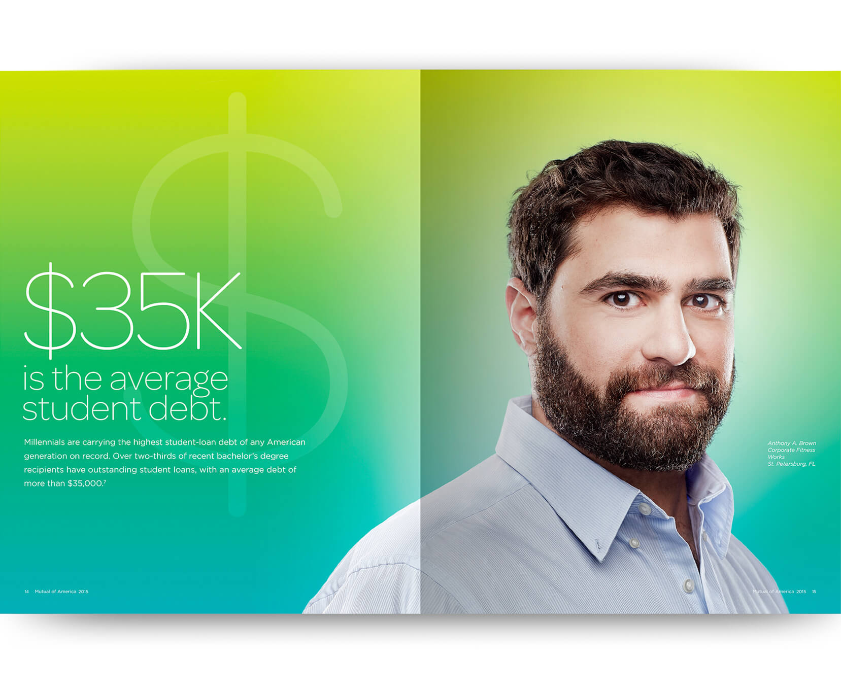
To accomplish this targeted effort, we created a fun, colorful digital platform that featured only their peer group. Our graphic approach for digital used a different “cover”—we created a number of high-energy situations on the photo shoot to create a group dynamic. In addition, video was also shot and loaded to the site.
We knew that mobile was going to be a far more important part of the strategy and we designed it with a different interface from the desk-top version. It has a number of pop up screens and divides content differently. Visits to the company website increased by 50% after launch with high mobile usage.

18%
Increase in site traffic for the year
4
Communication Awards including Best US Annual Report
Yes!
A positive response from regional offices who cited more effective meetings
