Challenge
The Houston market boasts a plethora of boutique litigation firms competing for work in verticals such as energy and healthcare. Our challenge was to uncover what differentiated this firm from the others.
Solution
Conduct research to reveal client perspectives and identify new marketing opportunities.
Result
A new logo and brand positioning, along with a website that is bold, modern, and reflects the firm’s intelligence and vigor.
The departure of a partner provided the catalyst for litigation boutique Schiffer Hicks Johnson to examine its brand, website, and marketing program. Decker Design—working with our content partner, Deborah Gaines Associates—embarked on an expedited discovery process. We began with a communications audit followed by a competitive analysis and questioned existing assumptions through a series of internal and external interviews.

Our report provided the firm with a number of strategic insights from which we built our creative brief and content strategy. Interviews revealed that clients were unaware of the full depth and breadth of the firm’s work. Our web strategy emphasized the quality and size of cases, including case studies that highlighted major wins.

Our web strategy emphasized the quality and size of cases, including case studies that highlighted major wins.
The homepage features four case studies showcasing the firm’s involvement in the fields of energy, construction, business, and healthcare. The lawyer directory opens with a navigation carousel, which creates several ways to search and highlights contact information. The personnel photography features the city of Houston, while the images representing client work are universal—emphasizing local intelligence with a global viewpoint.
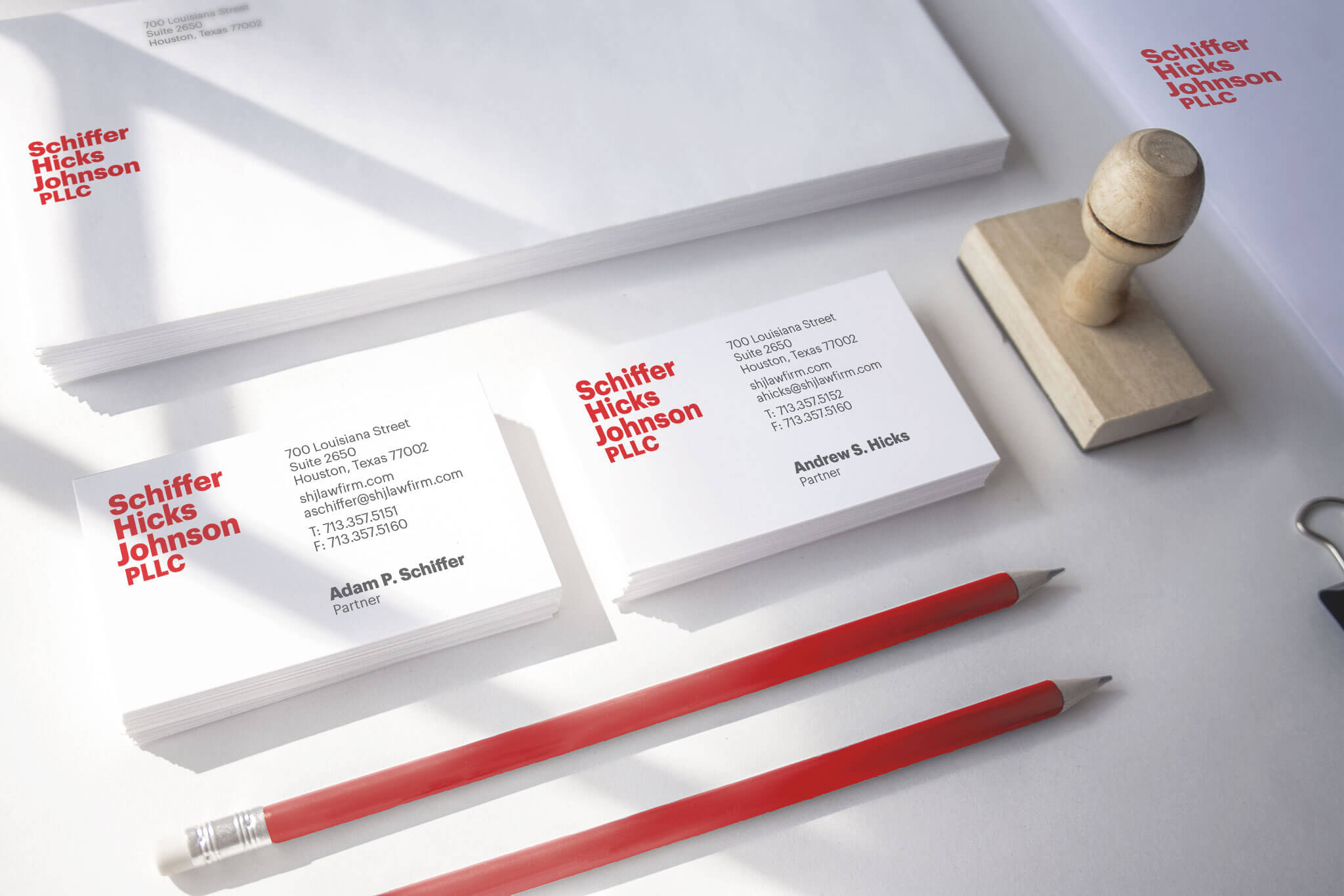

The visual brand retains the firm’s original color, red, in a brighter and more energetic iteration. The original font, a serif, which echoed the look and feel of old white-shoe firms, was abandoned in lieu of a contemporary geometric san serif. We also created a wordmark with a distinct alignment of the three name partners. To complement the wordmark, we created a monogram that could be used in email signatures or promotional patterns.
To date, the launch has been widely praised as a great digital marketing tool and the partners have credited it with assisting in successful business development with major clients.

Visit Schiffer Hicks Johnson