Lankler Siffert Wohl
Repositioning a Litigation Boutique
- Legal
- Design
- Digital Design
- User Experience
Challenge
Looking at an outdated website, a competitive marketplace and a new generation of firm leaders, established litigation boutique Lankler Siffert & Wohl sought to develop a brand platform to reflect the energy and dynamism of the firm as it moves into the future.
Solution
A disciplined process of research and discovery that culminated in a comprehensive strategic plan designed to strengthen the firm’s brand presentation.
Result
A 180-degree pivot—from a routine visual presentation to a bold, vibrant brand expression that amplifies the firm’s energy and honors its distinguished history.
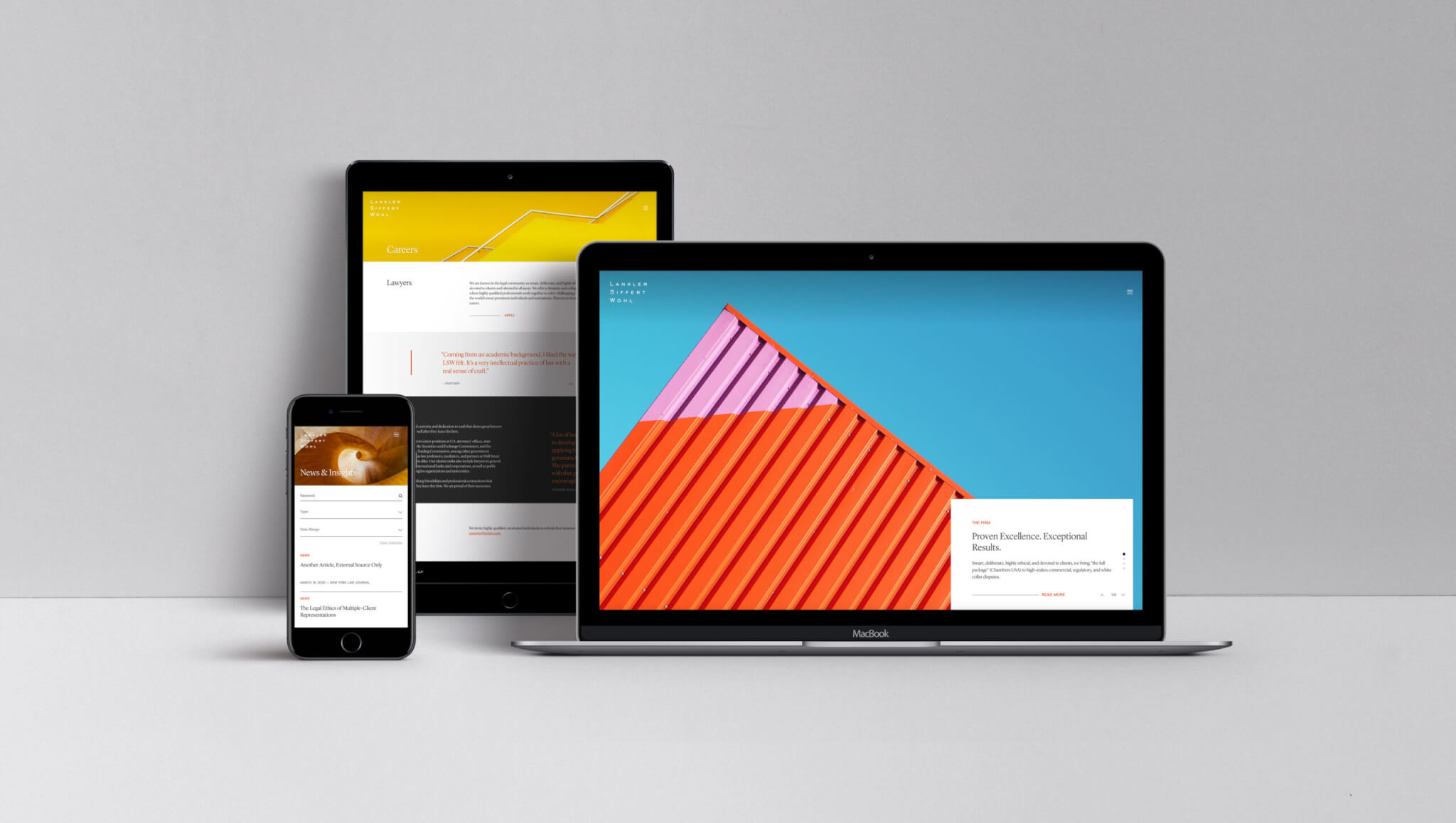
New York City-based boutique law firm Lankler Siffert & Wohl LLP (LSW) is widely known for its outstanding track record in white collar litigation. Since its inception in 1984, the firm has relied more heavily on referrals rather than formal marketing programs—an approach that, over time, became a cornerstone of the LSW brand. Clients of all sizes value the firm’s sensitive and confidential treatment of their most critical legal issues.
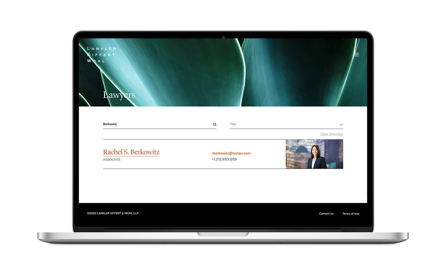
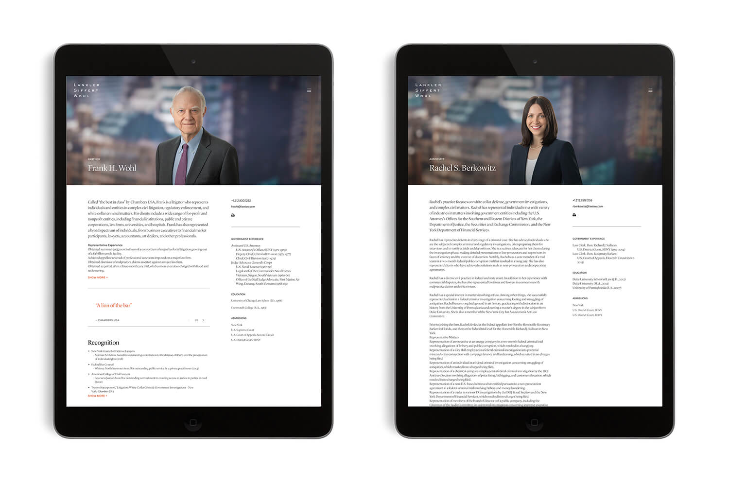
But as more and more competitors burst onto the scene, a vigorous branding website efforts have proved essential to reflect the firm’s evolution. And as the next generation of partners grew poised to lead the firm forward, LSW attracted a broader pool of clients and recruits to match.
Working with longtime content partner Deborah Gaines Associates, we launched the project with a disciplined research and discovery process. After analyzing the firm’s competitive landscape and current communications, we interviewed lawyers, associates, staff, and clients to gain a better sense of LSW’s strengths. Internal and external interviewees alike hit upon a handful of key themes that spoke to LSW’s key differentiators.
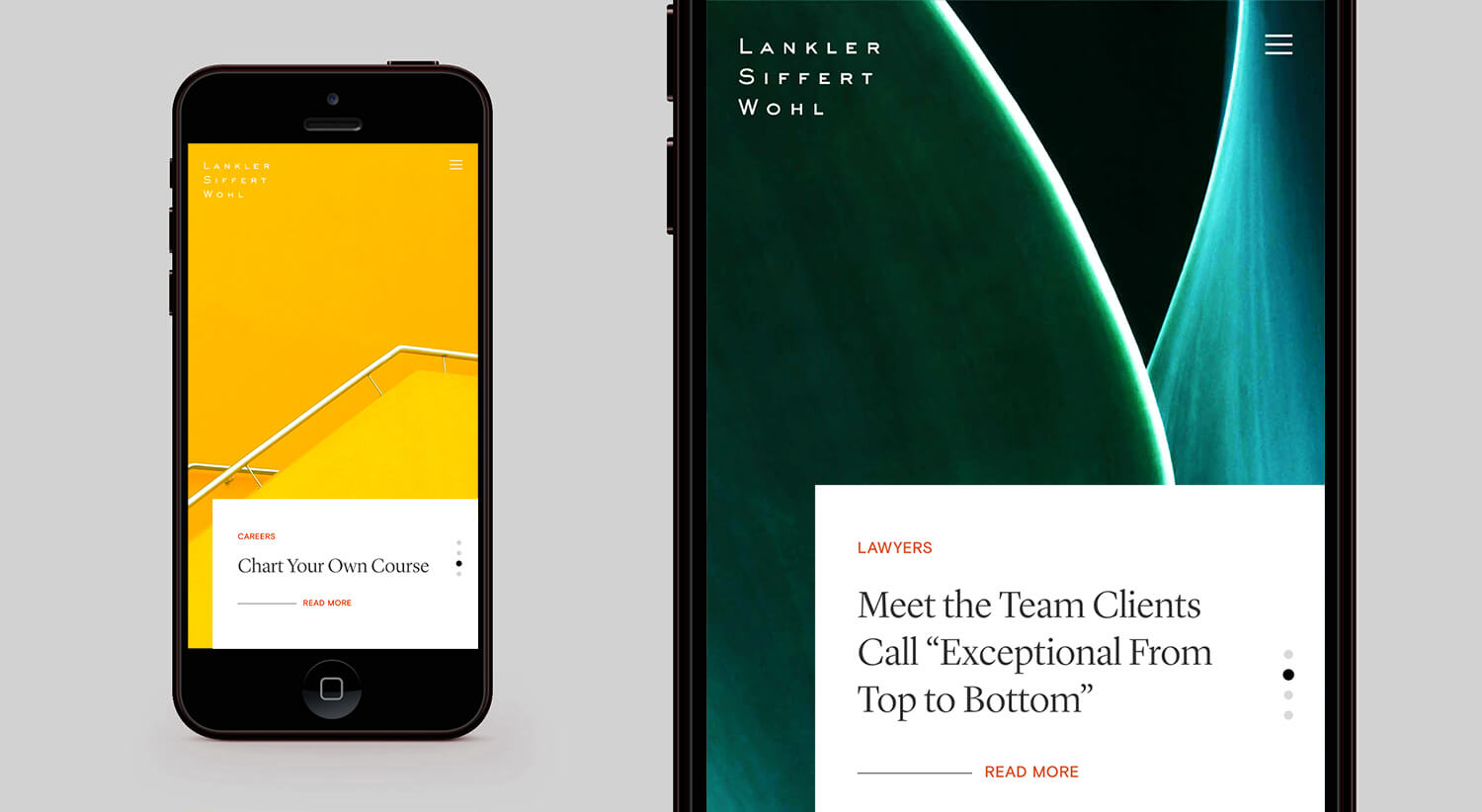
Based on these conversations, we developed a branding and website that would meet LSW’s goals: differentiate the firm from its competitors, highlight its civil and white collar capabilities, enhance recruitment and networking efforts, and position the firm for continued success.
The project centered around a full redesign of the firm’s website: the most visible manifestation of its brand. LSW’s existing website was technologically outdated, visually uninteresting, and failed to convey a sense of personality. In order to stand out from the current cluster of New York City-based legal boutiques, we would have to devise a truly unique visual brand expression.
For inspiration, we looked beyond the American legal market to European law firms—per LSW’s international capabilities—and large consulting firms such as McKinsey and Booz Allen. We sought to echo these brands’ punchy, concise messaging and creative promotion of thought leadership work.
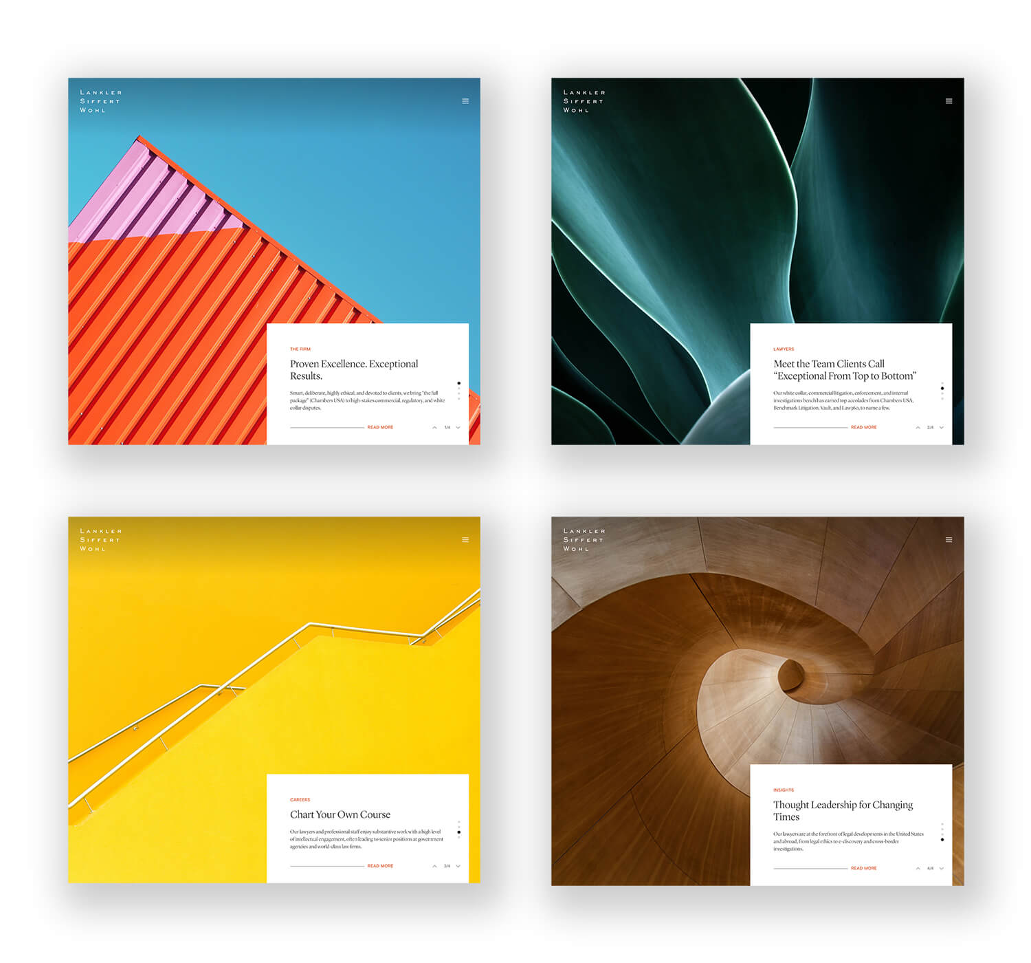
As we embarked on the redesign, we turned to abstract imagery as our lodestone. In addition to symbolizing a generational shift, these images conjure a striking visual power and invite deep introspection, paralleling the firm’s intellectually-minded dedication to the craft of law.
We chose an orange-red as the primary design color, foregoing the aggressive intensity of a traditional fire truck red. This hue projects a modern, magnetic energy, with just enough warmth to make visitors feel welcome. Even our navigation design signals a forward-thinking approach—users navigate the website through a sliding sidebar menu in lieu of the typical fixed pull-down menu.
To temper these bold visuals, we selected a classical serif font that mirrors LSW’s reputation for understated sophistication.
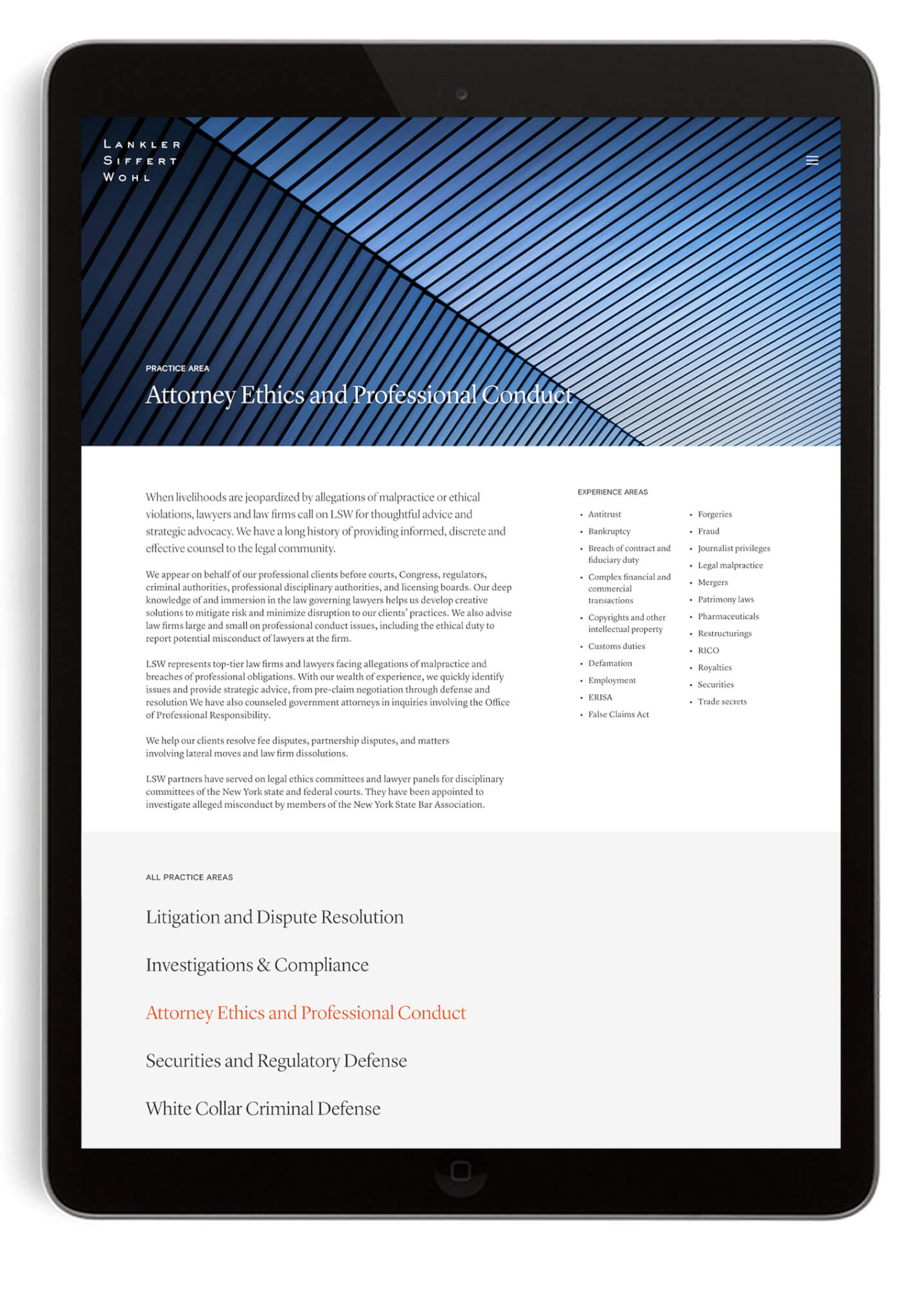
A brand and website that positions it for continued success: differentiate it from its competitors, highlight its civil and white collar capabilities and enhance recruitment.
The homepage speaks to LSW’s impressive body of work without mentioning results or client names. We designed a carousel of cards that each feature a key differentiator—from Chambers rankings to alumni career outcomes and thought leadership activity.
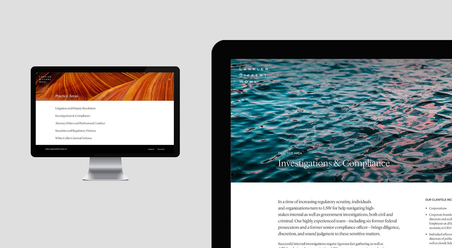
As LSW reflects on the successes of the past 35 years and looks toward the future, its new brand will complement a new generation of leaders’ fresh perspectives while remaining true to the firm’s core values.
Creative Director – Lynda Decker
Senior Designer – Susanne Adrian
Interactive Designer – Kelly Bryan
Junior Designer – Jason Mangelson
Development Partner – MANYFOLD
Awards won:
Graphis Design Award – Gold Award
PRINT Mag – Interaction Design
