Challenge
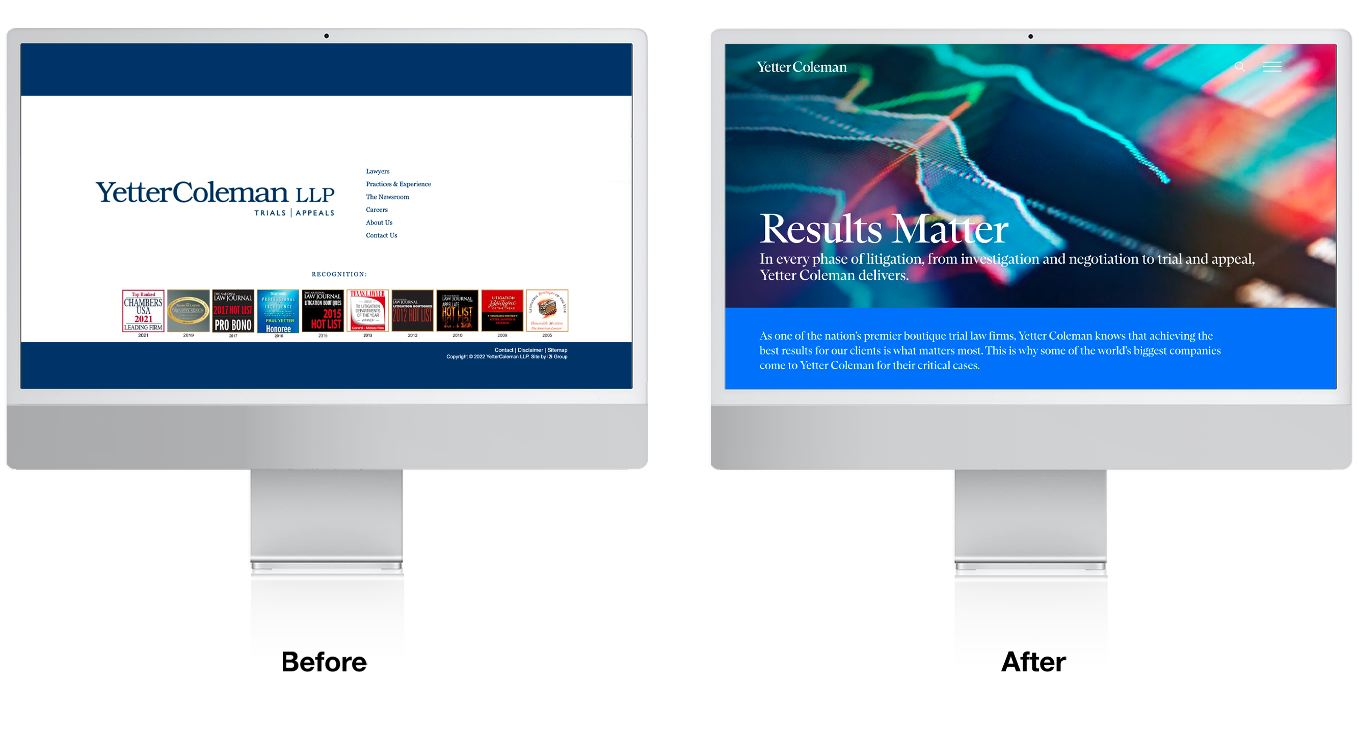
As Yetter Coleman approached its 25th anniversary, its website was out of date both technically and from a content perspective.
Solution
Our discovery period revealed information and accomplishments that were not effectively presented on the site.
Result
A refreshed brand that emphasizes the problem-solving prowess of this litigation team with an emphasis on capabilities in both Trial and Appeals.
Founded in 1997, Yetter Coleman established itself in Houston as a leading litigation boutique with clients such as American Airlines, the Houston Astros and ConocoPhillips. Yet as it entered its anniversary year, the partners recognized the website wasn’t reflecting their accomplishments and did not support a number of objectives.
Our team began a detailed discovery process interviewing internal and external stakeholders. Then we conducted a series of workshops with the partners to gain alignment on a strategic direction. We needed to find a way to demonstrate the intelligence, skills, and unique problem-solving abilities of the partners, communicate major clients with critical matters, while being respectful of the firm’s unpretentious heritage and culture.
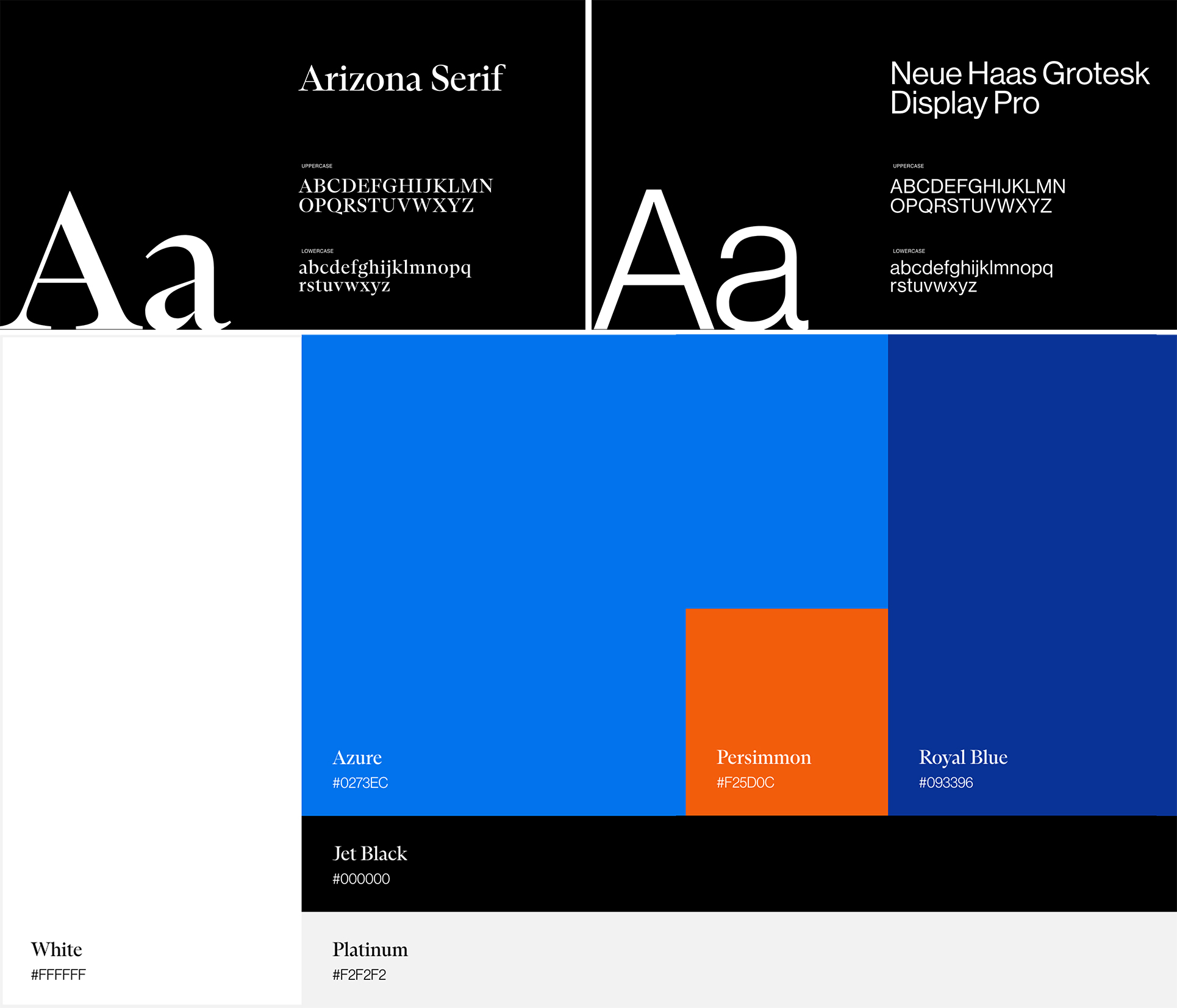
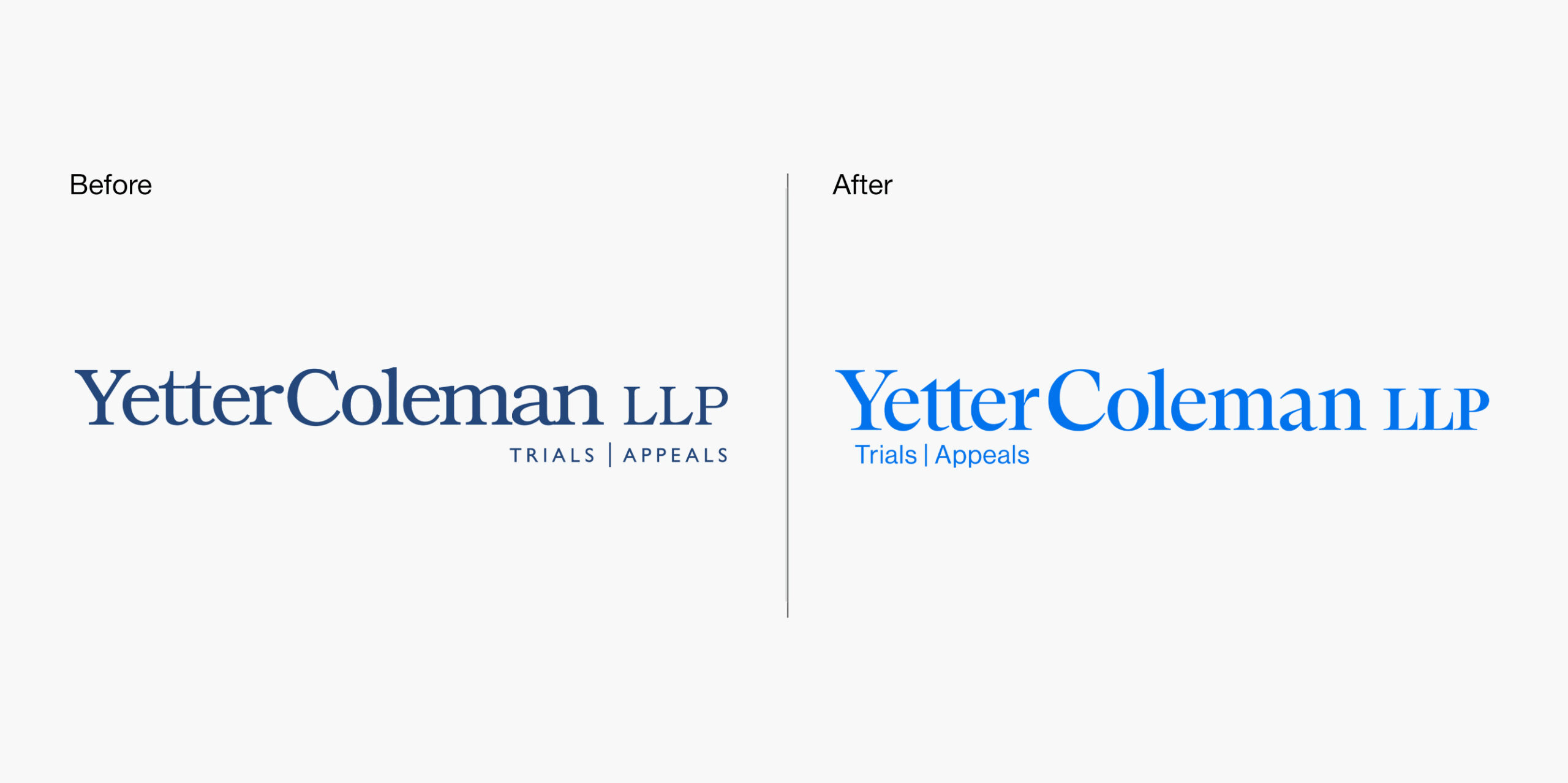
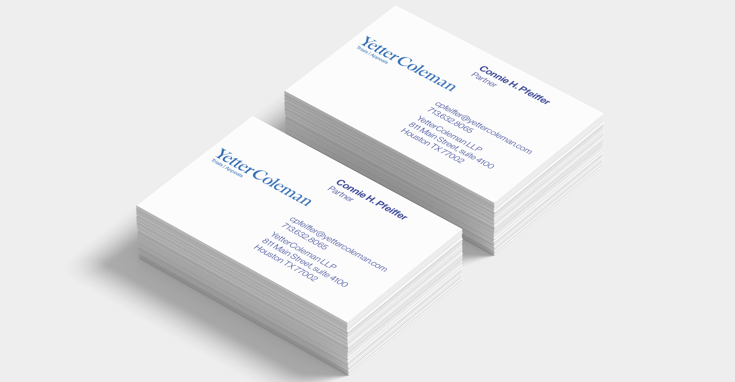
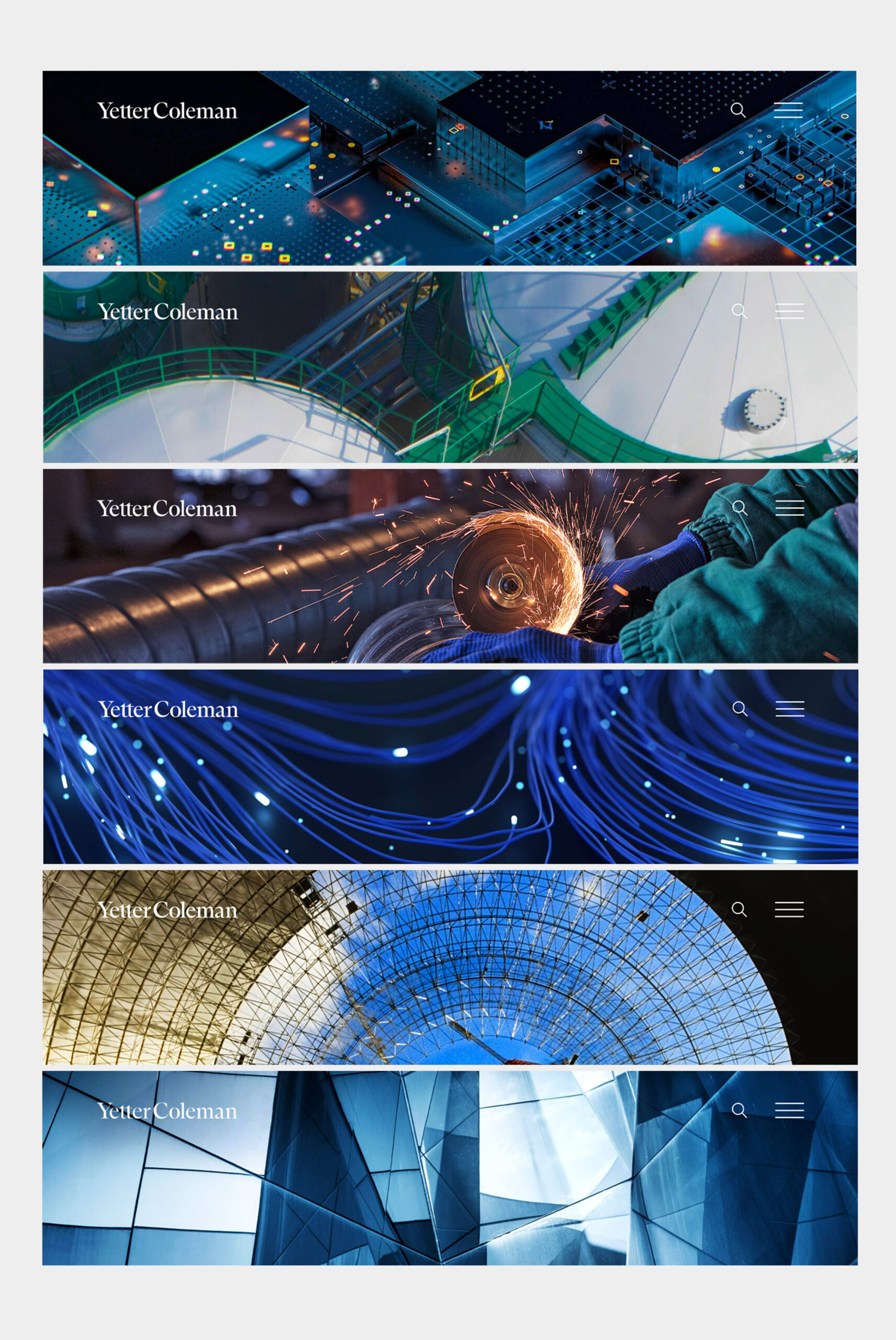
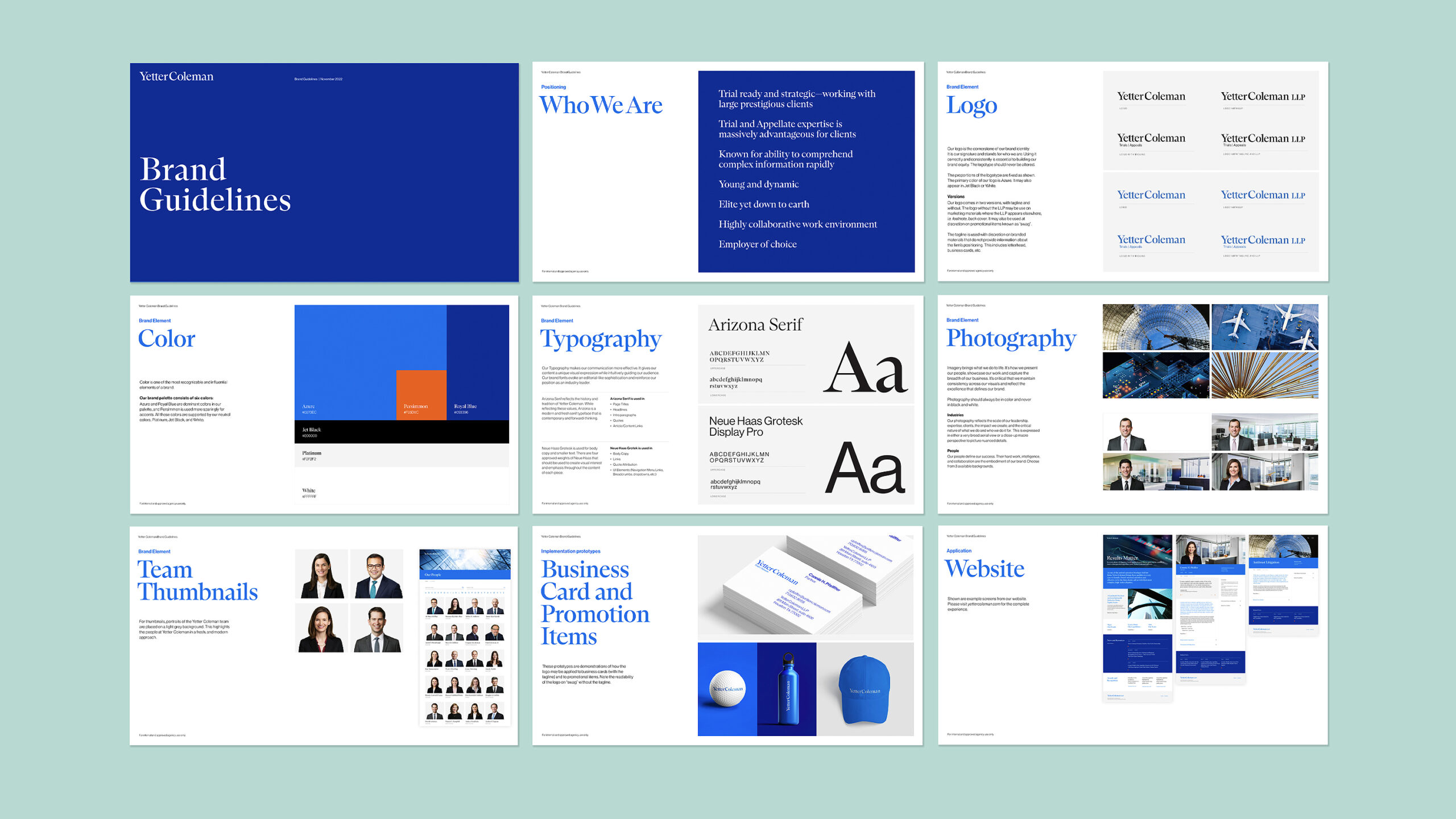
The typography chosen was Arizona, a modern serif combined with Neue Haas Grotesk, a sanserif. Arizona provides a foundational dignity to the logo as well as the headlines, leaving the reader with a sense of classicism and history. The firm’s blue was translated into two brighter shades of blue with a highlight of orange used as an accent. Our photo strategy representing client industries was to choose images that were either “big picture” or highly detailed, and close up—representing the lawyers’ unique perspectives and ability to understand complex information.
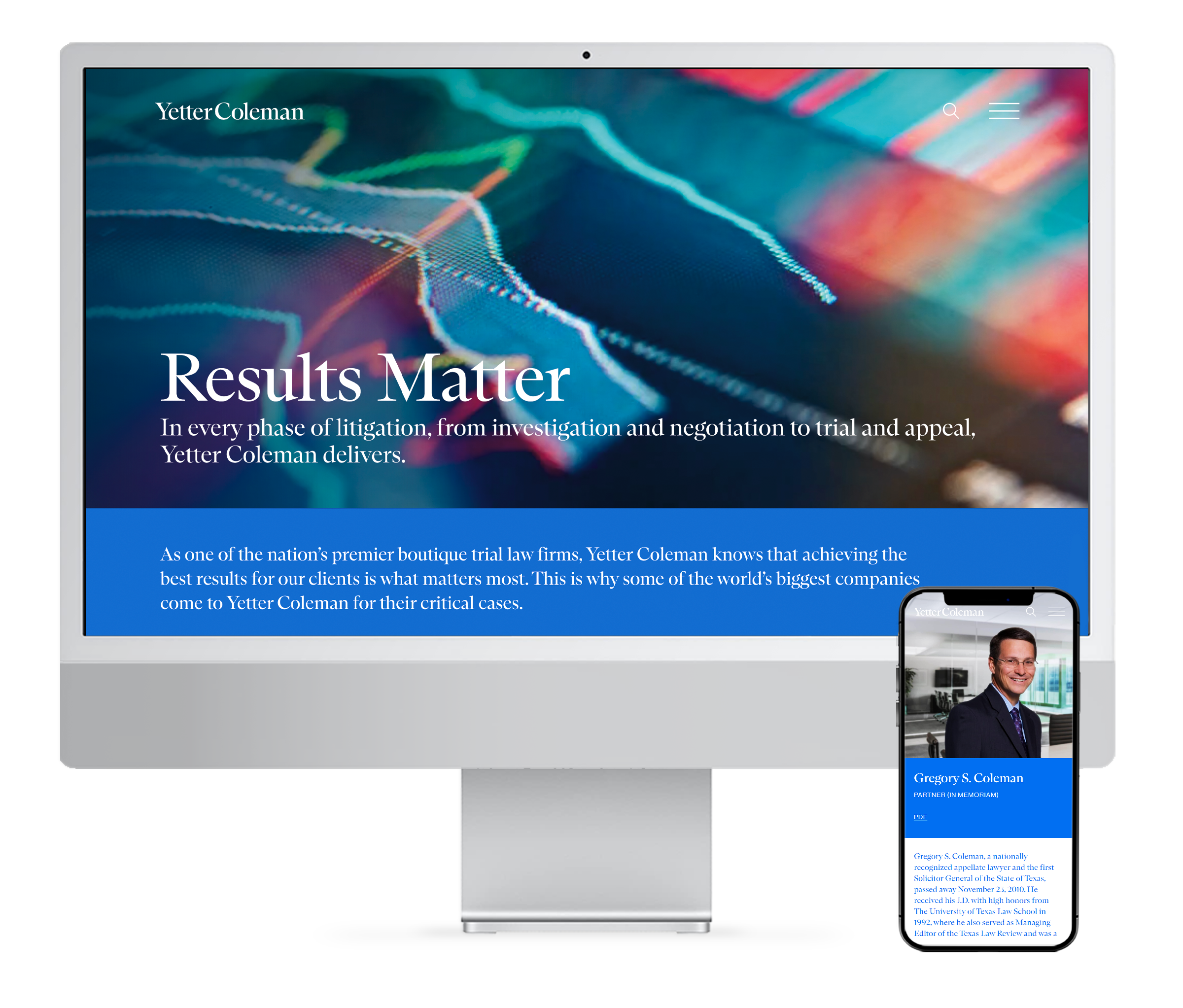
We suggested opening the home page with video representing major clients’ industries the firm has represented. This would bring a subtle energy into the design and subtly reflect some of the major matters. We focused on the concept of “show, don’t tell” and encouraged partners to craft case studies around results—this section is called Results/Victories. Rather than use an internal point of view, client quotes were obtained to reflect the firm’s impact from their perspective.
In today’s competitive market, the key to law firm branding is differentiation. The Decker team helped us find the words and pictures that powerfully communicate our unique brand and culture. They were strategic, thoughtful partners in the process, and their work is elegant. We were very happy with the process and thrilled with the final product.
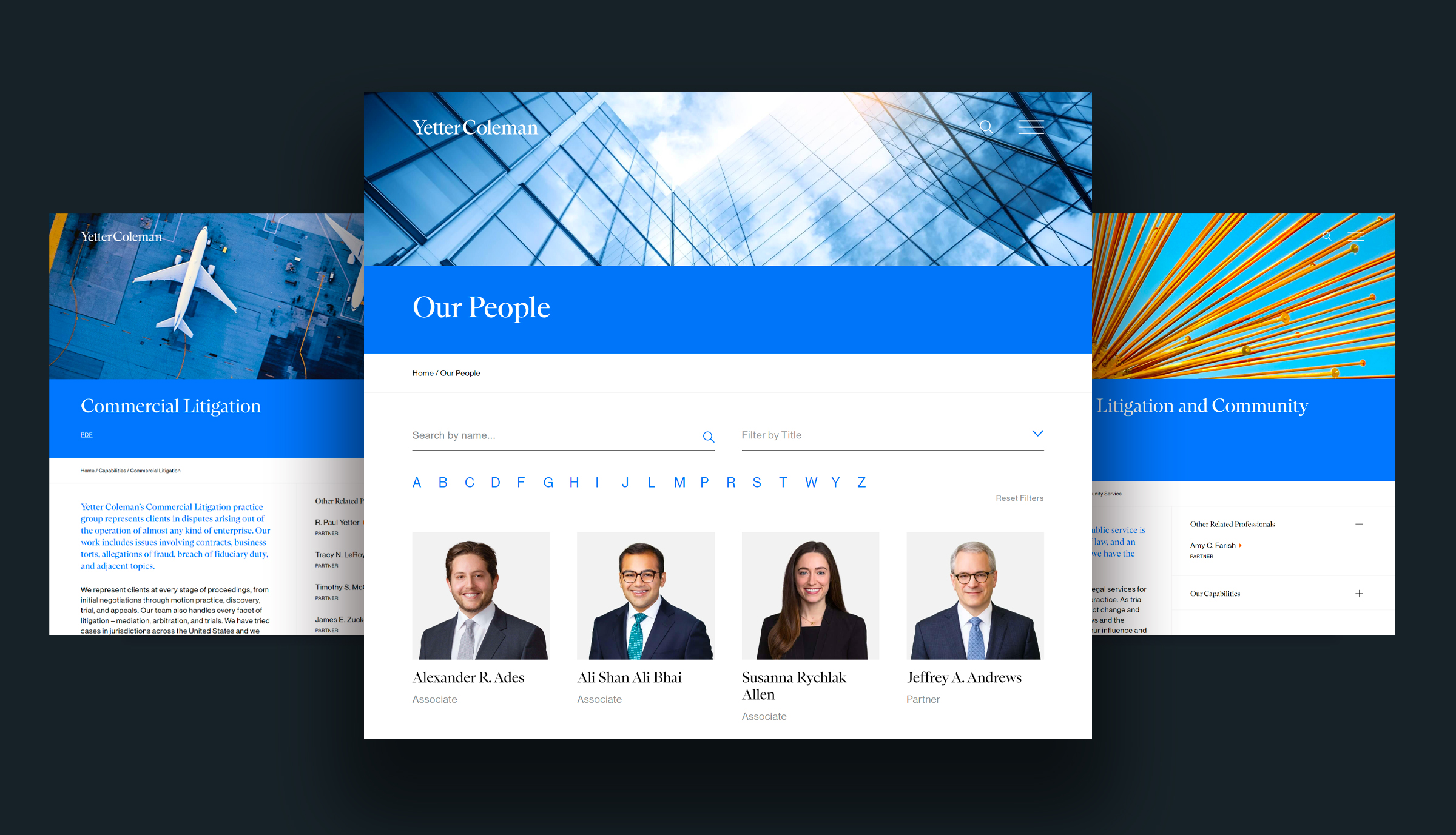
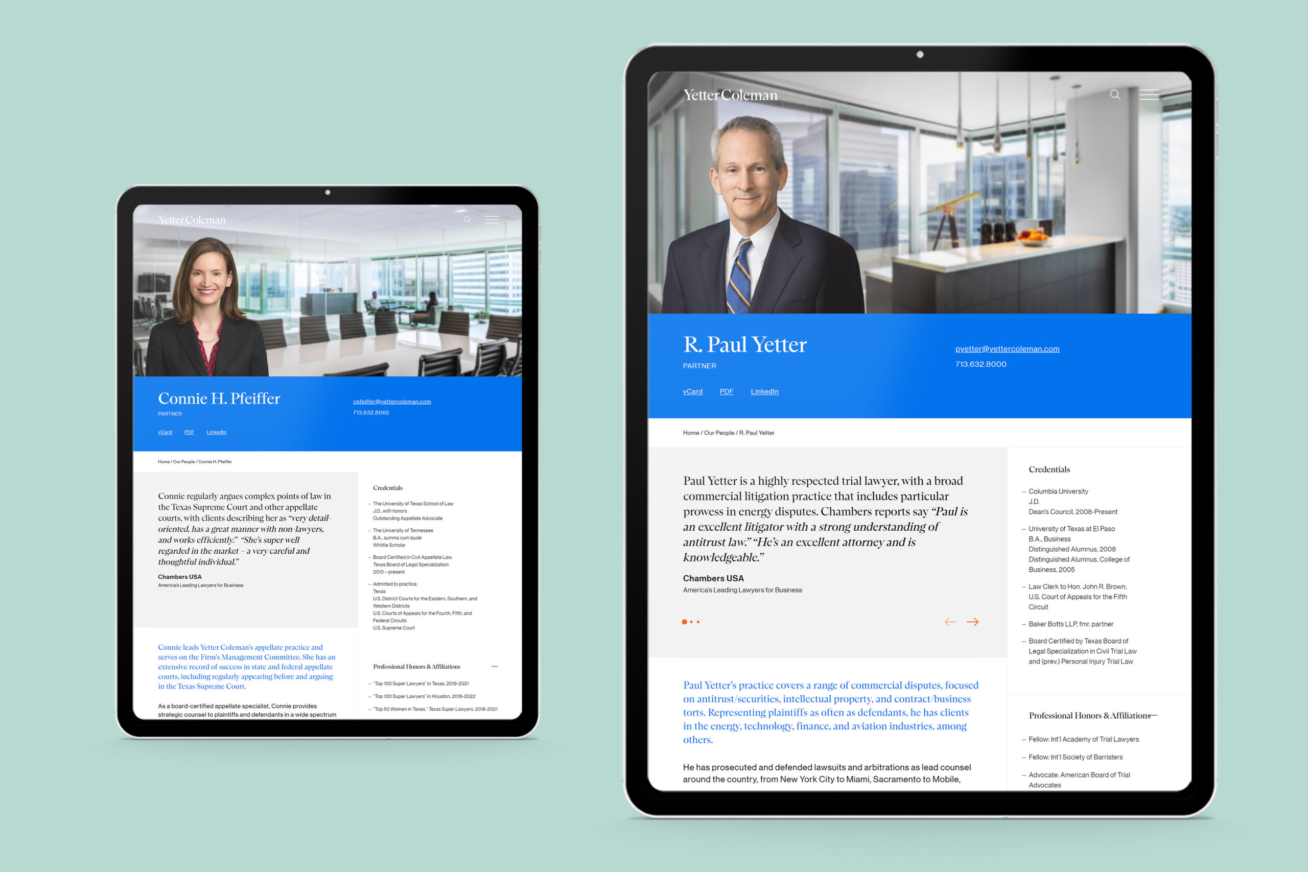
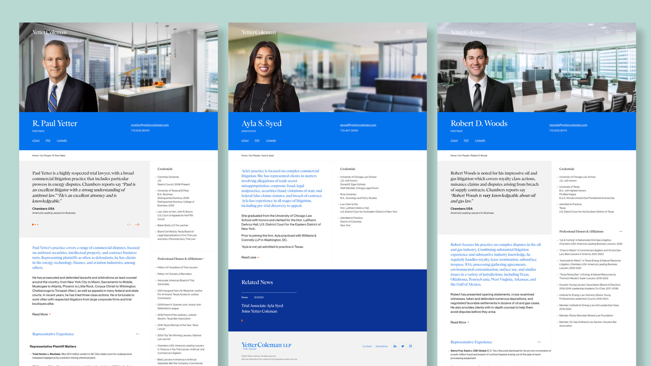
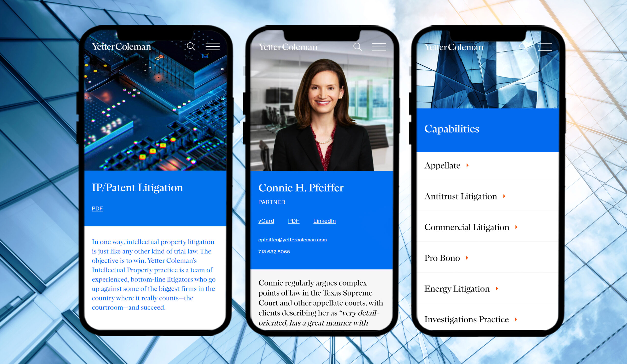
Biography pages are some of the most important on a firm’s website. The lawyer landing page displays all lawyers with the same background to give a sense of unity. When you visit the individual biography, however, the backgrounds change to bring an individual vibrance to each person. The credentials on each are “sticky” to be persistent as the visitor scrolls down the page. There are links to related content such as news and case studies to give a visitor 360-degree insight into each lawyer’s capabilities. And, the website serves as the firm’s database for all content—pdfs of biographies and capabilities can be generated for pitch books and v-cards have permanent urls so they will never be lost.
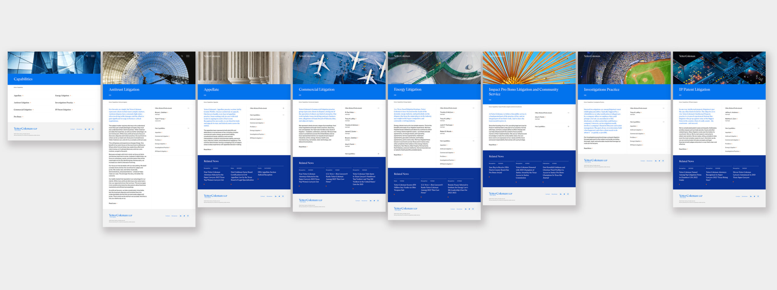
Law firms traditionally speak about practices. Yetter Coleman is litigation, full stop. Instead of practices we created “Capabilities” pages that defined the many aspects of their litigation practice. Specifically important to clients is Appellate Law, headed up by Connie Pfeiffer. Appeals are different from trials, and it is extremely beneficial to a client to know that both a trial and the potential appeal of a lower court’s decision can be handled by the same firm, sharing information, but led by different experts.
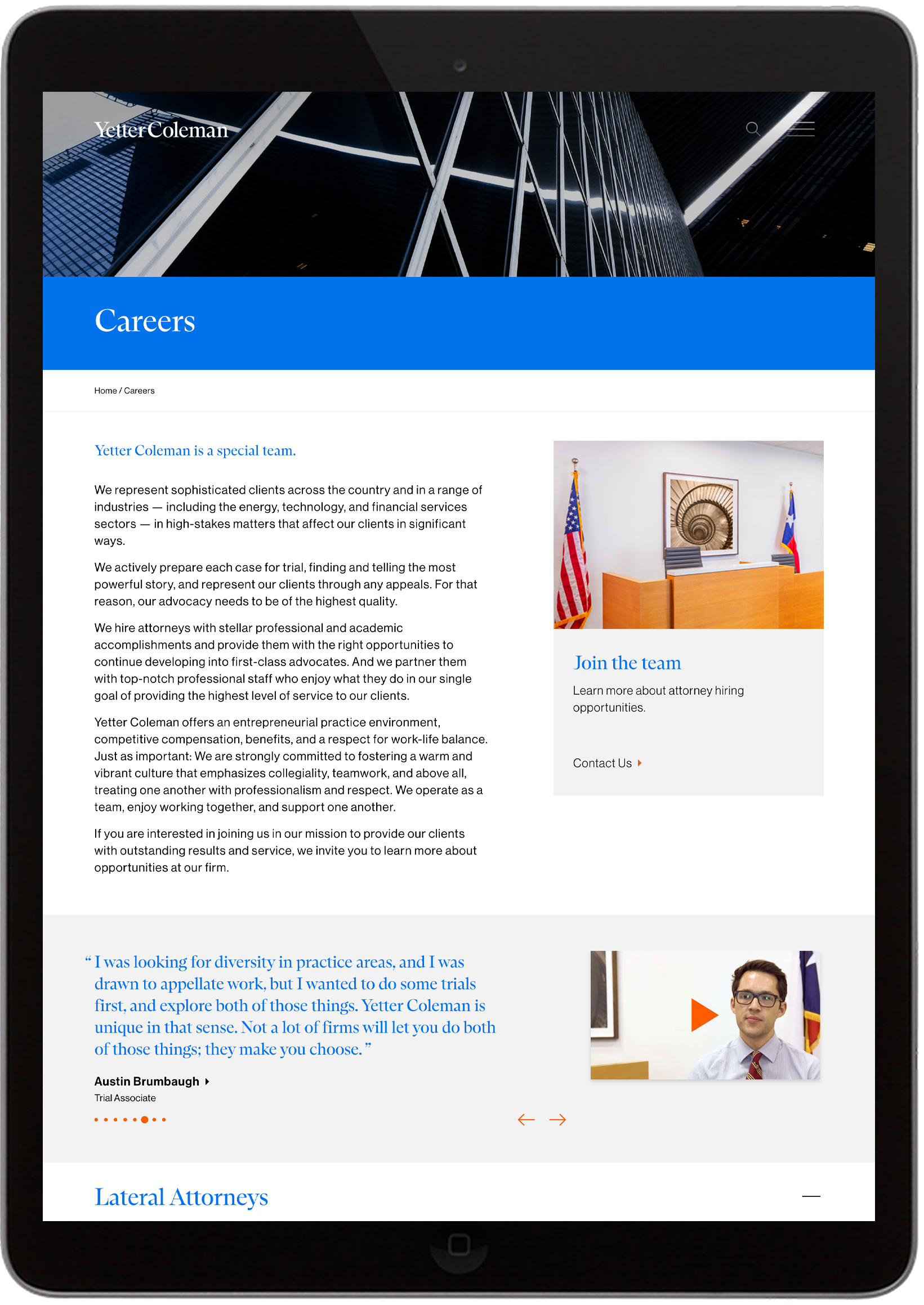
Over the past few years, every law firm in the U.S. has been challenged by recruiting the very best talent. Yetter Coleman’s new “Careers” section positions the firm as the best place to build a career in litigation or if one is not an attorney, work in a supporting staff role. The site is rich with videos and reflects the firm’s commitment to career development and its collaborative culture.
There are many technical challenges when creating a new site, one, is to make sure all existing links are redirected to avoid error pages and subsequent traffic losses. Launched at the end of January 2023, this new WordPress site is set to serve the firm well into the future, with an update to the brand that is contemporary yet rooted in its heritage.
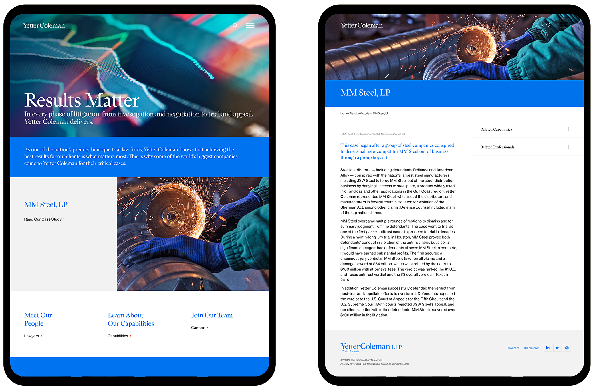
The result is a refreshed brand that emphasizes the problem-solving prowess of this litigation team with an emphasis on capabilities in both Trial and Appeals.
Credits:
Creative Director: Lynda Decker
Interactive Designer: Ryan Breeser
Developer: MANYFOLD
Copywriter: Peter Darling
Project Manger: Lani Tarozzi
