Challenge
Boies Schiller Flexner is one of the leading litigation firms in the US. Its website required an update both visually and technologically—to be responsive and fully navigable in the mobile environment.
Solution
Our digital strategy leverages Boies Schiller Flexner's storied reputation for litigating the most groundbreaking cases of the past 20 years.
Result
The new site runs more efficiently and is fully responsive. In the first month after launch, site visits increased 31%. A new feature, created by our development partner, allows users to curate and print content. This feature facilitates proposal making and has been welcomed by all.

Boies Schiller Flexner is known for its groundbreaking victories in complex cases, many utilizing novel applications of the law. While the partners wanted much from their new website, they were clear in their desire to NOT look like every other law firm.
To this end, we conducted stakeholder interviews, user testing and a competitive analysis. Our strategic approach had three goals: to modernize the digital brand experience with a new look and feel; to put the user in control; and to offer visitors a curated experience.
From marriage equality to opening markets in space, BSF operates in realms that are groundbreaking, historic, and often without precedent.
Abandoning the typical approach to a law firm site, we determined it would be best to model a look and feel against innovation-driven industries such as technology and venture capital. These sites telegraph clear, concise messages with simple navigation and enhance the user experience by removing unnecessary features and information.

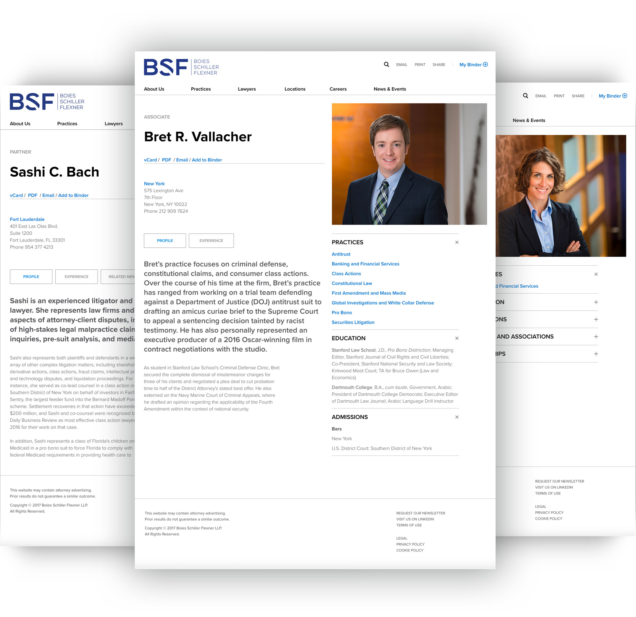
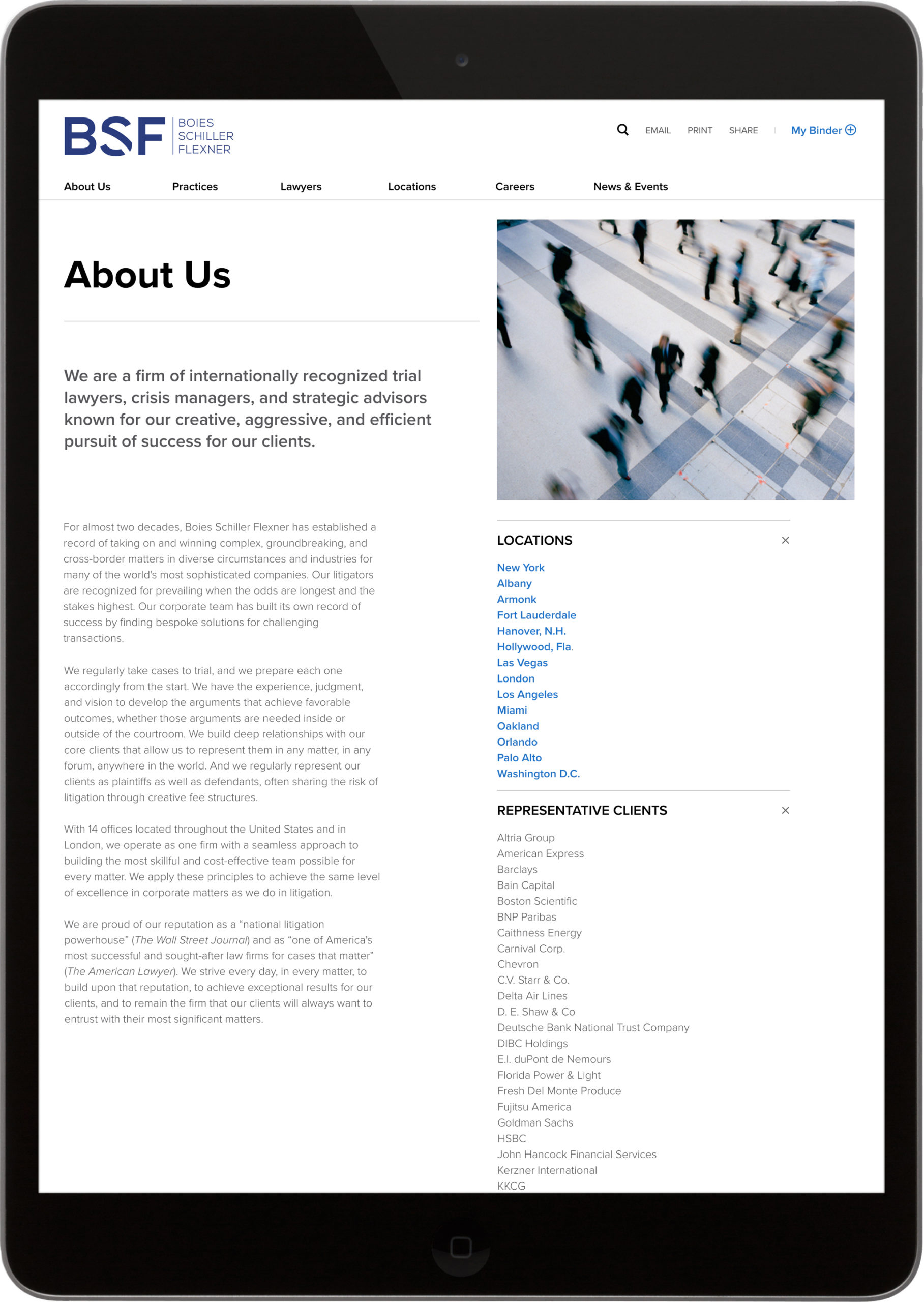
The new site is fully responsive and highly intuitive, enabling users to find information quickly and easily. Since most law firm website visitors enter through search engines, primarily to find lawyer biographies, this area was given special attention. The content has been restructured, rewritten and shortened to enhance the mobile experience.
The BSF strategic brand positioning centers on the firm’s work. From marriage equality to opening markets in space, BSF operates in realms that are groundbreaking, historic, and often without precedent.

The visual approach has been modernized, with tabbed hierarchies and file drawers for related information. On the old site, lawyers were photographed in triptychs, primarily at their desks in shirtsleeves. The new approach is clearer, sophisticated, and more dignified presentation without being stodgy. The new photos are appropriate not only for the website, but also for pitches and media distribution.
Practice area descriptions were also rewritten. The extensive news section was reorganized, with new sort and search features as well as multiple ways to access related content. The design supports users who know exactly what they’re looking for through search and navigation, but also allows them to find new resources serendipitously. The reader controls the flow of information on virtually every page.

Our process led to the creation of a digital marketing tool that is smart, modern and reflective of the firm’s leadership position within the industry.
BSF achieved their goals with this redesign. We were able to provide a best in class user experience that works seamlessly across platforms in partnership with our content partner, Deborah Gaines, and development partner, Rubenstein Technology Group. Rubenstein Technology Group’s custom content management system, RubyLaw, is a powerful CMS designed to meet the specific marketing needs of leading law firms. We were able to efficiently migrate legacy content while at the same time enhancing functionality. Our collaborative process resulted in a digital marketing tool that is smart, modern and reflective of the firm’s leadership position.

Visit Boies Schiller Flexner
31%
Increase in visits
12%
Increase in the length of visits
SEO
visits up 33%
