Acceso
Eliminating poverty at scale
- Social Impact
- Brand Experience
- Brand Systems
- Design
- Digital Design
- Strategy
- User Experience
Challenge
An initiative supported by the Clinton Foundation was being spun off as an independent organization. A name and brand identity were required.
Solution
Our seven-step Brand Revelation process helped the leadership and board to build consensus around a name and a brand strategy.
Result
A successful launch of a system that can be implemented by local partners and provides flexibility for growth as its capabilities grow.
If you are a small farmer, or a fisher, you have a multitude of barriers to success. Inconsistent yield, weather, farming methods, spoilage, and getting product to market are just a few. If you live in an impoverished country, these problems multiply exponentially. You may never make a living wage.
The Clinton Guistra Enterprise Partnership was an international initiative supported by the Clinton Foundation to address poverty through a market lens. As part of a strategic plan in 2016, the Foundation decided to divest its international efforts and act as more of an incubator to help these separate initiatives become independent organizations. At the time we met the client, their efforts were predominantly focused on Haiti, and Central and South America.
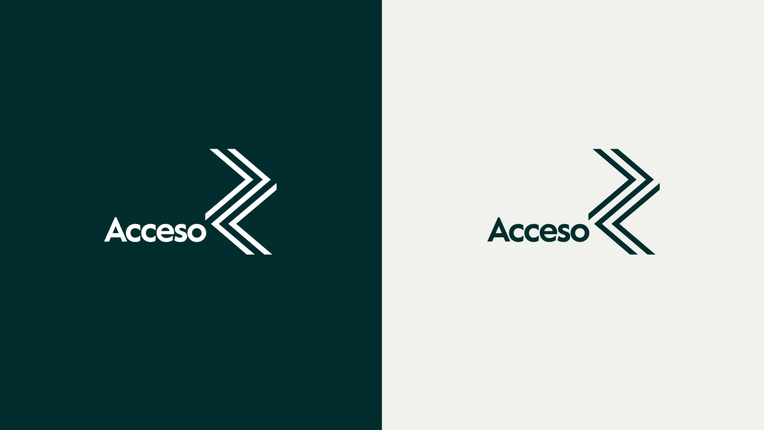
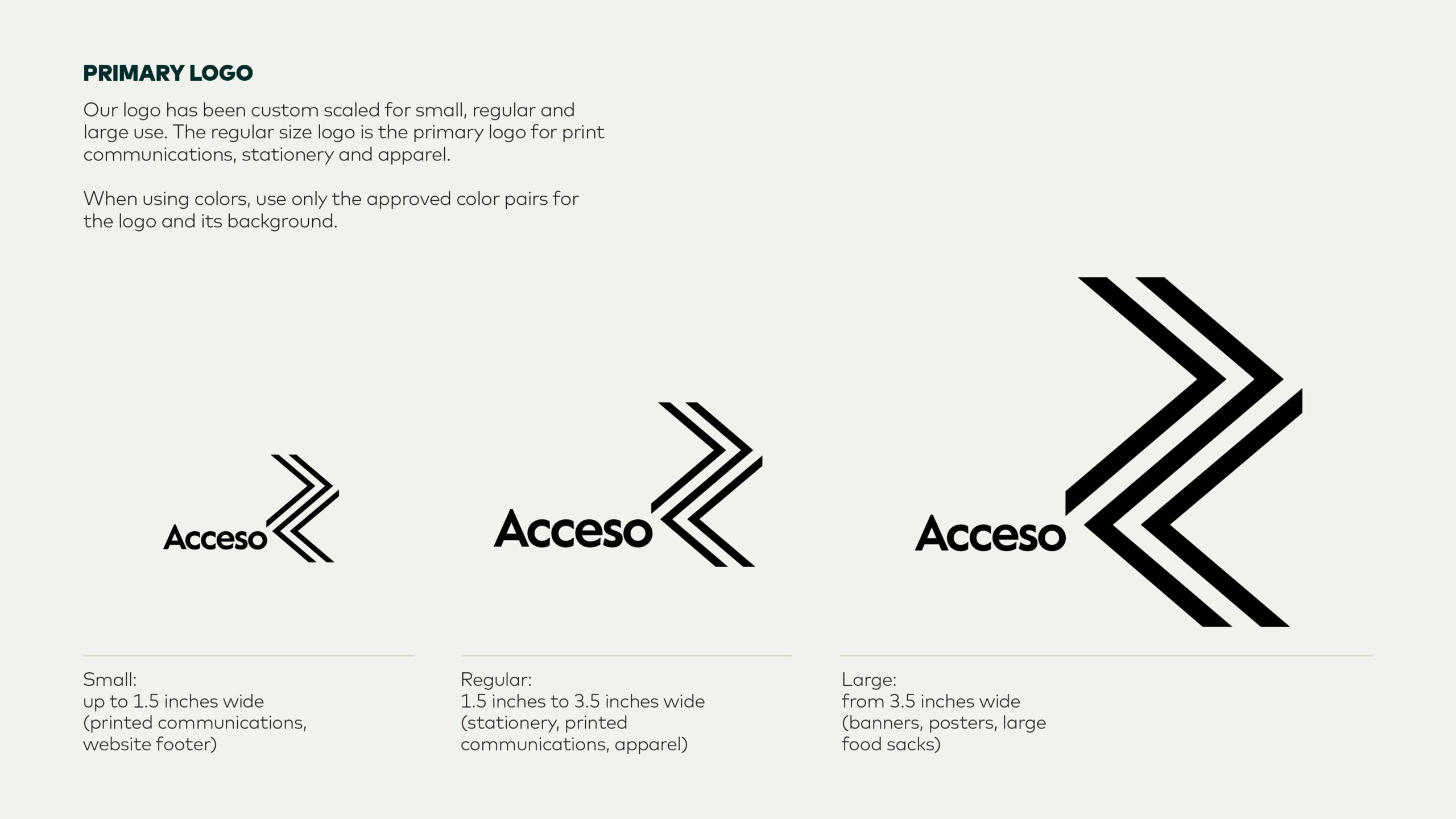
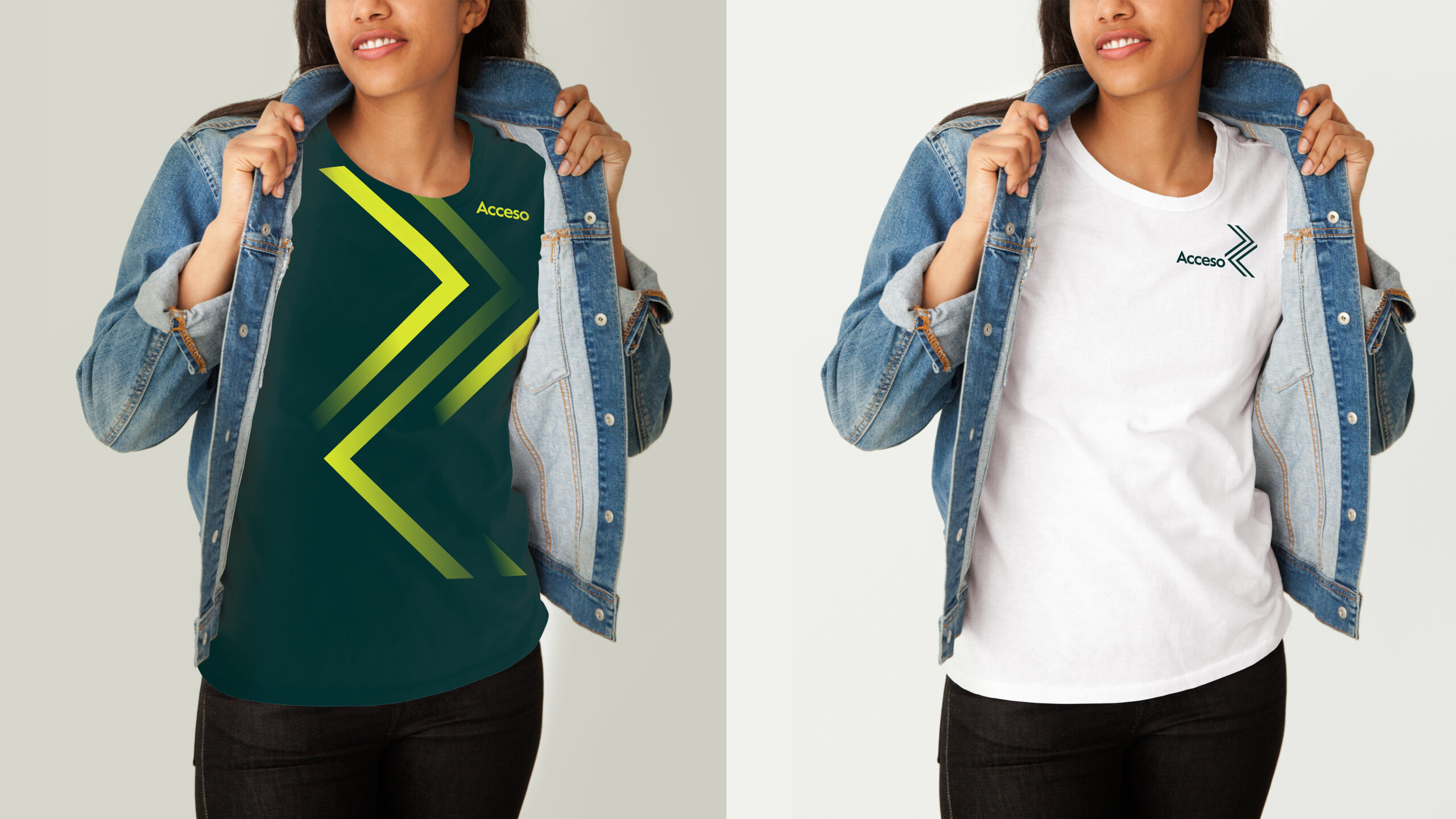
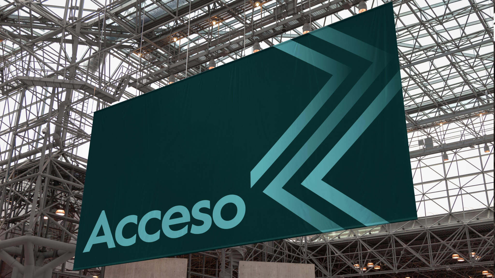
Our logo illustrates a metaphoric path of everyone working together to actively eliminate poverty.
The assignment
It was necessary to create a new name independent of the Clinton Foundation to appeal to multiple audiences consisting of funders, investors, partners, and the local communities in which they worked. Our initial workshops with the leadership consisted of naming and design sprints to stress test names and graphics. We landed on Acceso—a name that was currently in use in some of the countries.
The strategy
To expand appeal to new funders and partners, we had to clearly articulate how this organization differed from other more well-known efforts to address poverty. They told us, “We are not an NGO. We are not philanthropy.” It was one of the greatest challenges we faced. Through a series of external interviews with their corporate partners, we uncovered a market strength—logistics. Using logistics and technology, they are able to solve agricultural and supply chain challenges.
Through a series of external interviews with their corporate partners, we uncovered a market strength—logistics.
Global food production does not currently meet demand. Major food producers, multinational consumer product companies and regional supermarket chains need access to more product, yet the process of working with small growers across many international jurisdictions is complex and overly challenging for even the largest corporations.
Acceso eliminates the time-consuming process of going to market and entry to the global supply chain.
Acceso breaks down multiple barriers. For farmers and fishers, they provide education to increase yields, they purchase and sort crops while paying consistent, living wages. Acceso eliminates the time-consuming process of going to market and entry to the global supply chain. For multi-national corporations who become partners, Acceso provides one-stop access to product. Additionally, these organizations are assured that everything is ethically sourced and they are supporting an effort to alleviate poverty in some of the most challenged areas of the world.
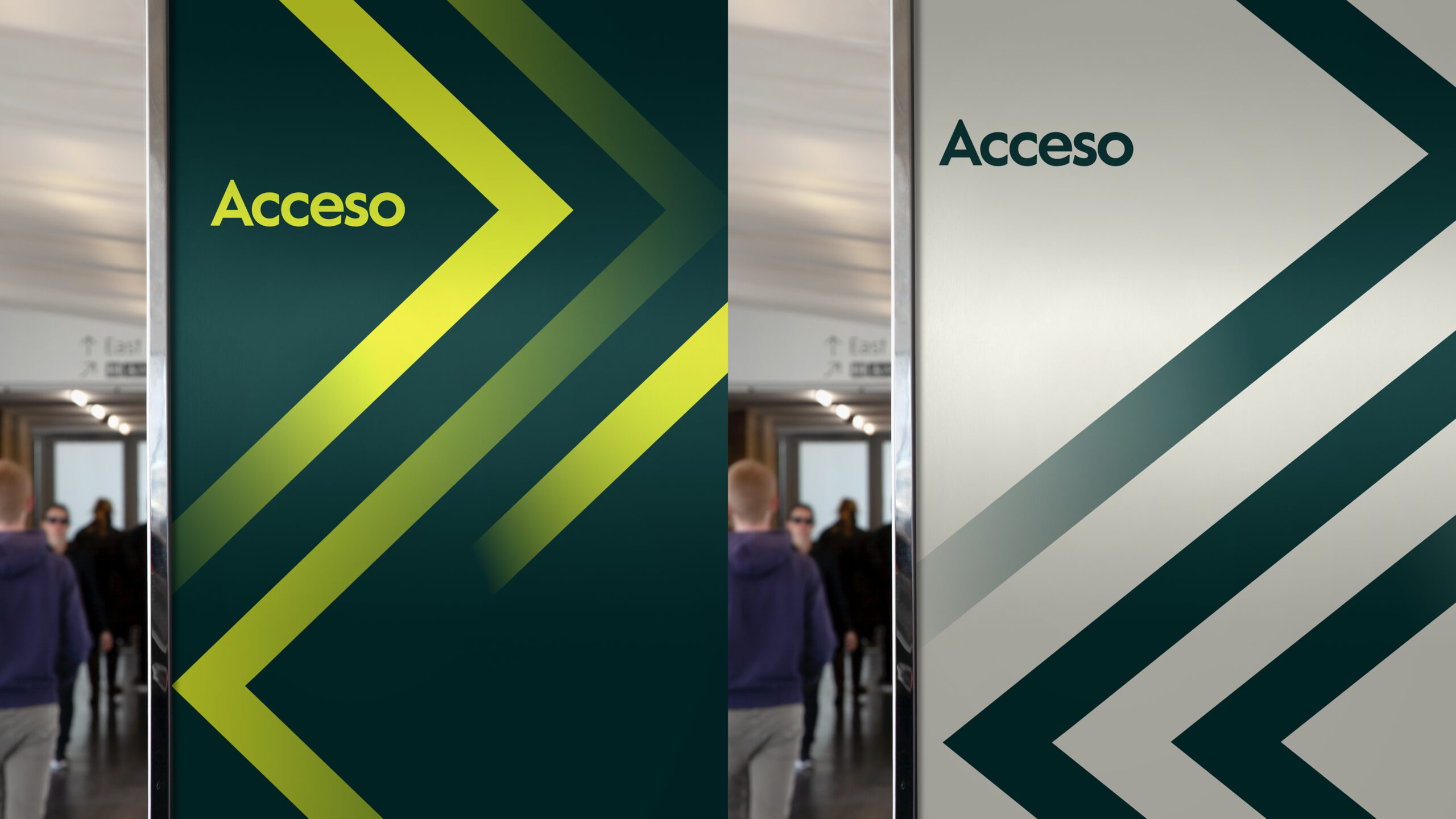
An integrated design language
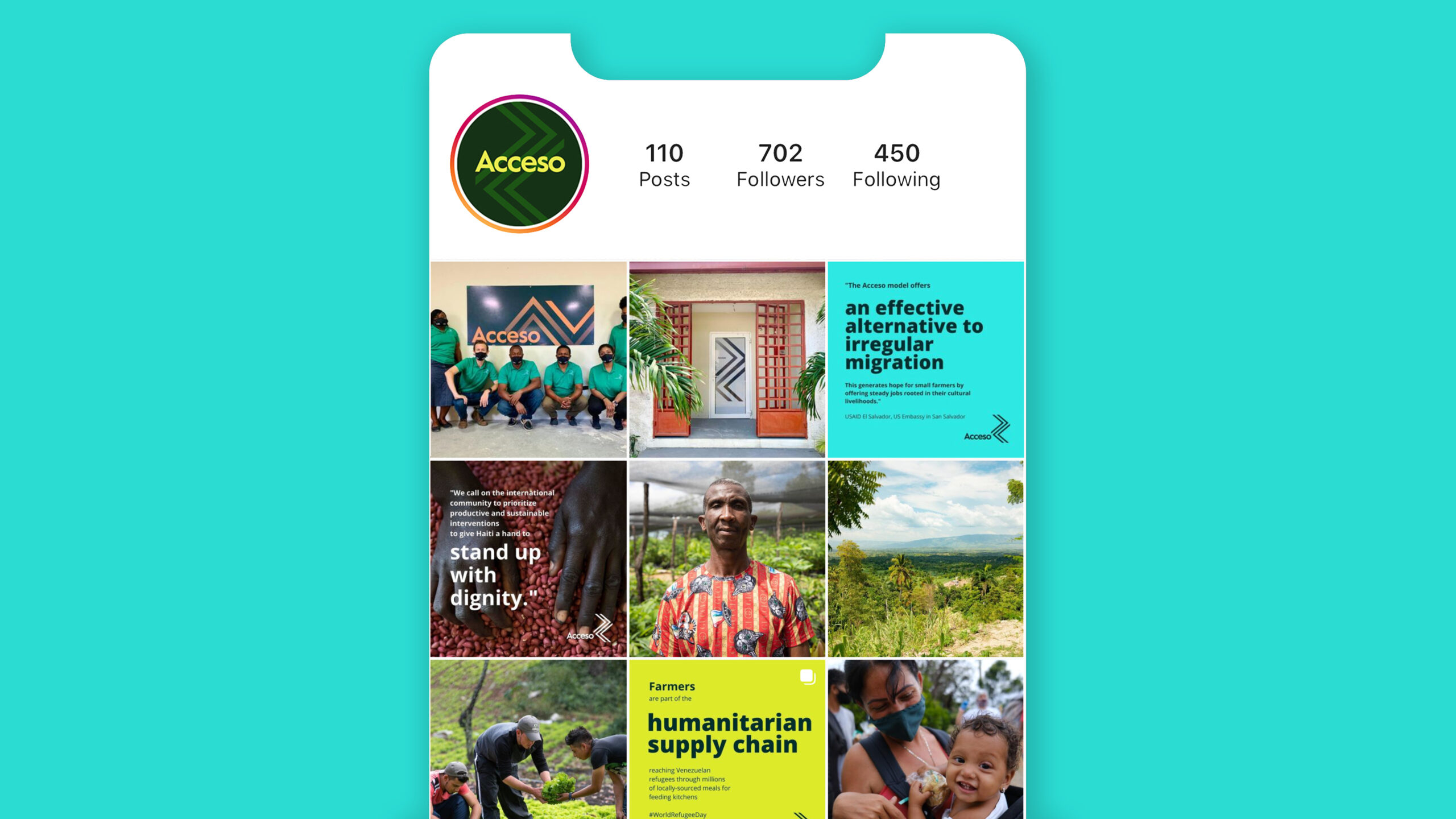
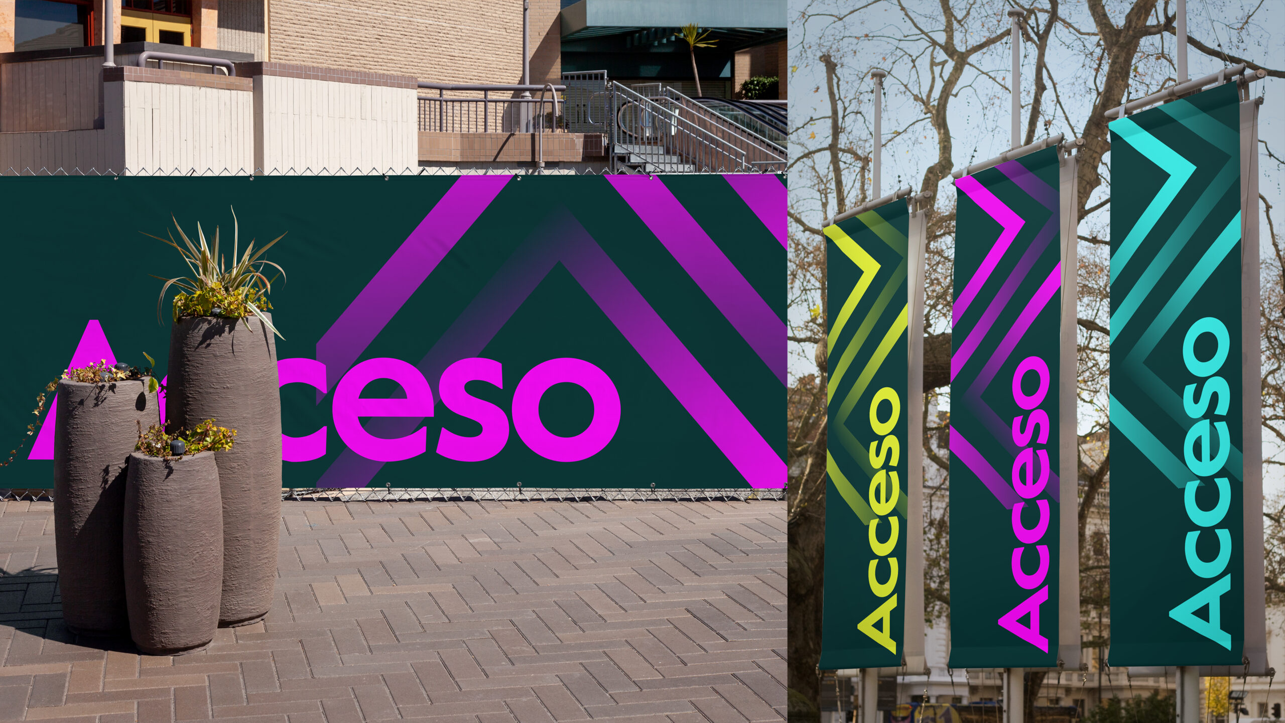
We worked to tell the story of Acceso visually to funders, global companies, and local consumers alike. Our logo illustrates a metaphoric path of everyone working together to actively eliminate poverty.
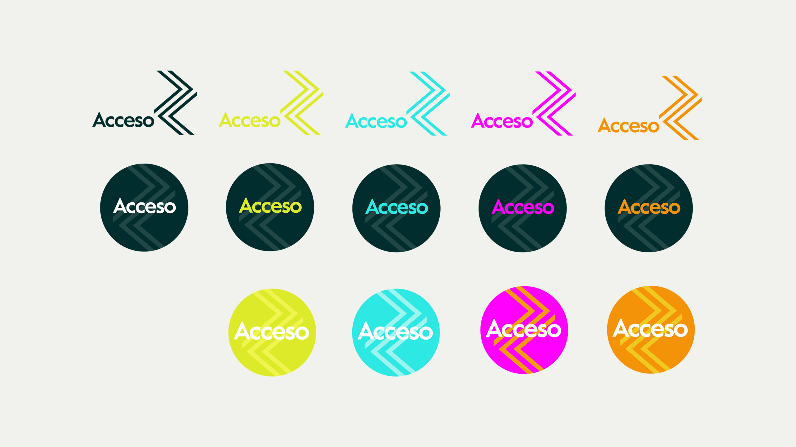
Acceso provides one-stop access to product.
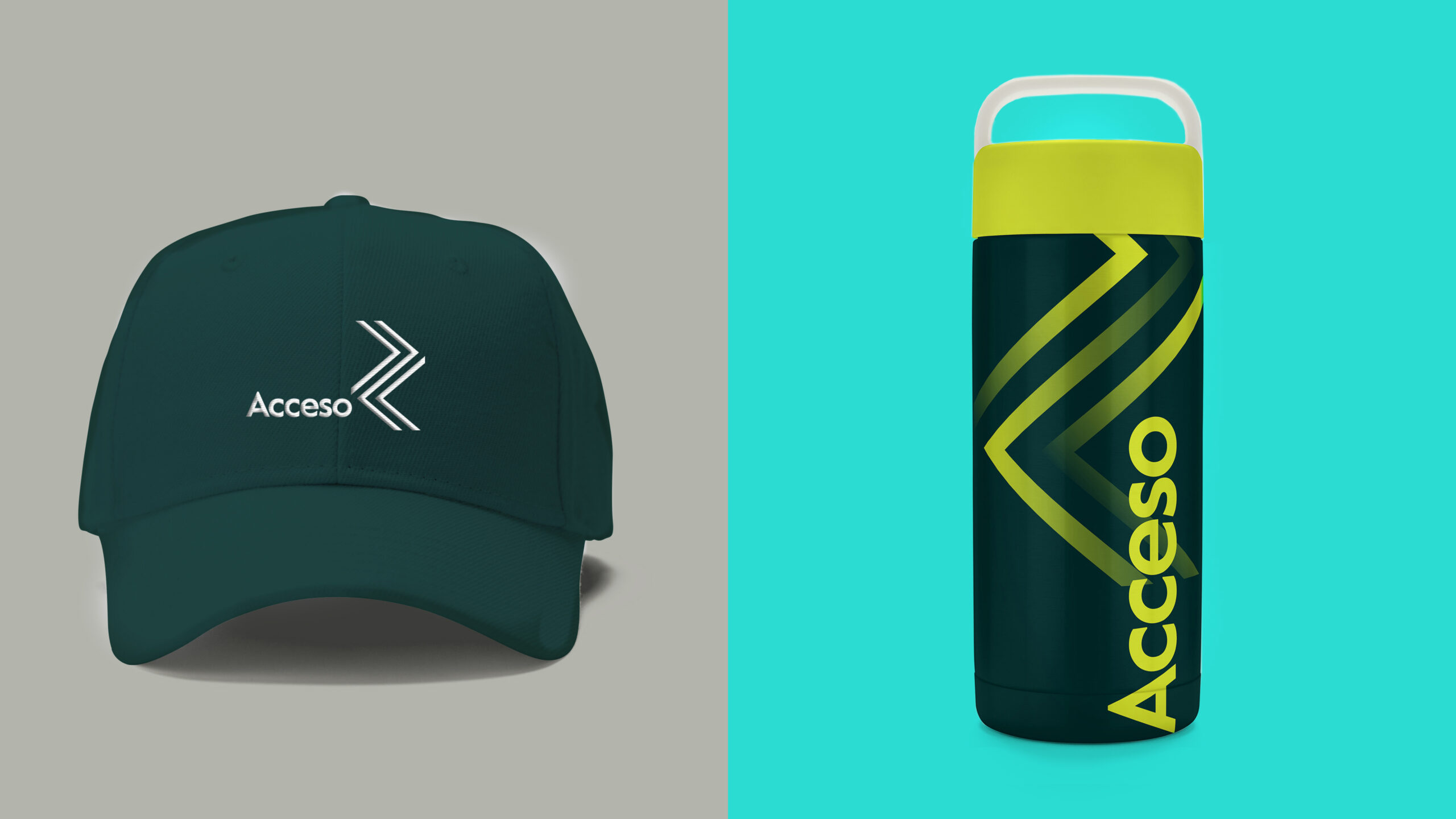
Over time, we expanded the system’s vocabulary to navigate brand and product architecture scenarios, determining the right relationship between retail environments and the Acceso Masterbrand.

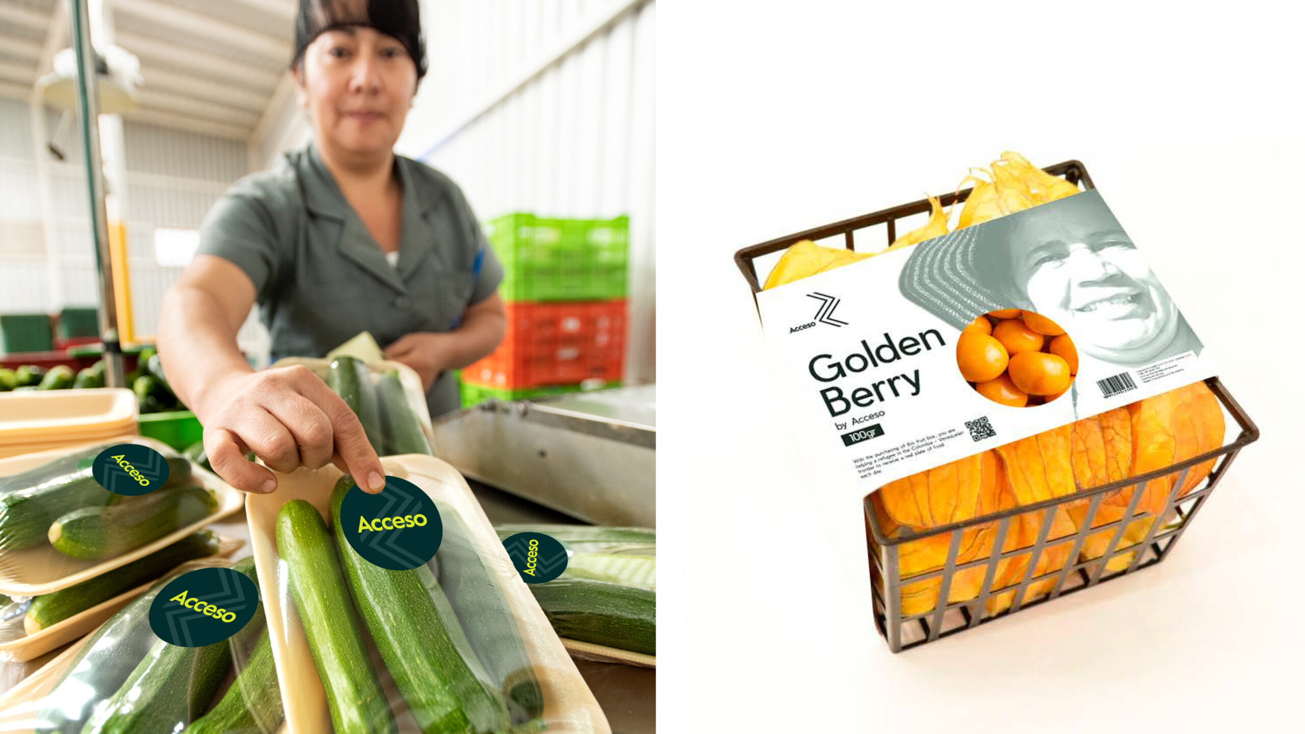
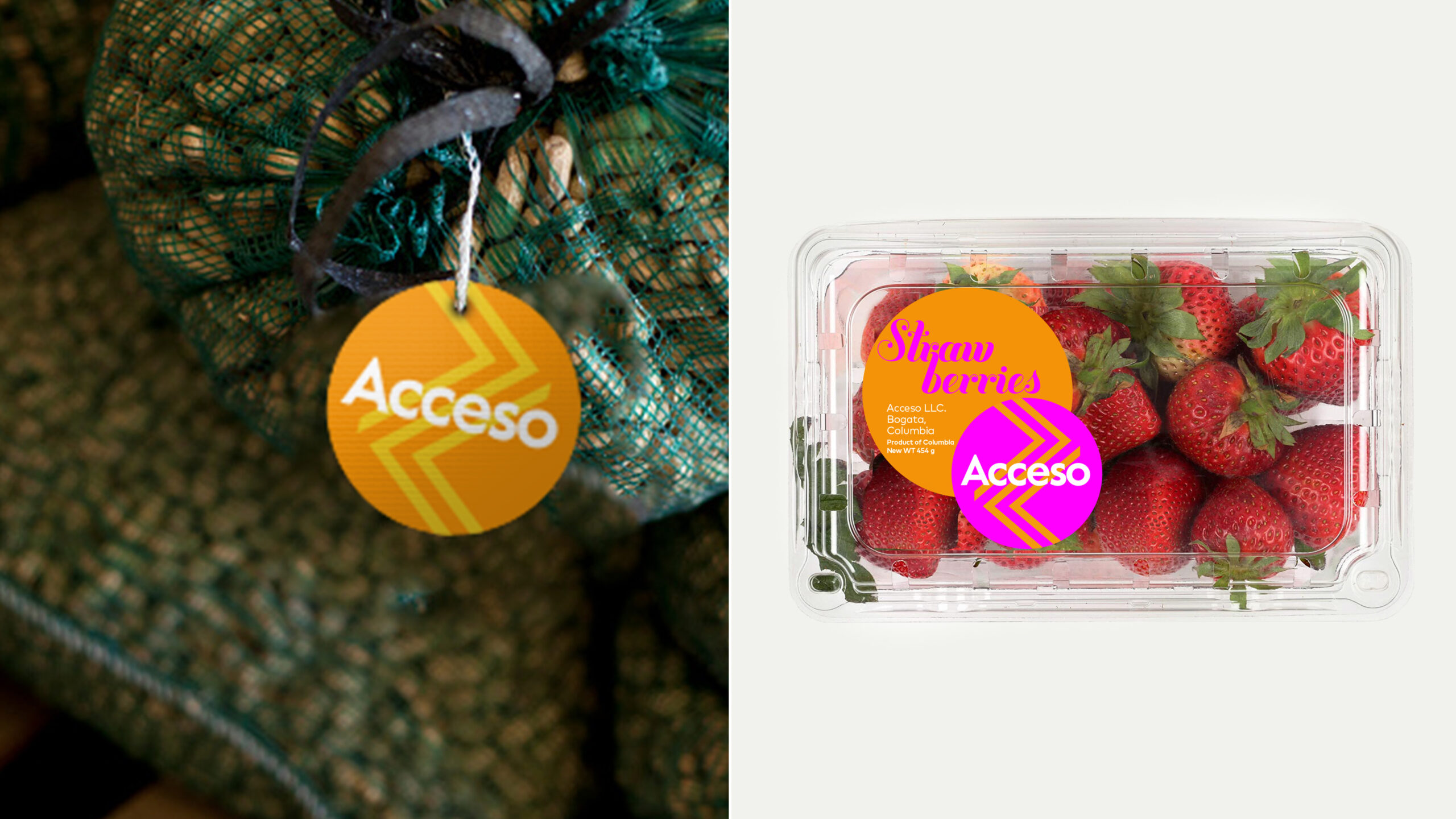
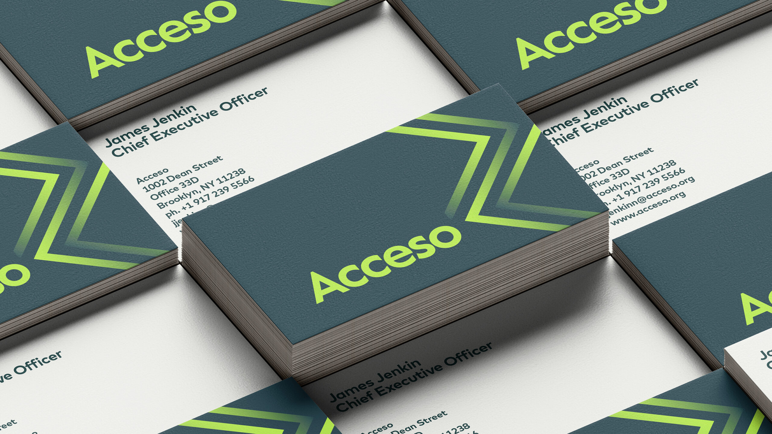
Building on a strong strategic platform, we created a premium design language to elevate this organization into a brand suite that would allow for growth and retain a level of friendliness and accessibility.

Credits:
Creative Director: Lynda Decker
Art Director: Lynda Decker
Senior Designer: Susanne Adrian
Junior Designer: Jason Mangelson
