Challenge
Rockpoint’s brand strategy had become dated, and it no longer aligned with the sophistication of the firm.
Solution
Our research revealed that many brands in the vertical did not effectively differentiate from one another, therefore creating an opportunity to highlight Rockpoint’s distinctiveness.
Result
Our brand strategy design emphasized Rockpoint’s culture of excellence—one that results in high-performance returns and long-term client relationships.
Rockpoint Group, L.L.C. (“Rockpoint”) is a real estate private equity firm headquartered in Boston with additional domestic offices in San Francisco and Dallas. Founded in 2003, its visual brand no longer projected the level of sophistication the company desired. Working in conjunction with strategy consultant, Will Pollock, our research revealed that the firm was well respected for its integrity as well as its financial performance.

The key to the firm’s long-term success is the intellectual agility of its team. They invest where they see opportunity and create value with their management—a strategy compelling to limited partners. Although their returns are in line with the “Blackstones and the Brookfields,” Rockpoint focuses on $50–$100 million investments.
The brand research phase pointed to a strategy that would emphasize the firm’s culture balanced with outstanding portfolio performance. This direction would help to differentiate as well as attract best in class talent.
Our strategy emphasized Rockpoint’s culture of excellence—one that results in high performance returns and long-term client relationships.
The founders wanted to maintain a sense of legacy, but agreed the system required an update for clarity and impact. All companies now communicate primarily through digital media. Rockpoint’s assets were more suited to print: text was overly long, without enough visual hierarchy to guide readers; images were stylistically inconsistent; data presentations were overly dense.


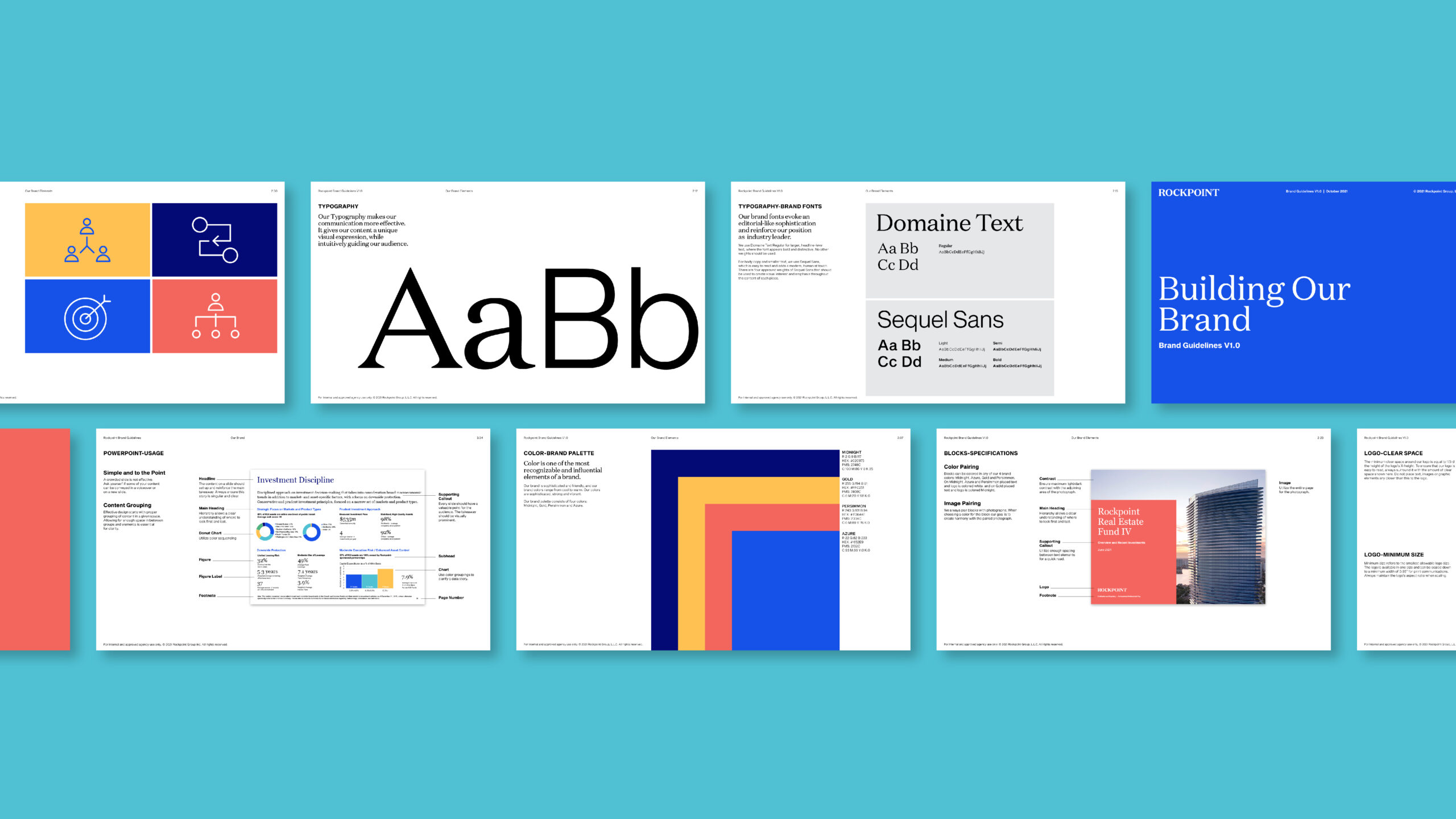
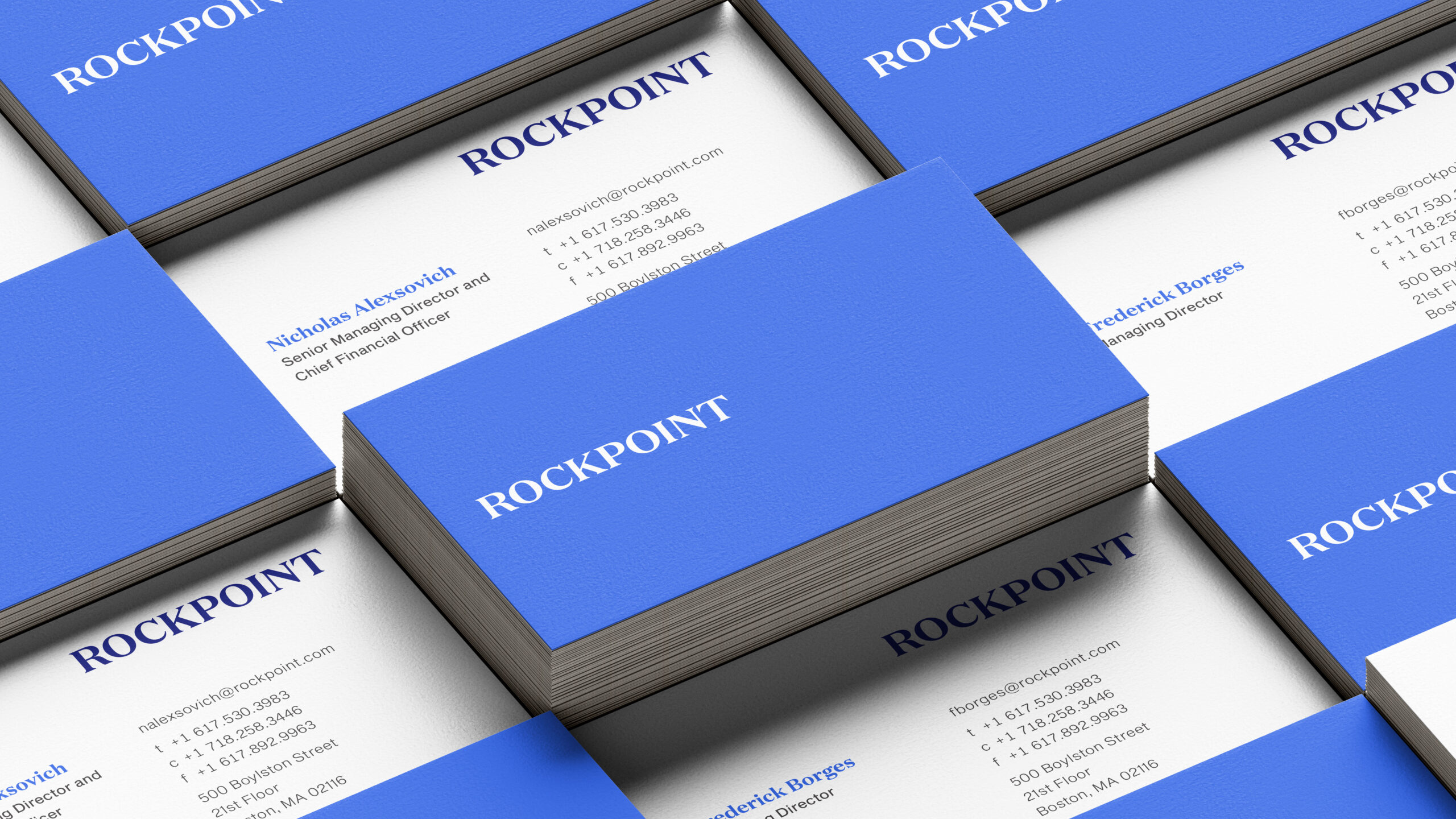
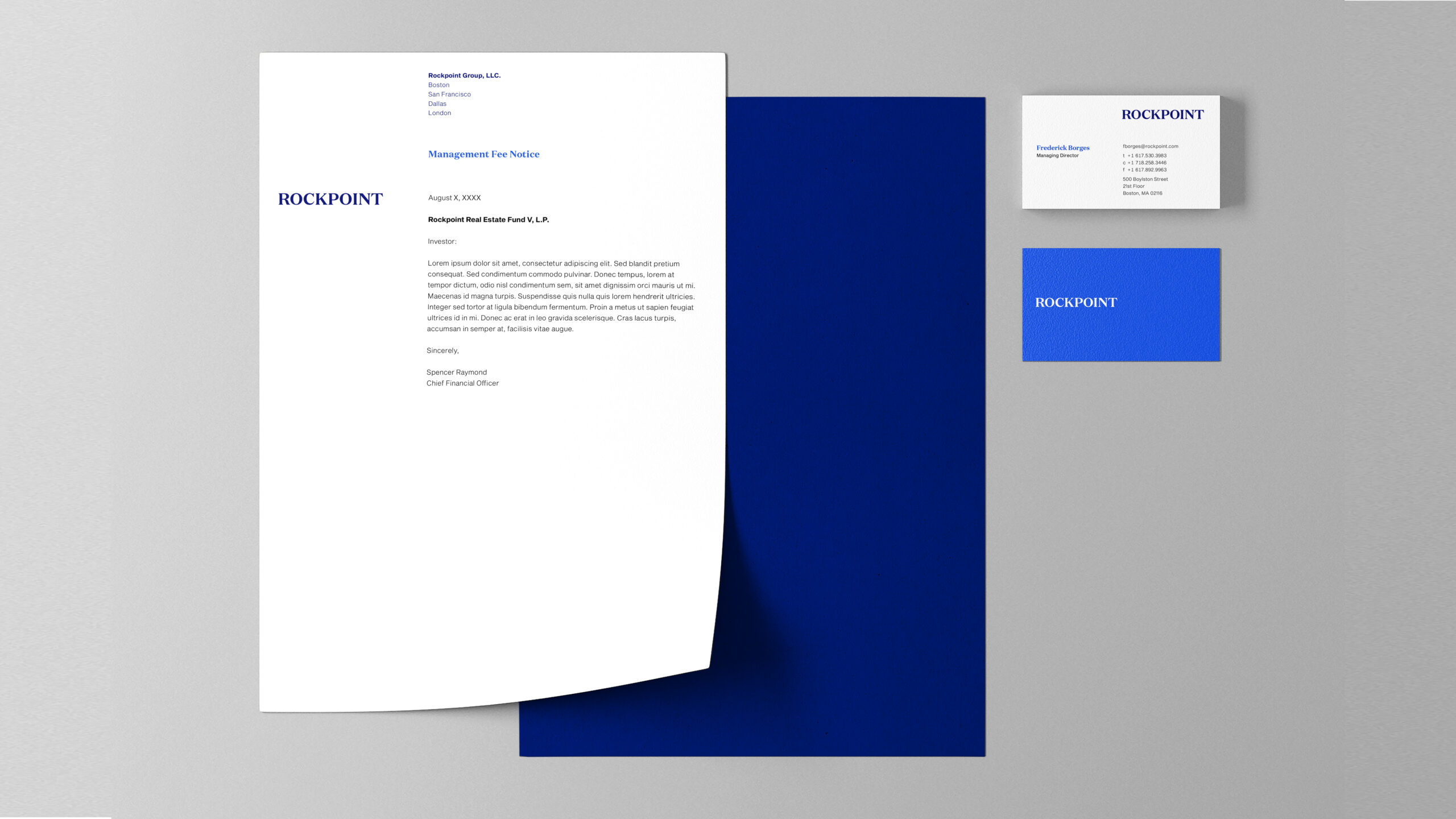
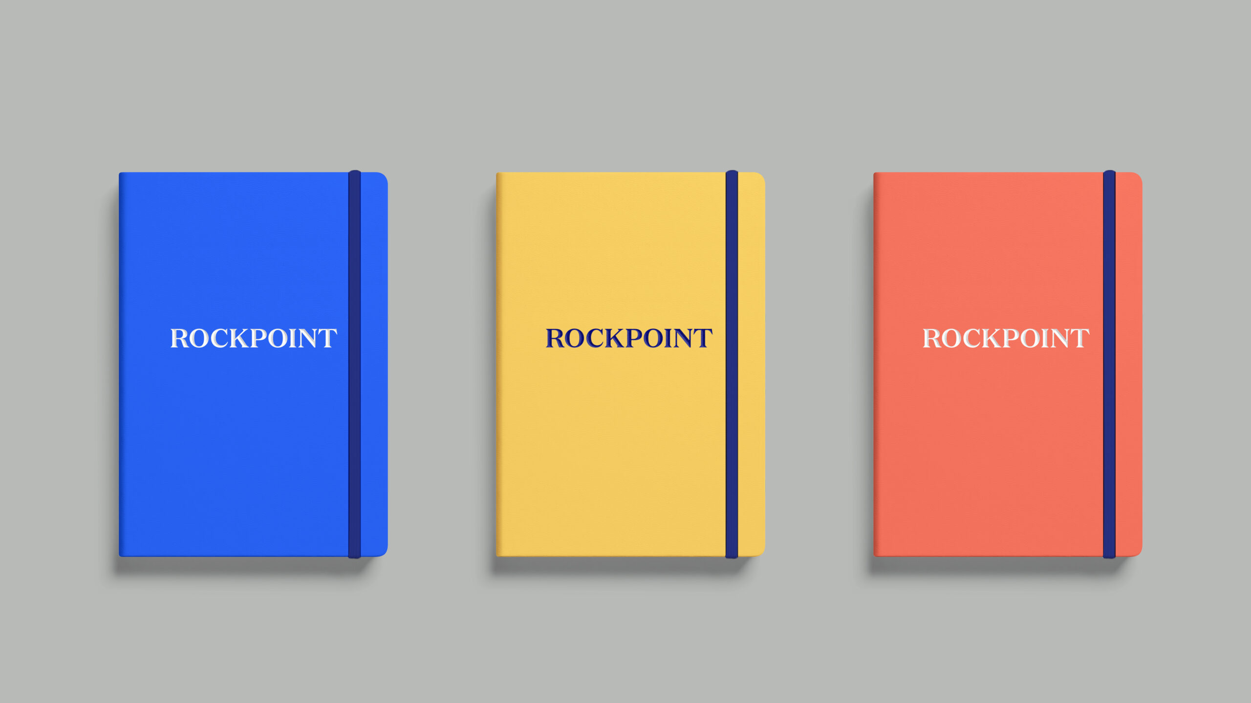
We suggested an update to the logo which made all the letterforms the same size and weight. We chose a font that is less round and has less contrast of thick and thin—resulting in greater legibility at smaller sizes and on screens.
A key element of the system is the use of content blocks. These blocks emphasize the brand, lend consistency and enable flexibility for an existing image library.
Imagery is a critical part of any brand system design. Rockpoint’s archives are filled with photos of property but not people. If we were going to emphasize culture, we had to show it. Our first major step was to determine the correct photographic brand strategy for buildings and humans.

To reflect the firm’s integrity, we suggested a shift in the photographic approach—buildings shot in daylight, not with special effects or sunsets. People would be photographed in light, airy locations. We would shoot employees in teams to reflect a collaborative environment, but with low depth of field, to provide a focus. People imagery would dominate general brand communication; buildings and data would dominate shareholder communication.
The brand colors were revised through referencing the existing brand color blue and expanding it to two versions—both brighter and optimized for digital communications. The blues were contrasted with a warm persimmon and a gold. The brand palette was then expanded for data presentations so that charting is easier to read.
The brand fonts are Domaine Text and Sequel Sans, the former lending a touch of human sophistication and the latter increased readability for text set in paragraphs. When using Microsoft products, the user would default to system fonts—our specification is Georgia and Arial. Our guideline document demonstrates a point-by-point lesson in crafting hierarchical relationships to effectively enhance text readability. Working with an editor, copy was reduced, and our grid system instructs how to use white space properly with text, tables and charts.
Overall, the new system provides a structure for consistency while allowing for flexibility as the organization grows and its investment strategies evolve to meet their goals.


Credits:
Creative Director: Lynda Decker
Brand Leader: Matty Brownell
Designer: Susanne Adrian
Junior Designer: Jason Mangelson