Design Communication Pitfalls: What to Avoid With Your Law Firm’s Design Partner
- Messaging & Communications ,
- Website Design
If your law firm is like many others, hiring a design partner represents a major investment. Of course, selecting the right design partner goes a long way toward ensuring you get the results you want. But that’s just the first step. You might be surprised to learn that the quality of your law firm’s design results is directly connected to the way you communicate with your designer throughout the engagement.
In order to maximize the return on your law firm’s design investment, you must communicate your needs clearly and effectively. Here’s what you need to know.
The Purpose of Design for Your Law Firm’s Business
Before we discuss communication best practices with your design partner, it’s essential to understand what good design means as it relates to your law firm.
If you think about design in the context of, say, your home’s furnishings, it makes sense to start with the colors, textures, and other aesthetic choices that make up your personal preferences. After all, the main purpose of interior design is to create a space that you personally enjoy spending time in.
But when it comes to your law firm, the purpose of design is entirely different. In order for your firm’s design to be effective — from your brand’s visual identity to your website — it must do more than just “look nice” or play to your preferences. Instead, your design must actively convey your unique expertise. It must demonstrate to your prospects why your firm is better than the other law offices they are no doubt considering.
Without a distinct strategy to guide it, business design is simply a series of aesthetic choices grounded in nothing more than personal preferences. It’s beautiful but directionless — a shiny new boat without a rudder.
How does this relate to the way you communicate to your design partner? It means that you should frame your design needs in terms of your underlying business objectives. You should come prepared to do just that, beginning with your RFP and continuing through the entire design process. A strategy-driven design partner will know how to take it from there.
The Three Most Common Design Communication Pitfalls
There are several common design communication pitfalls that ultimately undermine everyone’s results. These include:
Using subjective descriptions
If your designer presents you with a layout, don’t respond by simply saying, “It’s not sophisticated enough.” Remember, sophistication — like beauty and all other subjective adjectives — is in the eye of the beholder.
Instead, explain what sophistication means to you, and attempt to tie those qualities to what you are (or are not) seeing on the screen. Just make sure that whatever subjective quality you are asking your designer to achieve is in keeping with your strategy. Otherwise, you’re wasting your time.
Prescribing the solution rather than defining the problem
A seasoned strategic designer is specially trained to uncover creative solutions to clients’ problems. If you try to dictate specific solutions to your designer, your designer won’t have the space to find the best possible design solutions.
This communication pothole relates to big-picture design requests and in-the-weeds details alike. For example, avoid asking your designer to make your website “look like” another firm’s site. That’s prescribing a solution when you haven’t yet defined the problem. Instead, be open and honest about your business’s current needs and future goals. Then let your designer lead the way in finding the right solutions.
The same rule applies when you are reviewing design layouts. If you see something that doesn’t work, avoid the temptation to dictate a solution. For example, if an element doesn’t stand out enough, don’t just say, “make it bigger.” Instead, get more specific about the problem. In this case, do you really just want the element to be given more emphasis? If so, explain that to your designer. There are many ways to produce greater visual emphasis. With a clearly stated problem to work from, your designer is free to explore the options and find the best solutions.
Failing to provide holistic feedback
Your feedback is crucial. But if you fail to provide holistic feedback, your designer won’t be able to truly address your concerns.
For example, you shouldn’t go through a design presentation and point to individual elements that you personally like or don’t care for. When it comes to your law firm’s design, your personal preferences matter — but they aren’t the most important measuring stick by which you should measure a design.
Instead, assess each design against your stated strategy. How well does the design express your strategic goals? If it misses the mark, can you explain to your designer why that is? Think holistically when delivering your feedback. The more you do this, the better your results will be — and the faster your designer will arrive at the right solutions.
The Right Design Process Facilitates the Right Kind of Communication
The good news? The right design process can facilitate clear and effective communication between your firm and your design partner.
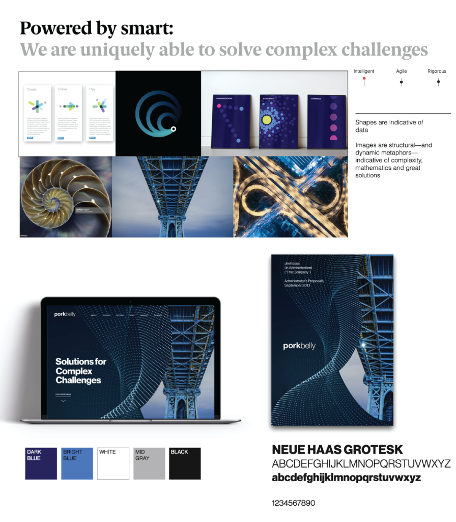
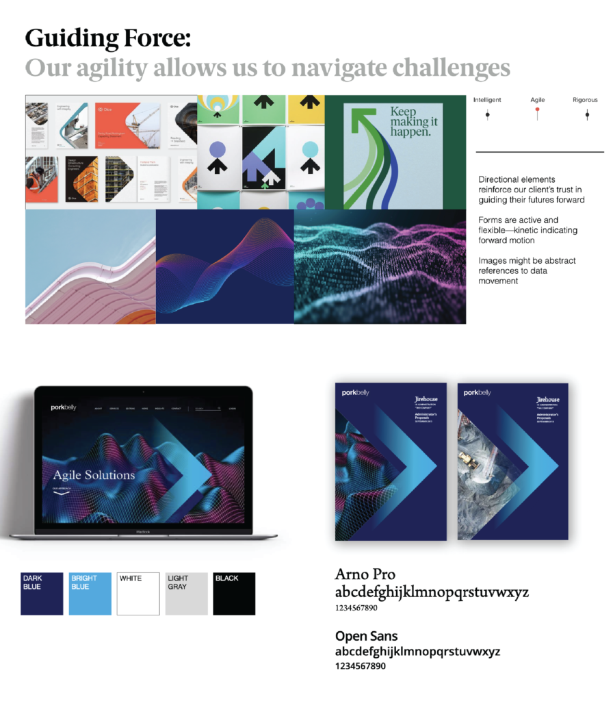
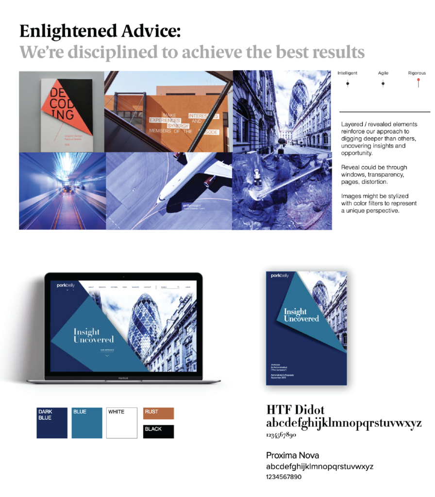
At Decker Design, all of our design activities and choices flow from our initial, research-driven strategy phase. During the strategy phase, we uncover each firm’s key differentiators. We then translate those differentiators into a set of guiding principles — such as intelligent, agile, and rigorous — that the entire firm can agree upon and align around.
Next, we define what each design principle will mean in terms of how we make design choices. For instance, we might decide to express the idea of being “rigorous” using bold forms, sharp edges, and informational graphics.
Finally, we use our agreed-upon design building blocks to explore design territories. Design territories are thematic groupings of visuals that explore each of the principles using the design elements we’ve identified for each principle. The following images demonstrate how three guiding principles — in this case intelligent, agile, and rigorous — can be expressed as design territories.
This process is designed to act as a funnel, guiding our clients toward their final design solutions by refining the way we visually express a firm’s unique positioning. Because it is so structured, and because it so clearly ties back to each client’s strategic foundation, our process keeps everyone in alignment throughout the design project. Which naturally helps to facilitate the sort of communication that enhances — rather than undermines — the final product.
Interested in learning more about how Decker Design can help your business find the right design solutions to propel you forward? We’d love to talk.


