Put Content in the Driver’s Seat of Your Website Design
- Marketing ,
- Messaging & Communications ,
- Website Design
The temptation for any firm redesigning its website is to begin by discussing visuals. You want to see all the bells and whistles. You want to make it flashy. Make it dynamic. Make it beautiful.
I get it. It’s a natural instinct. It’s also completely wrong.
Too many firms believe brand development and website design is a purely visual endeavor. They fixate on color schemes, graphics, images and other “shiny objects.”
But for professional services firms, brand “voice” really comes from content. It lives in the blog articles, the client communications, the podcasts, videos and landing pages. Brand is about what is actually being said.
When content dictates design, that information is placed in the proper context, directed to the right people and presented so a firm’s brand identity is clearly established throughout the website.
In 1996, Bill Gates said, “Content is king.” It’s still true today.
Without a clear understanding of content, designers have no roadmap. No way of determining content hierarchy. No way of organizing the structure. They’re just shooting in the dark and hoping for the best.
Anything built without a strong content foundation will crumble.
You don’t just do a design and then populate it with content.
Yes, you could try to start by designing something beautiful with placeholder copy, but that will become a waste of both time and money—things no firm can afford to squander.
If you don’t know what you’re designing for, you aren’t designing a solution. Having your content lead design provides a framework for a website that actually works. It’s how you develop a website that solves problems, answers questions, attracts prospects and generates qualified leads.
Considering Content First Makes for Easier Decisions Later
Putting content concerns front and center creates a logical set of stepping stones to follow as the creation or redesign of your website proceeds.
Start with your home page and work methodically from there. Scrutinize content everywhere: Practice area pages. Landing pages. Affinity groups. Job postings.
Here is how each step sets up the next and leads to another before finally culminating in design:
- Clarify your content. What are you saying? How are you different from others? Who are you saying it to? Is your brand voice and tone clear and consistent throughout?
- Determine features and functionality. How can users find what they’re looking for? How are they engaging? How can they get in touch?
- Establish the visual theme. Based on the earlier decisions, how should it look? What are the colors? What are the fonts? What is the imagery?
Following this simple, sequential approach with content at the forefront will help ensure a successful final product.
3 Content Best Practices to Use as Your Starting Point
You’ve invested significant time, energy and resources into creating content across multiple subjects and formats. Here are some simple ways for you to make sure your content is serving readers.
Say More by Saying Less
Remember that your readers are as busy as you are, so make an effort to keep articles and blog posts to a manageable length. A recent Axios study found that only 5% of readers make it to the end of an 800-word article.
Know what you’re going to say, and say it as succinctly as possible. As the acronym KISS implores, “Keep it simple, stupid.”
Understand Your Audience
A lot of our initial conversations with clients begin with a simple question: “What objective are you trying to achieve with your content?”
The answer can be as simple as determining who you are trying to impress. Is it about impressing potential clients? Is it a recruiting tool to impress potential employees? Are you trying to satisfy an internal constituency?
Give Them a Great Digital Experience
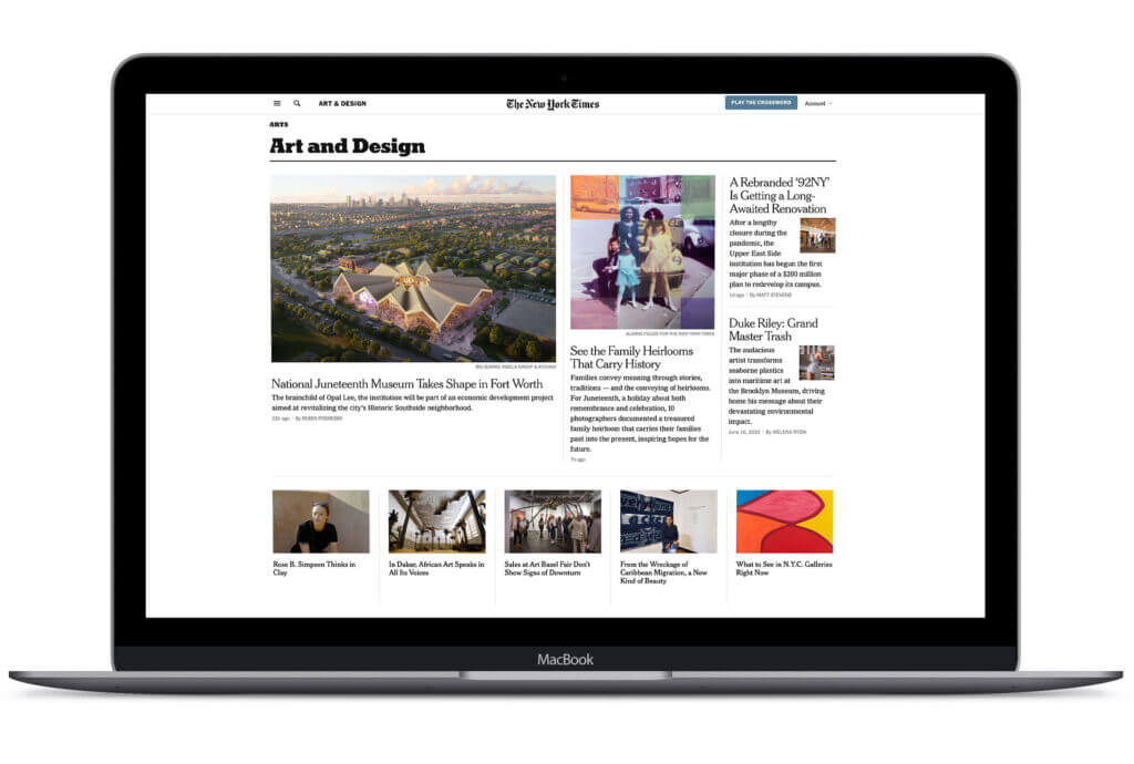
A lot of professional service firm websites would be greatly improved with content that was more scannable. Think of The New York Times and how readable it is by everybody. A clear, clean and consistent content format guides the reader along their journey. Distinct headlines, subheads and callouts indicate the most important information.
Your website should be doing the same. When conceived and designed as a genuine content platform, your website becomes a truly powerful marketing tool.
The Best Website Designs Flow From Thoughtful Content
At their core, websites for professional services firms are content containers. They are a repository for showcasing a firm’s experience, expertise and insights you’ve created — an invaluable platform for your firm’s unique skill set and value proposition.
When you’re ready to redesign or refresh your site, resist the temptation to start by focusing on how it will look. Nothing happens in a vacuum. It’s the same with design. You can’t create a high-performing website without first knowing what it will say.
To fully unleash your website’s potential, let your content take the lead. Only then can you be confident the final design will deliver the results you expect.


